Your Home Feels ‘Off,’ Doesn’t It? Let’s Fix These Common Decorating Mistakes.
I’ve been in more homes than I can count, and I’ve learned one big truth: a great room isn’t about one giant, perfect decision. It’s about a whole bunch of small, smart choices that all click together. I learned this the hard way, of course. Early in my career, I was working on a gorgeous traditional home. The client was absolutely in love with a massive, dark wood armoire they had inherited. I was eager to please, so I said, “Let’s do it!” The second the movers set it down, we both knew. It was a disaster.
In this article
- 1. The Scale Game: Getting Your Furniture and Space to Play Nice
- 2. The Truth About Color and Light
- 3. Ground Your Room With the Right Rug
- 4. Let There Be (Layered) Light
- 5. Hanging Art Without Driving Yourself Crazy
- 6. Dodging the Trend Trap
- 7. The Final Showdown: Looks vs. Livability
- Inspirational Gallery
That single piece just devoured the room. It blocked the light and made a perfectly spacious room feel cramped and heavy. We had to hire the movers all over again to haul it back out. It was an expensive, slightly embarrassing lesson, but it taught me my real job: to help people sidestep those frustrating and costly mistakes before they happen.
So, I’ve basically put together my field notes from over the years. These are the recurring issues I see everywhere, from first-time homeowners to seasoned renovators. This isn’t about a bunch of stiff rules. It’s about sharing what actually works so you can make choices that feel good and create a home you genuinely love living in.
1. The Scale Game: Getting Your Furniture and Space to Play Nice
Honestly, the most common problem I fix is scale. And it’s not just about a sofa being physically too big for a room. It’s about the relationship—the visual conversation—between everything in that space. When the scale is off, a room just feels… unsettled. You might not be able to put your finger on why, but you know something’s wrong.
Get Your Tape Measure. Seriously.
Before you even think about clicking “buy now,” you have to measure your room. Then measure the furniture. This sounds like a no-brainer, but it’s the step almost everyone wants to skip. They see a sofa in a giant showroom with 20-foot ceilings and it looks amazing. In their living room with standard 8-foot ceilings, it suddenly becomes a behemoth. You need the length, width, and—this is critical—the height of every single item.
Heads up! A tall piece can make a low ceiling feel even lower, while a super low-profile sofa can get completely lost in a room with soaring ceilings.
Here’s a pro tip that has saved my clients thousands. Get a roll of blue painter’s tape. Once you have the dimensions of a sofa or table you’re eyeing, tape its outline directly onto your floor. Live with that blue rectangle for a day or two. Walk around it. How does it feel? Does it block your natural path to the window? This simple trick costs about $5 and can prevent a massive headache.
The ‘Don’t-Screw-It-Up’ Measurement List
Oh yeah, and it’s not just about the room’s dimensions. You have to get the furniture into the room. Before you fall in love, make sure you’ve measured:
- The width of all your doorways
- The clearance in any hallways it needs to pass through
- Any tricky stairwell angles or tight corners
Let’s Talk About Flow
A room needs clear pathways to feel comfortable. A major walkway, like from a hallway into your living area, should be at least 36 inches wide. Smaller paths, like the one between your coffee table and TV stand, can be a little tighter, but I try never to go below 30 inches. Any less and people start doing that awkward sideways shuffle.
The gap between your sofa and coffee table is also key. A common goof is placing them too far apart. You should be able to sit back and comfortably set down a drink without doing a full-body lunge. The sweet spot? Between 14 and 18 inches. Any more, and the table feels like it’s floating away. Any less, and you’ll be banging your shins.
Visual Weight is a Thing
Two sofas can have the exact same dimensions, but one can feel way heavier. That’s visual weight. A dark leather sofa with a solid base that sits right on the floor has a high visual weight. But a light-colored sofa on tall, skinny legs? That has a low visual weight because you can see the floor underneath. In a smaller room, choosing furniture with legs can make the space feel dramatically bigger without sacrificing seating.
2. The Truth About Color and Light
Paint is, hands down, the fastest way to transform a room. It’s also the easiest to mess up. That perfect little color chip from the hardware store can turn into an absolute monster on your walls. Why? Because color doesn’t exist on its own—it’s totally dependent on the light that hits it.
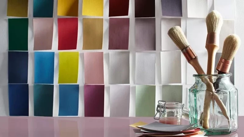
A Little Bit of Paint Science
On the back of most paint chips, you’ll find a number called the Light Reflectance Value, or LRV. It’s on a scale from 0 (jet black) to 100 (pure white). A high LRV (think 60+) reflects a lot of light, making a room feel brighter and bigger. A low LRV (below 40) absorbs light, making a room feel cozier and more intimate. If you have a dark room with a sad little window, choosing a paint with a high LRV isn’t just a style choice; it’s a technical solution. For example, a crisp, clean white like ‘Chantilly Lace’ has a sky-high LRV of 92.2. A go-to greige that works in almost any light, something like ‘Agreeable Gray’, sits right around an LRV of 60.
The Only Way to Test Paint
Please, I’m begging you, never paint a room based on a tiny chip. You have to test it on the actual walls. Buy sample pots or—even better and way less messy—order large peel-and-stick samples from a site like Samplize. Stick them on the main wall. Then put another one on a wall that gets less light.
Now, just watch. See how the color looks in the morning, at noon, and in the late afternoon. Then, flip on your lights at night. A soft gray can suddenly turn lavender under your light bulbs. That warm beige might go sickly yellow. You have to see the color in all its moods before you commit.
Sheen Is Just as Important
The paint’s finish, or sheen, matters a ton. It affects both durability and how the color looks.
- Matte/Flat: Zero shine, great for hiding wall imperfections. It’s not very washable, though, so I save it for ceilings or low-traffic rooms.
- Eggshell: Has a soft, low-key glow. It’s more durable than flat and is my go-to for most living rooms, bedrooms, and hallways.
- Satin: A bit more shine and even more durable. It’s a champ in high-traffic areas, kitchens, and bathrooms. The downside? It will highlight any bumps or flaws on your wall.
- Semi-Gloss/Gloss: Super shiny and tough as nails. This is strictly for trim, doors, and cabinetry. It’s a breeze to clean but will show every single imperfection on the surface.
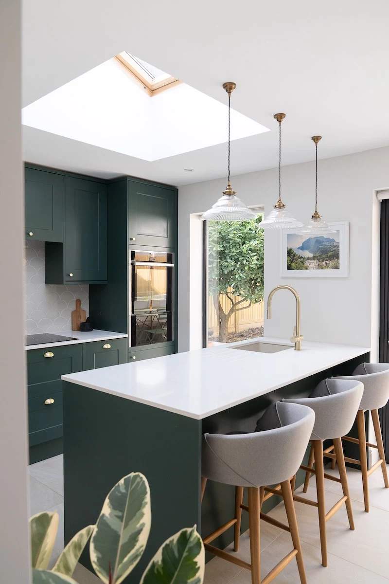
3. Ground Your Room With the Right Rug
A rug that’s too small is like wearing a suit with pants that are three inches too short. It just looks… off. The rug’s job is to pull all the furniture together and define the space. When it’s too small, it looks like a lonely postage stamp, and your furniture seems to be floating aimlessly.
The Rules of Rug Size (That Actually Work)
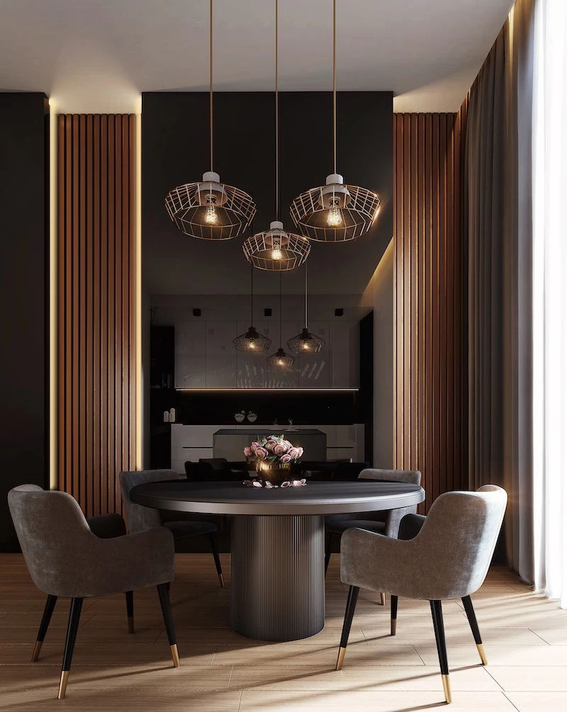
So what size do you need? For a standard living room with a 3-seater sofa, you’re probably looking at an 8×10 foot rug, minimum. For a queen-sized bed, an 8×10 is great, and for a king, a 9×12 is even better. The goal is to have at least the front legs of all your main furniture pieces sitting on the rug.
For a dining room, the rug needs to be big enough that the chairs stay on it, even when you pull them out to sit down. As a rule of thumb, aim for the rug to extend about 24-30 inches beyond the edge of your table on all sides. Nothing’s more annoying than a chair leg catching on the rug’s edge.
A Budget-Friendly Rug Trick
Big rugs can get pricey. A trick I love is to layer. Start with a large, affordable natural fiber rug (think jute or seagrass) that’s the correct size for the room. You can find these at places like IKEA, Rugs USA, or even Wayfair. Then, layer a smaller, plusher, more decorative rug on top. You get the scale right for a fraction of the cost.
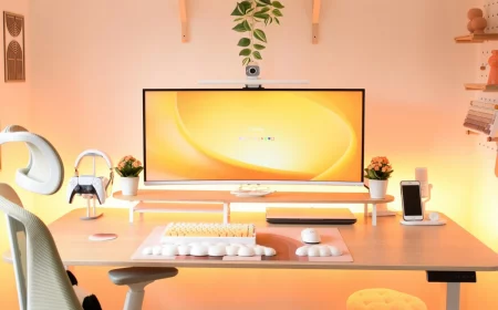
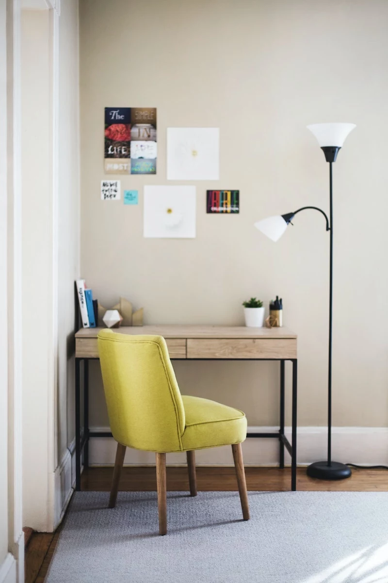
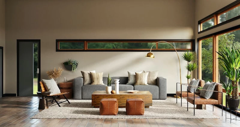
4. Let There Be (Layered) Light
You could have the most stunning furniture in the world, but with bad lighting, the room will always fall flat. Good lighting is emotional; it’s what creates a mood. A great plan always has three layers.
- Ambient Light: This is your general, all-over light from ceiling fixtures or recessed cans. The mistake is stopping here, which can feel harsh and create weird shadows.
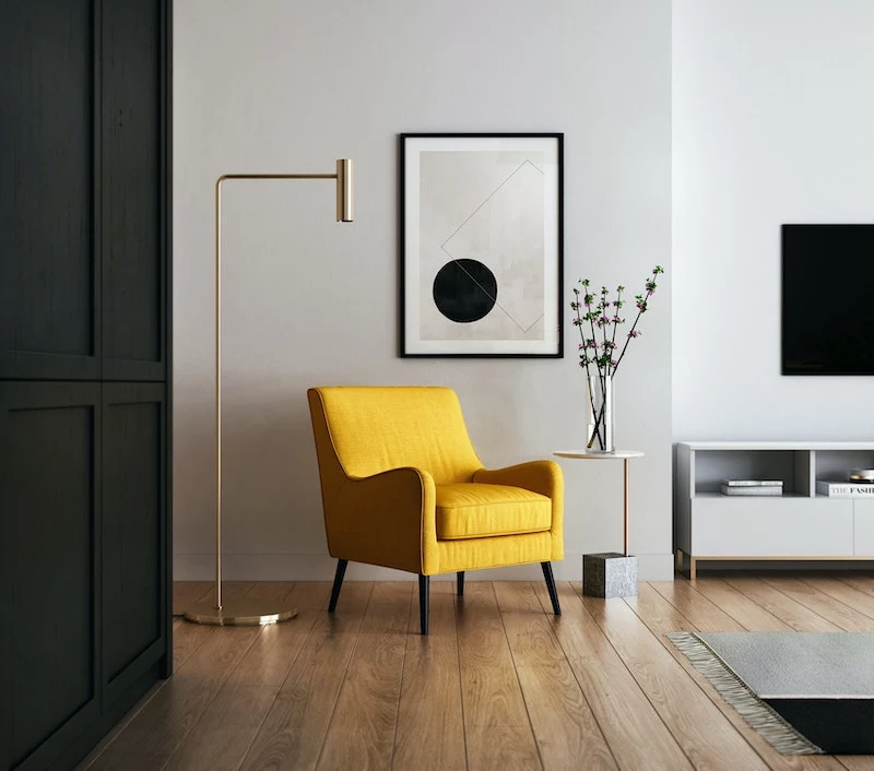
- Task Light: This is focused light for doing stuff—a reading lamp by your chair, under-cabinet lights for chopping veggies, or a desk lamp.
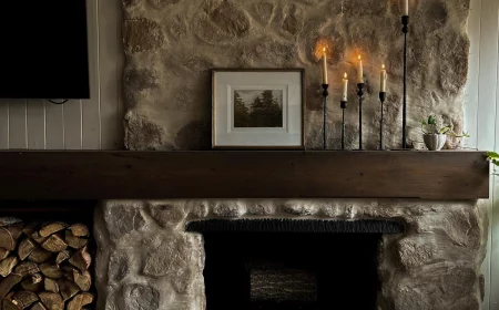
- Accent Light: This is the fun stuff! It’s the light that highlights art, a cool plant, or an architectural feature. It adds depth and personality.
The Secret Weapon of Lighting…
Dimmers! Seriously, put dimmer switches on everything you can. They are the single best way to control the mood of a room and make your layered lighting plan work. It’s a relatively cheap upgrade an electrician can handle in an hour or two, and the impact is massive. If you’re renting, you can get plug-in dimmers for your lamps or use smart bulbs that you can control from your phone.

Quick tip: For a cozy vibe in living rooms and bedrooms, use light bulbs in the 2700K to 3000K (Kelvin) range. This gives off a warm, inviting white light. Anything higher starts to feel clinical and blue.
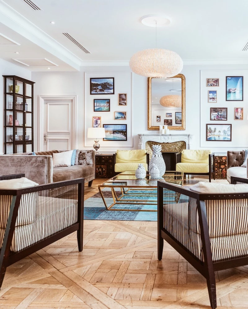
5. Hanging Art Without Driving Yourself Crazy
Art is the soul of a home, but hanging it too high is an epidemic. People tend to center it on the wall, leaving it floating in no-man’s-land, completely disconnected from the furniture below.
The 57-Inch Rule
Here’s the standard used by galleries and museums: hang art so that its center point is 57 inches from the floor. This number represents the average human eye level, making it comfortable to view. It instantly makes the art feel connected to the people in the room. The main exception? When hanging art above furniture like a sofa or headboard. In that case, the bottom of the frame should be about 6 to 8 inches above the piece.
How to Create a Gallery Wall (Without 100 Nail Holes)
The key to a great gallery wall is planning. First, trace all your frames onto kraft paper and cut them out. Arrange these paper templates on the floor until you find a layout you love, keeping the spacing between them consistent (usually 2-3 inches). Then, tape the templates to the wall. Live with it for a day. Once you’re sure, hammer your nail right through the paper, then just tear the paper away. Perfect placement, zero mistakes.
6. Dodging the Trend Trap
It’s so easy to get sucked in by the latest trends. But designing your whole home around something that will be out of style in two years is a recipe for regret. Think of your home as a long-term investment.
The 80/20 Guideline
Here’s what I tell everyone: Invest 80% of your budget in timeless pieces. This is your sofa, your flooring, your kitchen cabinets. Stick with neutral colors and classic shapes for these big-ticket items. Then, use the other 20% to have fun with trends! Go wild with pillows, throws, art prints, and small accessories. If you’re obsessed with a trendy color, bring it in with a few $40 pillows. When you’re over it in a couple of years, it’s a cheap and easy fix.
Remember that heavy, ornate kitchen style that was everywhere a while back? People spent fortunes on them, and they looked dated almost overnight. Your home should tell your story, not just repeat what’s popular right now.
7. The Final Showdown: Looks vs. Livability
The last mistake is creating a room that looks like a magazine but is miserable to live in. A beautiful home that doesn’t support your actual life is just a pretty picture. It’s a failed design.
‘Test Drive’ Your Furniture
You have to sit on that sofa. You have to pull that dining chair up to the table. If you’re buying online, this gets tricky. Your new best friends are the customer reviews—read them like a detective. Hunt for real customer photos to see the piece in a normal room, and ALWAYS order fabric swatches first. And for the love of all that is holy, check the return policy before you add to cart. Some are brutal.
Your Sofa Shopping Cheat Sheet
When you’re in a store, it’s easy to get overwhelmed. Pull this up on your phone. Here’s what to ask about:
- The Frame: Ask if it’s “kiln-dried hardwood.” That’s the gold standard. Avoid particleboard or soft woods like pine.
- The Springs: “8-way hand-tied” is the absolute best, but “sinuous springs” are a very good, more common alternative.
- The Fabric: Ask for the “double rub” count. For a family sofa that gets a lot of use, you want a fabric rated for at least 25,000 double rubs.
At the end of the day, the goal is to create a true sanctuary. By avoiding these common slip-ups, you’re not just dodging mistakes—you’re actively building a more thoughtful, comfortable, and supportive home that you’ll love for years to come.
Inspirational Gallery
The Wrong Rug Size: One of the fastest ways to make a room feel disjointed is a rug that’s too small, creating a
Why does my all-white room feel more like a hospital than a haven?
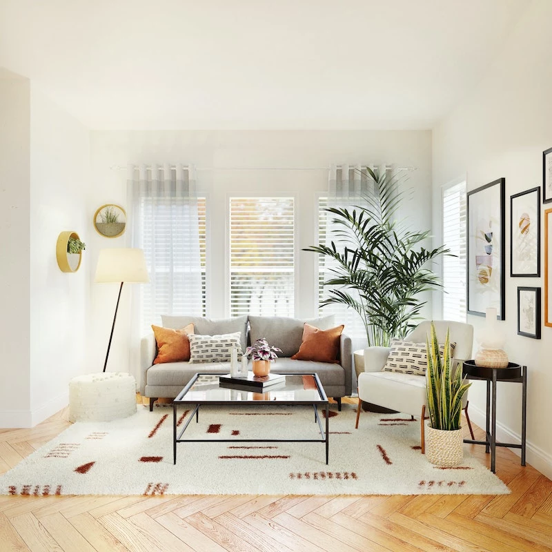
The culprit is often a lack of texture. A common error is thinking that a single color is enough to create a mood. Without a variety of textures, a monochromatic space falls flat. To fix this, layer different materials: a nubby bouclé pillow on a smooth linen sofa, a rough-hewn wooden bowl on a sleek marble table, a chunky knit throw, and a jute rug. It’s the interplay of these surfaces that brings warmth and visual interest to a minimalist palette.
A critical lighting mistake: Relying solely on a single, central overhead light. This creates harsh shadows and a flat, uninviting atmosphere. A well-lit room always has layers of light—ambient (general), task (for activities like reading), and accent (to highlight art or architecture). Think table lamps, floor lamps, and picture lights to build a warm, functional glow.
When it comes to paint, choosing the wrong sheen can be as bad as choosing the wrong color. It affects durability and how light plays in the room.
Matte/Flat Finish: Hides imperfections beautifully and offers a soft, velvety look. A huge mistake is using it in high-traffic or high-moisture areas, as it’s difficult to clean. Perfect for ceilings or a formal dining room. Benjamin Moore’s
Resist the urge to push all your furniture against the walls! This creates a static, waiting-room feel and a dead space in the middle. Even pulling your sofa forward by just a few inches can make a room feel more intimate and intentional. The goal is to create conversational groupings that encourage connection, not a furniture line-up.
It’s estimated that over 70% of homes hang their artwork too high.
This common error disconnects the art from the furniture and the human-scale of the room. The rule of thumb used by galleries and designers is to hang art so its center is 57 to 60 inches from the floor. This is average eye level. When hanging art above a sofa, aim for the bottom of the frame to be 6-8 inches above the back of the furniture.
- Your beautiful curtains will hang perfectly, draping elegantly to the floor.
- The room will instantly feel taller and more spacious.
The secret? A simple adjustment to your curtain rod. The mistake is mounting it right at the top of the window frame. For a more professional and dramatic look, mount the rod 4-6 inches above the frame and extend it 3-6 inches on either side. This tricks the eye into seeing a larger window and a higher ceiling.
There’s nothing wrong with good faux botanicals, but a common mistake is choosing ones that scream