Your Living Room Paint Color Looks Wrong. Here’s Why (And How to Fix It).
I’ve walked into countless living rooms over the years, and I see the same thing every time: that look of pure panic. It’s the look of someone staring at a wall covered in tiny, confusing paint swatches, terrified of making a thousand-dollar mistake. It often starts with a simple, hopeful idea, like “I just want it to feel relaxing.” But turning that feeling into a gallon of paint? That’s where things get complicated.
In this article
So many articles will try to tell you that your color choice is about your personality. You like blue, so you must be calm. Honestly, that’s a tiny, tiny part of the story. The color on your walls is a powerful tool that actively changes how you feel in your own home. It’s not just about picking a pretty shade; it’s about understanding how that shade will actually behave in your specific room.
Forget the simple formulas. We’re going to walk through the process the pros use, and I promise it’s less about secret knowledge and more about just paying attention. We’ll cover how light works, the deal with paint sheen, and some real-world color theory that actually makes sense. Let’s get you from panicked to confident.
First Things First: It’s All About the Light
Before you even think about a color, you have to understand light. Seriously. Color doesn’t exist without it. What we see as “color” is just how a surface bounces light waves back to our eyes. This isn’t just boring science class stuff; it’s the single most important factor determining how a paint color will look on your walls.
The Magic Number on the Back of the Chip: LRV
Flip over any decent paint chip, and you’ll see a little number for LRV, or Light Reflectance Value. It’s a scale from 0 (think black hole) to 100 (pure, brilliant white). All it tells you is how much light that color will reflect back into the room.
- High LRV (60 and up): These are your light and airy colors. They bounce light around like crazy, which is why they’re great for making a space feel bigger and brighter. Most ceiling whites have an LRV over 80 for this very reason.
- Mid-Range LRV (20-59): This is the sweet spot where most popular wall colors live. They absorb some light, which helps create a cozier, more defined atmosphere without feeling dark.
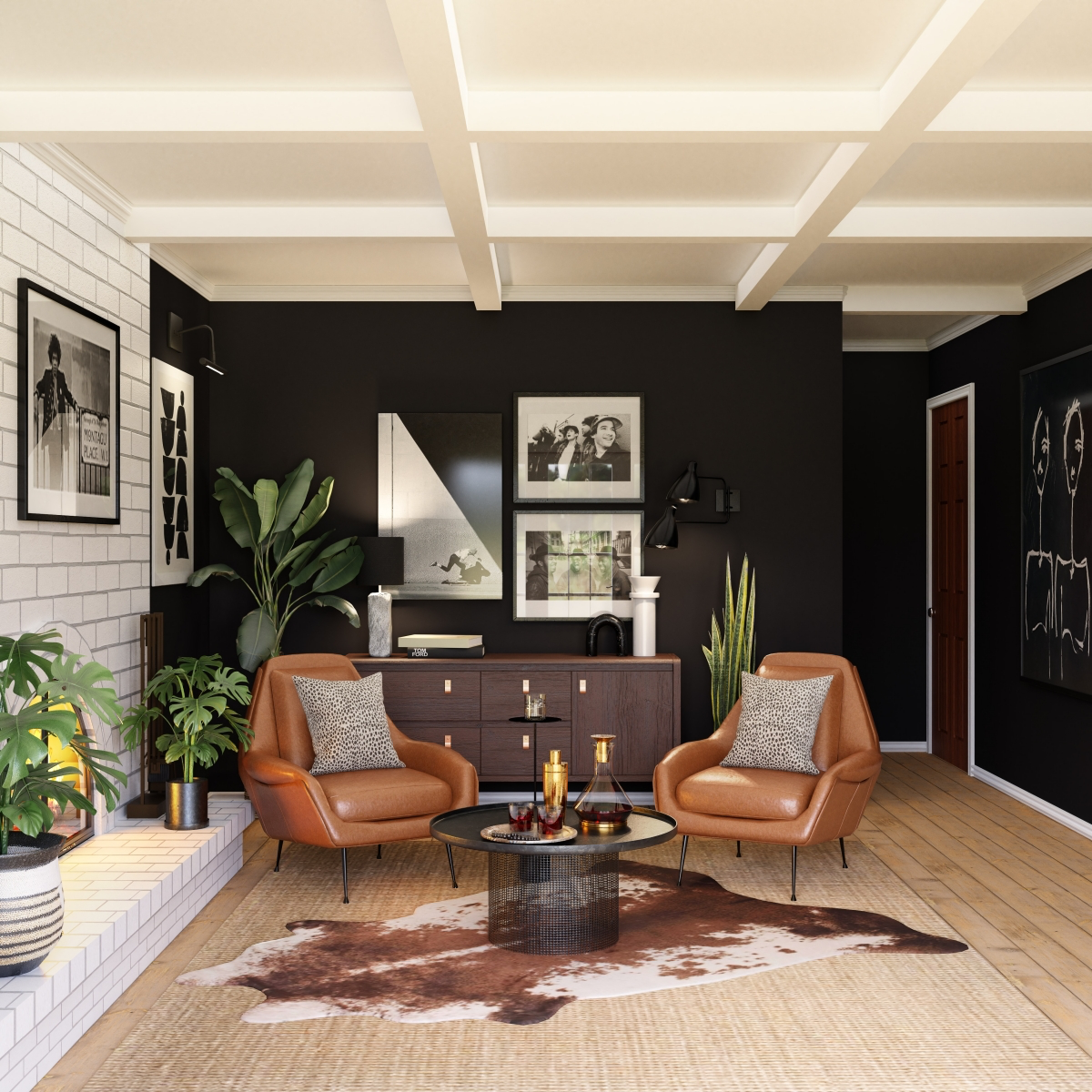
- Low LRV (below 20): We’re talking deep, dramatic colors here. They soak up light, making a room feel intimate and moody. But be warned: without great lighting, they can quickly turn a room into a cave.
I learned this lesson the hard way with a client who fell in love with a deep navy blue (its LRV was about 5). It looked stunning in the store. Their living room, however, was small and faced north, getting very little natural light. I warned them, but we sampled it anyway. It looked almost black. The walls just ate the light. We ended up with a gorgeous, sophisticated slate blue with an LRV of 32—something like Benjamin Moore’s ‘Stormy Sky’ or Sherwin-Williams’ ‘Serious Gray’. It gave them that moody vibe they wanted but didn’t feel oppressive.
Which Way Do Your Windows Face?
This is my first question, every single time. The direction of your natural light completely changes paint colors.
Try this right now: Go stand in your living room. Which way do the main windows face? North, South, East, or West? Now, look at your lightbulbs. Are they giving off a warm, yellowish glow or a cool, bluish-white light? Knowing these two things is half the battle.
- North-Facing Light: It’s cool, indirect, and has a blueish cast. It can make colors look colder and a little darker. My advice? Either lean into it with beautiful grays, greens, and blues, or fight it with a very warm, creamy off-white.
- South-Facing Light: This is the jackpot. It’s bright, warm, and pretty consistent all day. The warm, yellowish light makes almost any color look good. You have the most freedom here.
- East-Facing Light: You get a bright, clear light in the morning that turns cool and shadowy in the afternoon. A color can look amazing at breakfast and totally wrong by dinner. You HAVE to watch your samples all day long in an east-facing room.
- West-Facing Light: This light starts off weak and then gets intensely warm and almost orange in the late afternoon. It can turn a nice beige into a weird peachy-pink right before your eyes.
And Don’t Forget Your Lightbulbs
Once the sun goes down, your lightbulbs take over. The color temperature of your bulbs, measured in Kelvins (K), is a huge deal.
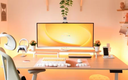
For a living room, you generally want bulbs in the Warm White (2700K – 3000K) range. This is that classic, cozy, yellowish light that makes warm colors glow and softens cool colors. Anything higher, like a Cool White or Daylight bulb, can feel stark and clinical, and it will make your paint colors look much colder.
How to Actually Choose a Color Without Losing Your Mind
Okay, let’s get practical. This is a step-by-step process, not a guessing game.
The #1 Mistake: Ignoring Undertones
Ever paint a room a lovely “greige” only to find it looks weirdly purple? Or a gray that suddenly looks like a baby’s nursery? That’s the undertone rearing its ugly head. Almost every neutral color—grays, beiges, whites—has a hint of another color (blue, green, yellow, pink/violet) hiding inside. The right light will pull that hidden color right out.
A lesser-known trick: To spot an undertone in the store, hold the paint chip up against a piece of pure white printer paper. The subtle color hiding within the neutral will pop right out. Is it a little bit green? A little pink? Now you see it.
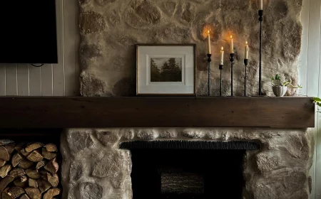
Your paint has to get along with the undertones of things you can’t easily change, like your flooring, stone fireplace, or kitchen cabinets. That violet-gray I mentioned? It happened because the warm cherry floors and southern light brought out a hidden purple undertone in what looked like a perfectly neutral gray. We had to repaint. It was a costly lesson in respecting the undertone.
The Only Correct Way to Sample Paint
Please, I’m begging you, do not pick a color from a tiny paper chip under the fluorescent lights of a hardware store. It’s a recipe for disappointment.
- Get Sample Pots: Pick your top 2-3 choices. No more! It just causes confusion. A sample pot will run you about $5 to $10.
- Use BIG Boards: Do NOT paint swatches on your wall. The old color will mess with your perception. Go to an art supply or hardware store and buy two large white foam boards (at least 2×2 feet) for each color. They cost about $3 a pop.
- Two Full Coats: Grab a cheap 2-inch brush and give each board two full coats of paint, letting it dry completely. One coat is a lie; it won’t show you the true color.
- Move Them Around: Now, live with these boards for a day or two. Prop one in the darkest corner. Put another on the wall that gets blasted with sun. Look at them in the morning, afternoon, and at night with the lights on. Hold them right up next to your sofa and your floor. This is how you find out a color’s true personality.
Let’s Talk About Paint Sheen (It’s More Important Than You Think)
Sheen is just a fancy word for how shiny the paint is. Choosing the wrong one can ruin a perfect color. Here’s the breakdown I give my clients, without the confusing charts.
For Hiding Flaws: Flat or Matte
This finish has zero shine, which makes it absolutely fantastic for hiding imperfections on your walls, like bumps or wavy drywall. It creates a rich, velvety look. The big catch? It’s not very durable. It scuffs if you look at it wrong and is tough to clean. I usually reserve it for ceilings or low-traffic adult spaces.
The All-Around Winner: Eggshell
This is my go-to for most living rooms. It has a tiny bit of luster—like a chicken’s egg—that gives it a soft glow. It’s a great compromise, offering way more durability and washability than flat paint while still hiding most flaws. It just looks and feels finished.
For Durability: Satin
A step up in shine from eggshell, a satin finish has a noticeable gleam. It’s super durable and easy to wipe down, making it a smart choice for high-traffic homes with kids or pets. The downside? That shine will highlight every single nail pop and ding in your walls. I tend to use satin on trim and doors, not entire walls.
For Drama: Semi-Gloss & High-Gloss
These are your shiny, light-reflecting finishes. They’re incredibly tough and are perfect for making architectural details like trim, doors, and built-ins pop. Using them on walls is a very bold design choice that can look plasticky if your walls aren’t perfectly smooth.
Good to know: Shinier paints can sometimes release more VOCs (Volatile Organic Compounds) as they cure. Always, always make sure you have good ventilation, no matter what sheen you choose.
So… Which Color Family Should You Choose?
Let’s talk about how these colors actually function in a room.
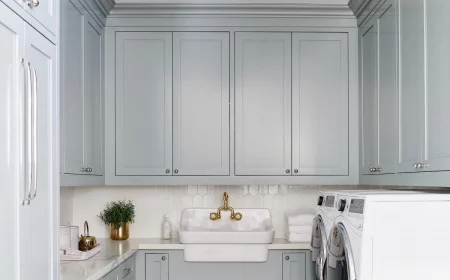
Neutrals: The Foundation
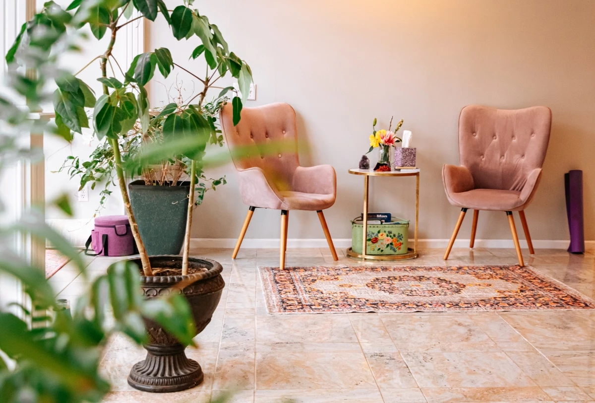
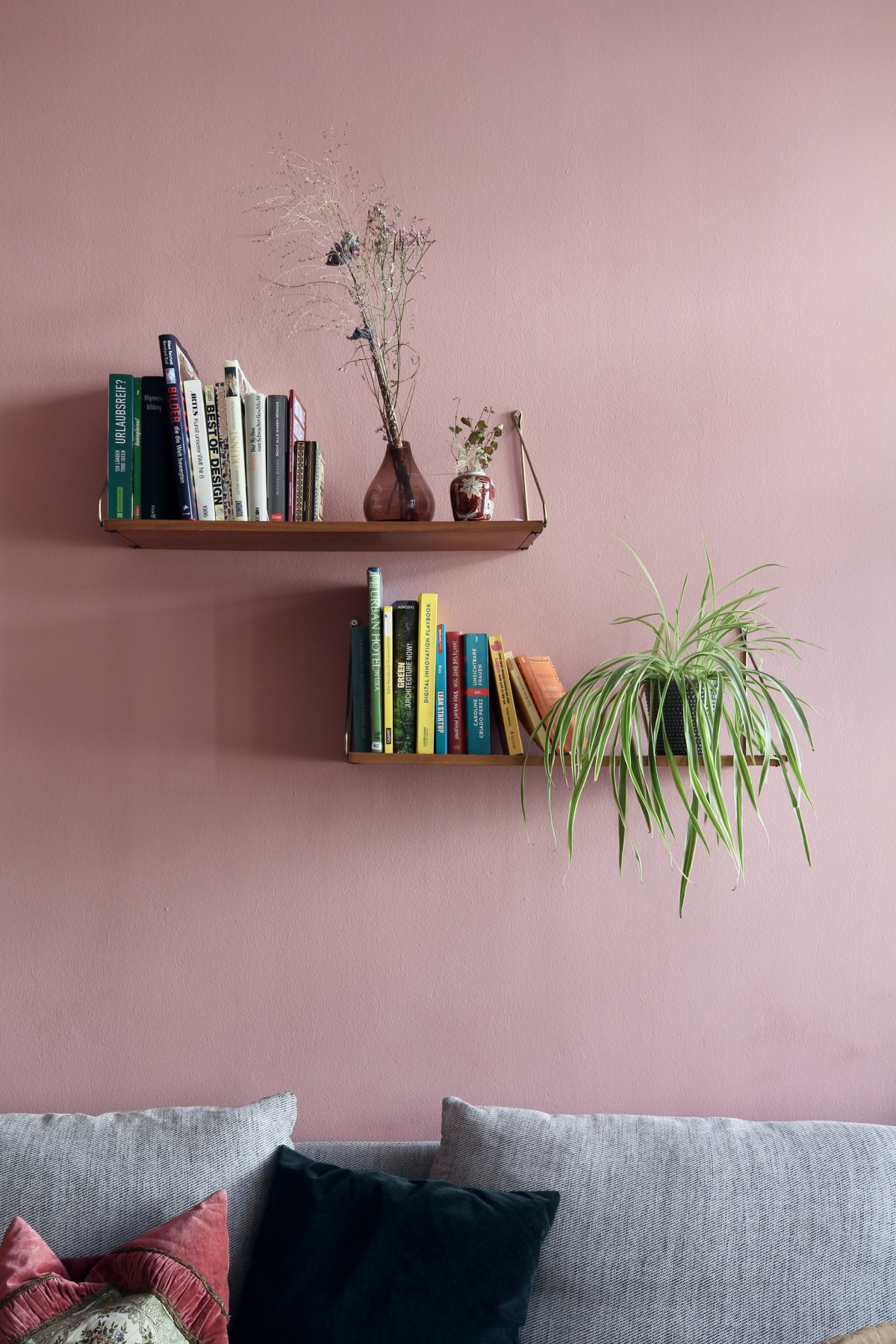
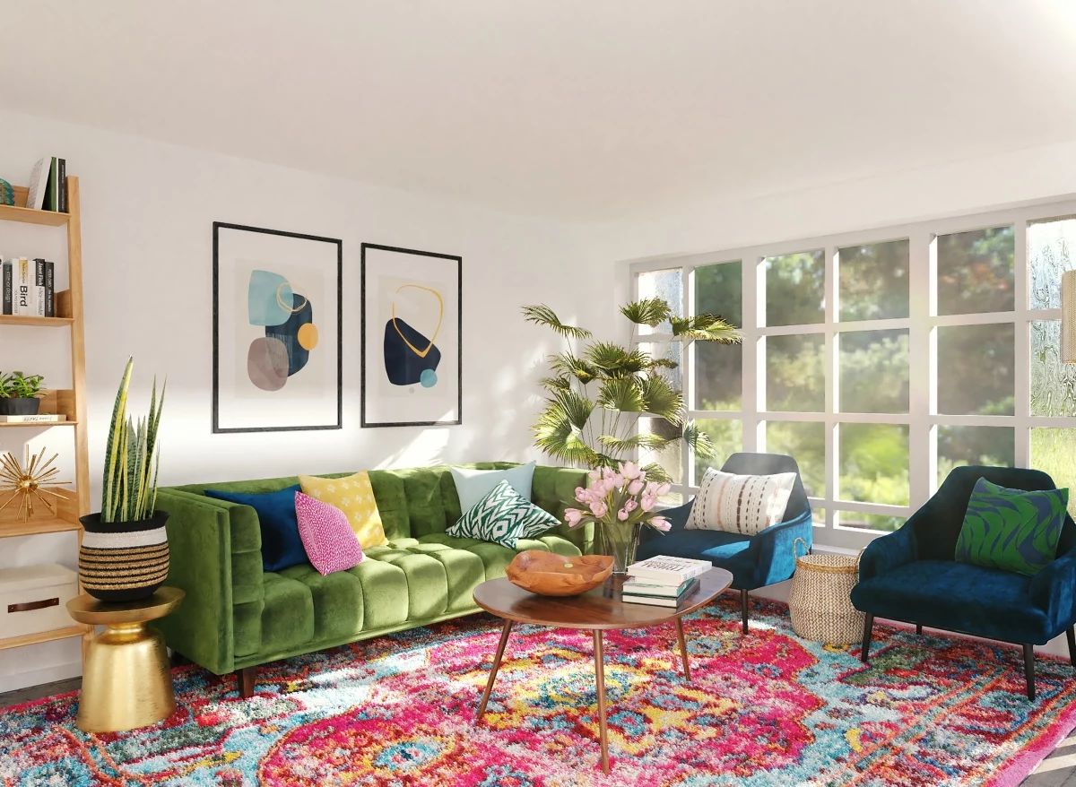
Warm neutrals (beiges, tans, creamy whites) make a space feel cozy and inviting—perfect for balancing the chilly light of a north-facing room. Cool neutrals (grays, greiges, crisp whites) create a more serene, modern vibe and are fantastic for taming the intense heat of a south- or west-facing room. That trend where every room was just gray? It faded because people realized a flat gray room can feel cold and unwelcoming. The fix isn’t always repainting! Sometimes, you can save a cold gray room by adding warm textures, like a cognac leather chair, a wool rug, or brass light fixtures.
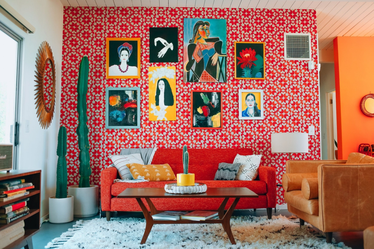
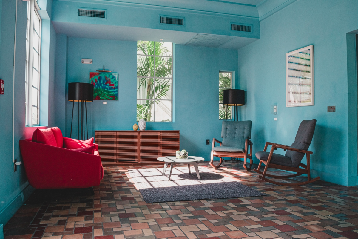
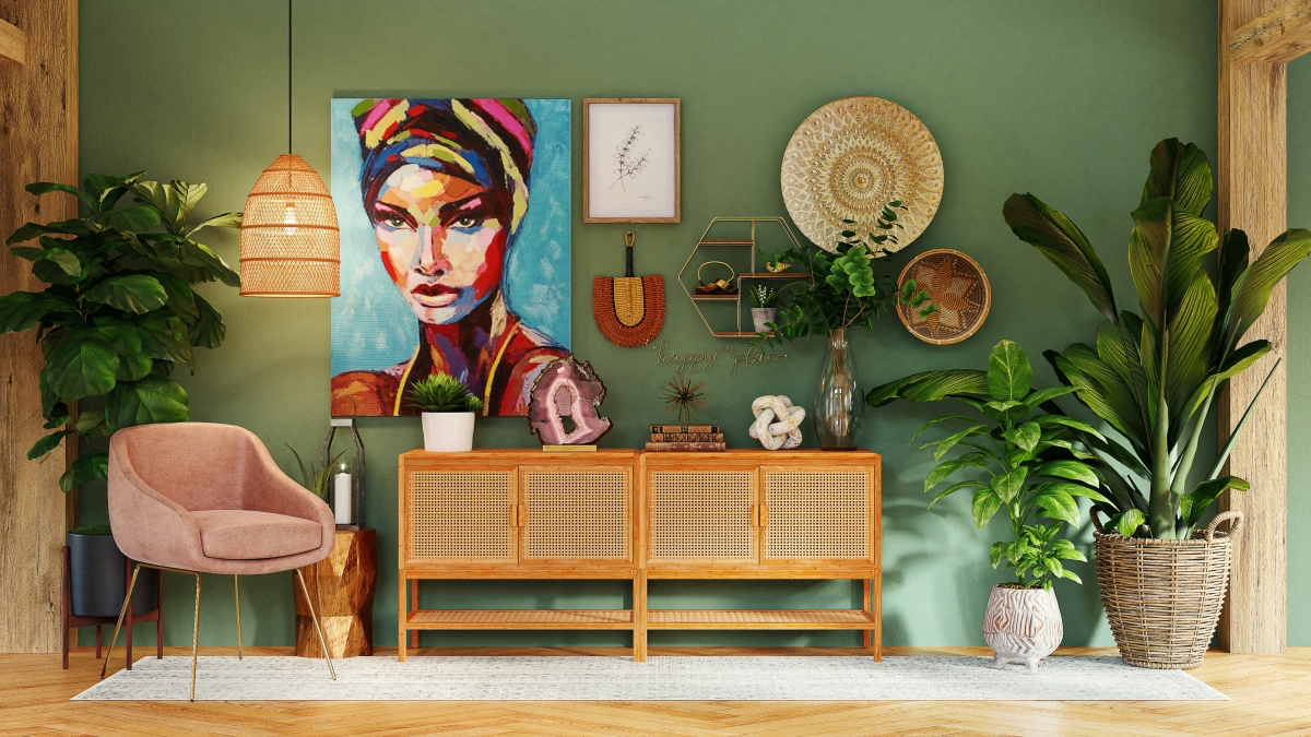
Blues & Greens: The Calm-Down Colors
These colors from nature are naturally relaxing. Lighter, muted versions like sage green or sea salt blue can make a room feel airy and tranquil. Darker shades like navy or forest green are a whole different ballgame. They create a dramatic, cozy, and sophisticated mood, perfect for a den or a living room used for evening entertaining. But they demand a lot of light to work, so plan on adding extra lamps to support a dark color choice.
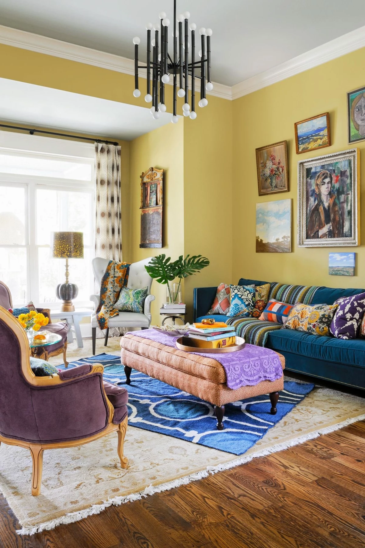
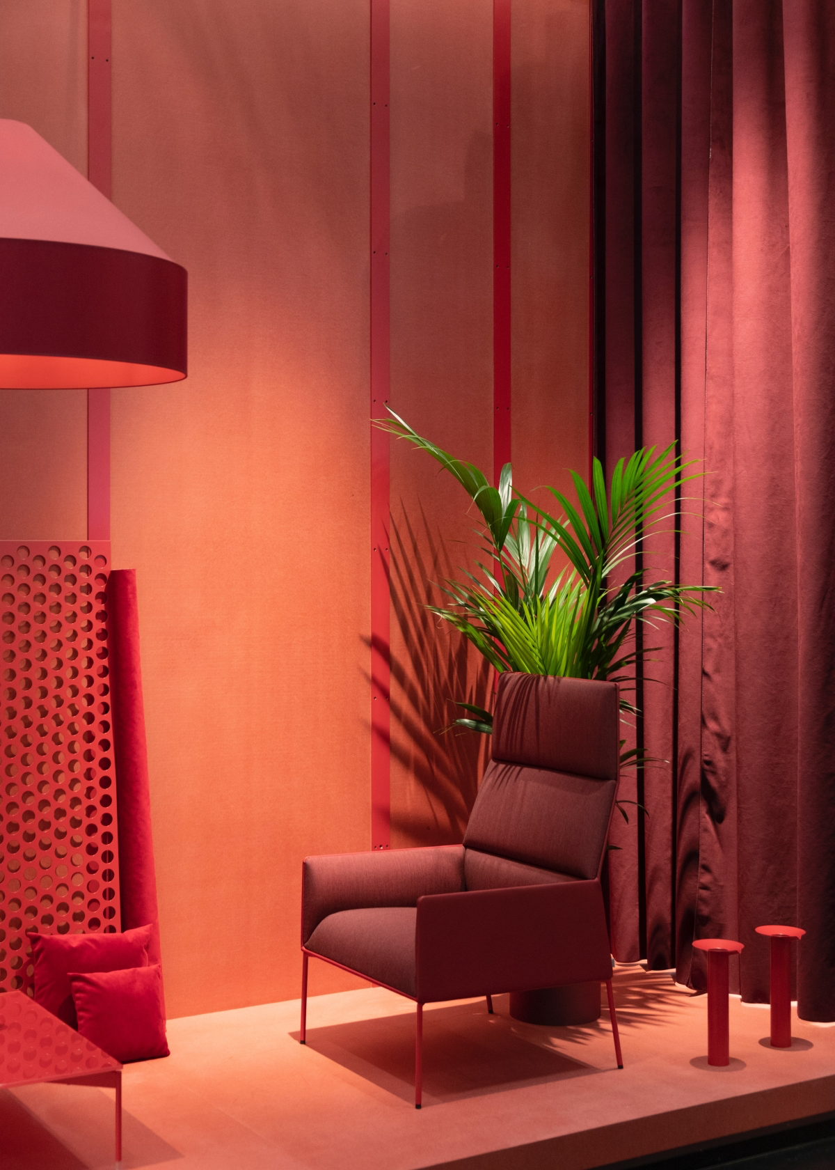
Reds, Oranges & Yellows: The Energy Boosters
These are high-energy colors. I almost never recommend painting an entire living room a bright, pure yellow—it can actually cause agitation. Instead, think of these as spices. A deep, earthy terracotta can be incredibly warm and grounding. A pop of orange on a bookshelf or a single yellow chair can bring a neutral room to life without being overwhelming.
When to DIY and When to Call a Pro
Can you paint your own living room? Of course. But the real question is, should you? A professional painter is an investment in a flawless finish. You’re paying for their meticulous prep work (all the boring but critical hole-filling and sanding) and for those perfectly straight lines where the wall meets the ceiling, which pros call ‘cut-in lines’.
Hiring a pro, which can cost anywhere from $500 to $1,500+ for an average living room depending on your location and the job’s complexity, is a good idea if:
- You have super high ceilings or tricky architectural details.
- Your walls are in bad shape and need a lot of prep.
- You’re short on time and just want it done right.
- You chose a very dark or glossy color that will show every single mistake.
And a quick but serious safety note: If your home was built before 1978, it could have lead-based paint. Do not sand or scrape it yourself. Buy a test kit or, for real peace of mind, hire a certified pro. It’s a serious health risk.
Choosing a color is a process of discovery. By observing the light in your home, testing samples the right way, and considering the whole room, you can make a choice that goes beyond just looking pretty. You can create a backdrop that truly supports the life you live in those walls. You’ve got this.
Galerie d’inspiration
That perfect gray on the chip looks stubbornly blue on my wall. What went wrong?
You’ve stumbled upon the undertone trap! Nearly every neutral paint, from greige to off-white, has a subtle base color—like blue, green, yellow, or even purple—that emerges under your specific lighting conditions. To reveal a color’s true character, place your swatch next to a pure primary color or on a sheet of stark white printer paper. This contrast makes the hidden undertone pop, saving you from an accidental baby blue living room.
The right paint sheen can be as important as the color itself. It controls not just the look, but the durability.
Eggshell Finish: This is the crowd-pleaser for living rooms. It has a very subtle luster, giving walls a soft, velvety depth that hides minor imperfections. It’s more wipeable than flat paint, making it practical for most spaces. Think of it as the sophisticated default.
Satin Finish: A step up in sheen, satin offers a gentle gleam and is even easier to clean than eggshell. This makes it a smart choice for high-traffic family rooms or walls that might get scuffed. Brands like Sherwin-Williams offer their popular colors, like Agreeable Gray, in both sheens so you can tailor the finish to the room’s function.