Stop Agonizing Over Paint Chips: A Pro’s Guide to Picking the Right Color
I’ve been a professional painter for a long, long time, and if there’s one thing I’ve seen more than anything else, it’s the “paint chip paralysis.” You know the look. A homeowner stands frozen in front of a wall of color samples, completely overwhelmed. They’ve seen the trendy colors online, but when it comes to their own living room, they’re just stuck.
In this article
- Why That Perfect Paint Chip Looks Awful on Your Wall
- The Pro’s Method for Testing Paint (The Right Way)
- First, Let’s Do the Math: How Much Paint Do You Need?
- Choosing a Finish Is More Than Just Looks
- Let’s Talk About Timeless Color Choices
- Real-Talk and Troubleshooting
- When to Skip the DIY and Call a Pro
- Inspiration:
I’ll never forget this one young couple with their first house. They had painted seven different splotches of gray right onto their living room wall. They’d check on them in the morning, in the afternoon, and at night under the lamps. And every single time, the colors seemed to shift and betray them. The “warm” gray suddenly looked purple. The “neutral” gray looked weirdly blue. They were at their wits’ end.
This is a story that plays out in homes everywhere. Here’s the secret: choosing a paint color isn’t about picking a pretty shade from a magazine. It’s a technical process. It’s about understanding light, space, and how our eyes actually perceive color. So let’s forget the trends for a minute. Let’s talk about how to choose a color that will actually work in your home and look great for years.
Why That Perfect Paint Chip Looks Awful on Your Wall
Before you can pick the right color, you have to understand why a tiny paper square can look so drastically different on a big wall. It’s not magic; it’s mostly about light and finish. Grasping these two things is the most important step to getting the result you actually want.
Light Reflectance Value (LRV)
On the back of almost every quality paint chip, you’ll find a number called the Light Reflectance Value, or LRV. It’s a scale from 0 (pure black) to 100 (pure white), and it tells you exactly how much light a color reflects. Think of it as your secret weapon for predicting how a room will feel.
A moody charcoal with an LRV of, say, 5 to 10 will absorb light, creating a cozy, intimate vibe. But be careful, because in a small, dark room, it can feel like a cave. On the flip side, an off-white with an LRV of 85 will bounce light all over the place, making the space feel way bigger and brighter. For most walls in a home, the sweet spot is usually in the 45 to 65 LRV range—it gives you noticeable color without sucking all the light out of the room.
Natural and Artificial Light
The type of light hitting your walls changes everything. The exact same can of beige paint will look completely different depending on which way your windows face.
- North-Facing Rooms: The light here is indirect and cool, with a blueish tint. This can neutralize warm colors but often makes cool grays look strangely purple or blue.
So, what should I use? To fight the chill, lean into whites with creamy or yellow undertones. Or, just embrace the moodiness and go with a rich, saturated color like a deep emerald green or a cozy navy. - South-Facing Rooms: You get intense, warm light for most of the day. This beautiful light can sometimes wash out very pale colors, but it makes most warm and cool shades look vibrant and true.
So, what should I use? You have a lot of freedom here! Bolder colors work well. If you go with a light color, make sure it has enough pigment to hold its own in the bright light. - East-Facing Rooms: The light is bright and clear in the morning, then gets cooler and more shadowed in the afternoon. You need a color that can pull double duty.
So, what should I use? A color with a bit of complexity, like a sage green that can look fresh in the morning and serene in the evening, is a great choice. - West-Facing Rooms: The light is muted in the morning but becomes very warm and almost orange in the late afternoon. This evening light can make warm colors feel intensely fiery.
So, what should I use? Cool colors can balance the warm evening light beautifully. A calming blue or a soft gray with a green undertone can look fantastic.
And then there’s your artificial light. Old-school incandescent bulbs cast a warm, yellow light. Modern LEDs come in different temperatures. A “warm white” (around 2700K) feels cozy, while a “daylight” bulb (5000K) is much bluer and cooler. The bulbs you use will dramatically change how your paint looks after sunset.
The Pro’s Method for Testing Paint (The Right Way)
After years of fixing color mistakes, my crew and I have a strict testing process. Trust me, it saves time, money, and a whole lot of frustration. The biggest mistake people make is painting a tiny swatch directly on the wall. The old color underneath will mess with your perception, and you can’t move it around the room.
Step 1: Make Big Sample Boards
Do not skip this. Seriously. Go to a craft or home improvement store and buy two or three large pieces of white poster board for a few bucks. Even better, see if they have a small, thin drywall offcut. You want a sample that’s at least 2 feet by 2 feet.
Paint your sample color onto the boards. And this is critical: apply two full coats, letting it dry completely between each one (usually an hour or two is fine). A single coat will lie to you about the final color.
Step 2: Observe Them in the Space
Once your boards are bone dry, use painter’s tape to stick them on different walls. Put one on the wall that gets the most light and another on the darkest wall. Look at them in the morning, at noon, and in the evening. Turn on your lamps at night. This is the only way to see how the color truly behaves in your home.
Step 3: Check Against Your Stuff
A color never lives in a vacuum. It has to get along with your floors, furniture, and countertops. Hold your sample board right up against your sofa. Put it on the floor next to your wood flooring. In the kitchen, hold it vertically next to your cabinets and backsplash. A beautiful gray can suddenly look drab and lifeless next to a warm oak cabinet. This step prevents those expensive clashes.
First, Let’s Do the Math: How Much Paint Do You Need?
Before you even think about finishes, let’s tackle the question that stresses everyone out: how much paint do I actually buy? Overbuying is a waste of money, and underbuying means a frantic trip back to the store mid-project. Here’s a simple formula we use in the field.
The Pro’s 60-Second Paint Calculation:
1. Measure the length of all the walls in the room and add them together. (Let’s say you have a 10×12 foot room, so 10 + 12 + 10 + 12 = 44 feet). 2. Multiply that number by the ceiling height. (44 feet x 8 feet = 352 square feet). 3. Divide that total by 350. (352 / 350 = just over 1). Most paint cans promise about 350-400 sq. ft. of coverage per gallon.
So, you’ll need a little over one gallon for one coat. Since you always need two coats for a good finish, you’d buy two gallons. Easy as that. Don’t forget to subtract for any huge windows or doors.
Choosing a Finish Is More Than Just Looks
The sheen, or finish, of your paint is just as important as the color. It impacts durability, cleanability, and how it plays with light. Here’s the breakdown in plain English.
- Matte (or Flat): This finish has no shine at all, which is fantastic for hiding small imperfections on older walls. The catch? It’s the least durable. It scuffs if you look at it wrong and is tough to clean without creating a shiny spot. I’d only use a true matte on ceilings or in very low-traffic areas like a formal dining room.
- Eggshell: This is the workhorse of residential painting. It has a very subtle, low sheen—like an actual eggshell. It offers a great balance, hiding flaws pretty well while being much more durable and wipeable than matte. It’s our go-to for living rooms, hallways, and bedrooms.
- Satin: A step up in shine from eggshell. It reflects more light and is even easier to clean. We use satin in high-traffic or high-moisture areas like kitchens, bathrooms, and kids’ rooms. The extra durability is worth the slightly higher gloss.
- Semi-Gloss: Noticeably shiny and super durable. Its hard surface is resistant to moisture and easy to scrub. This is why it’s the standard choice for trim, doors, and cabinets. Using it on a big wall would be a mistake, though—it would highlight every single bump and imperfection.
Heads up! One brand’s “eggshell” might be another’s “satin.” There isn’t a perfect industry standard. When in doubt, ask to see a physical sample of the dried finish before you commit.
Let’s Talk About Timeless Color Choices
Forget what’s “in” this year. Good design is timeless. Instead of chasing trendy color names, let’s talk about color families and how they actually work in a home.
The Tricky World of Neutrals
Whites, grays, and beiges are the most popular choices, and honestly, they’re the hardest to get right. Their complexity comes from their undertones—the subtle hint of another color mixed in. A gray can have blue, green, or violet undertones. A beige can have pink, yellow, or green undertones. This hidden color is what will either harmonize with your room or clash horribly.
I once saw a client pair a cool, violet-undertone gray on the walls with a warm, yellow-undertone beige carpet. The room just felt… sick. You couldn’t put your finger on why, but it was because the undertones were secretly at war with each other. The key is to match warm undertones (like in your oak floors or creamy tile) with other warm undertones in your paint.
(Quick Win: Go grab three of your favorite gray or beige paint chips. Tape them to a plain white piece of computer paper. Now you can really see it—one probably leans a little pink, another a bit green. This is the first step to seeing undertones like a pro!)
Working with Saturated Colors
Bold colors like deep blues, rich reds, and sunny yellows are fantastic, but they require a plan. They’re powerful and can easily overwhelm a space.
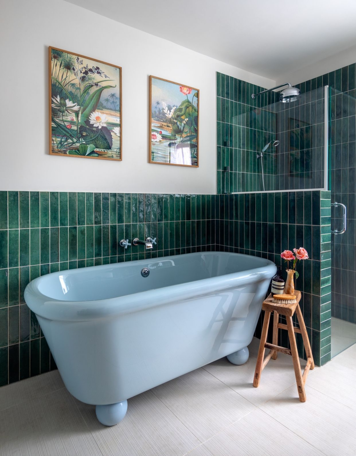
- Deep Blues and Greens: These are generally seen as calming. A deep navy or forest green can make a small powder room or office feel incredibly chic and intentional. The key is to balance their coolness with warm wood tones or soft lighting.
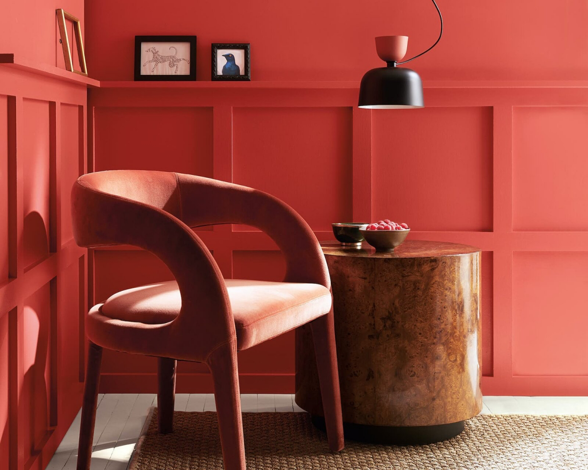
- Reds and Terracottas: These are high-energy colors that are known to stimulate conversation, which is why they have long been used in dining rooms. A quick warning for the DIYer: red paint is notoriously tricky. The pigments that create a true, rich red have poor hiding ability. You will almost always need a special gray-tinted primer and at least three, sometimes four, top coats. Factor that extra labor and material cost into your plan.
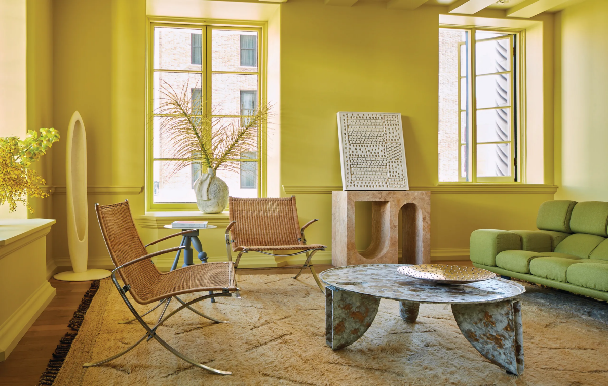
- Yellows: Cheerful and uplifting, but a little goes a long way. A soft, buttery yellow can make a kitchen feel warm and inviting. A bright, primary yellow on all four walls, however, can feel stressful. For a bold yellow, consider it for an accent wall or a piece of furniture instead.
Real-Talk and Troubleshooting
Even with perfect planning, things happen. Here are some real-world issues we deal with constantly.
The Budget Question: Is Expensive Paint Really Worth It?
In a word, yes. To be frank, the cost difference isn’t about the brand name; it’s about the ingredients. Premium paints have more high-quality pigments (for better color) and more solids (the stuff that actually forms the durable paint film). Cheaper paints are often just thinned down with water and fillers.
A can of premium paint from a dedicated paint store might run you $70-$80, while a big-box store brand could be $40. But here’s the thing: that extra $35 often saves you from buying a whole second can and spending another 4 hours applying a third coat. For us pros, the math is easy—our labor is way more expensive than a can of good paint.
Common Flaws and How to Avoid Them
Ever see a DIY paint job that just looks… off? It’s usually one of these things.
- Roller Marks: These happen from using the wrong roller cover or pressing too hard. For smooth walls, use a 3/8-inch nap roller. For textured walls, go with a 1/2-inch nap. Keep your roller loaded, but not dripping, and use light, consistent pressure.
- “Picture Framing”: This is when the edges you painted with a brush look darker than the rolled part. It happens because the brushed paint starts to dry before you roll up to it. The fix is to have one person “cut in” the edges while another follows right behind with the roller, blending the two areas while they’re both wet.
- Quick Tip: Don’t want to wash your brushes and rollers between coats or overnight? Wrap them tightly in a plastic grocery bag (or plastic wrap), squeeze the air out, and stick them in the fridge. They’ll be ready to go the next day. It’s an old painter’s trick that saves a ton of time and water.
When to Skip the DIY and Call a Pro
I’m all for a good DIY project, but there are times when hiring a professional is the smarter, safer, and sometimes even cheaper choice.
If Your Home Was Built Before 1978
This is my most important safety warning. If your home was built before the late 70s, you have to assume it contains lead-based paint. Sanding or scraping this creates highly toxic dust that can cause serious, permanent health problems, especially for kids. It’s not worth the risk. Certified professionals are trained to use specific containment and cleanup methods to keep your family safe. Don’t mess with this one.
High Ceilings and Scary Stairwells
Painting a two-story foyer or a vaulted ceiling is not just hard; it’s dangerous. Working on tall, wobbly ladders or scaffolding requires experience. We have the right equipment and training to do this work safely. A fall can be catastrophic.
Choosing a paint color is a journey. Don’t be bullied by trends. The whole point is to create a backdrop for your life that feels right to you. Take your time, do your homework with sample boards, and trust what you see in your own space. The right color is out there, waiting to make your house feel like home.
Inspiration:
How can I use a bold, trendy color without my home looking dated in a few years?
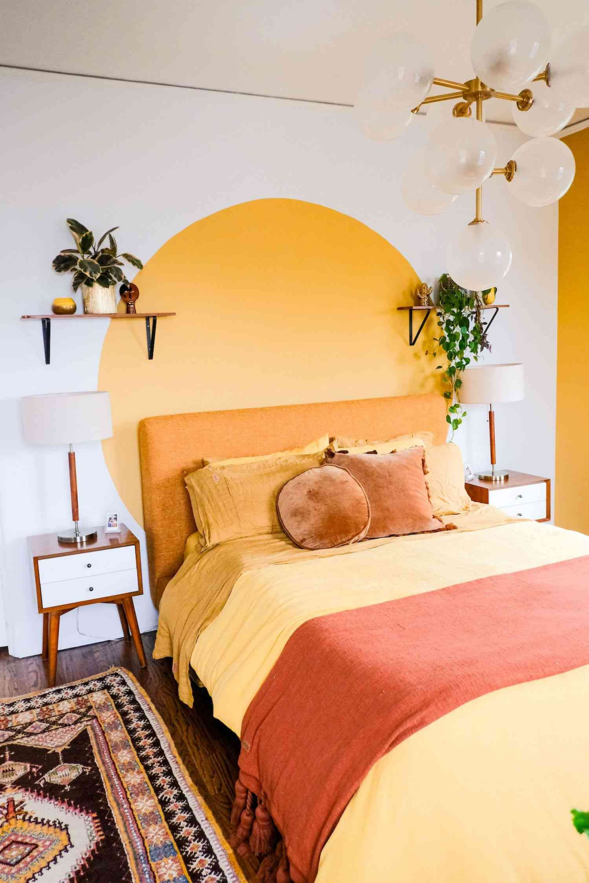
The key is strategic placement. Instead of painting an entire room in 2024’s trending terracotta, use it as a powerful accent. Consider it for a single ‘feature’ wall, the back of a built-in bookshelf, or to revive an old piece of furniture. This approach gives you the full impact of a color like Farrow & Ball’s ‘Setting Plaster’ or Valspar’s ‘Gentle Violet’ without the commitment. It becomes a deliberate design choice that’s much easier to update later than four walls.
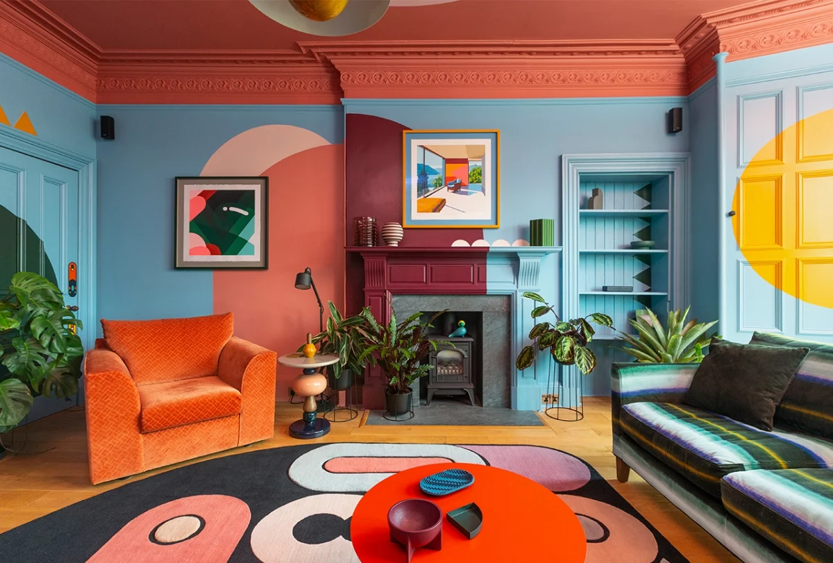
The human eye can distinguish about 10 million different colors, but our perception is heavily influenced by surrounding shades.
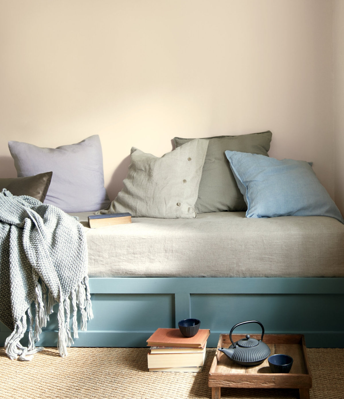
This is why a gray paint chip can suddenly look purple when you bring it home. It’s reacting to the undertones in your flooring, furniture, and even the view out the window. Before committing, always view your large paint sample directly against your sofa fabric, your wooden floorboards, and your window trim to see how they interact.
Matte Finish: Offers a rich, velvety look that absorbs light and is excellent at hiding minor surface imperfections. It’s perfect for low-traffic areas like adult bedrooms or formal living rooms. However, it’s the least durable and can be difficult to clean.
Satin/Eggshell Finish: Has a subtle sheen that reflects some light and is far more durable and wipeable than matte. This makes it the go-to choice for high-traffic zones like hallways, family rooms, and kids’ bedrooms. Benjamin Moore’s Aura line is renowned for its beautiful, lasting eggshell finish.
Forget painting small swatches directly onto your existing wall—the old color will skew your perception. For a true read, follow the pro method:
- Get at least two large sample boards (at least 2×2 feet) or peel-and-stick samples like those from Samplize.
- Paint them with two coats of your chosen color and let them dry completely.
- Move these boards around the room throughout the day, placing them in bright spots and dark corners.
- Check how the color looks next to your trim, your sofa, and your flooring.
This simple step is the single best way to avoid a costly color mistake.
