Your Home Should Feel Like You, Not a Showroom. Here’s How.
You know that feeling when you walk into a house that looks like it was plucked right out of a magazine? Everything is perfect. Too perfect. After years of being in people’s homes for a living, I’ve learned to see the little cracks in that facade. I see where the daily chaos of life clashes with the pristine design, where a family is whispering because the noise echoes everywhere, and where someone just feels… invisible in their own space.
In this article
- Breaking Up with the Unruly Open Floor Plan
- Moving Beyond the Boring White Box
- Designing for People, Not Just for Screens
- The Magic of Mixing Furniture (and Ditching the Matchy-Matchy Set)
- Choosing Furniture That Will Actually Last
- The Hard Truth About Open Shelving
- Decorating with Purpose: Make Every Object Earn Its Spot
- Inspiration:
Trends are fun, but they’re fleeting. The core human need for a home that’s comfortable, functional, and a true reflection of you? That never goes out of style. The goal isn’t to have a home that looks good for a photo; it’s to build a space that genuinely supports your life.
So, let’s talk about some of the most common design traps I see and, more importantly, how to sidestep them for a home that feels amazing for the long haul.
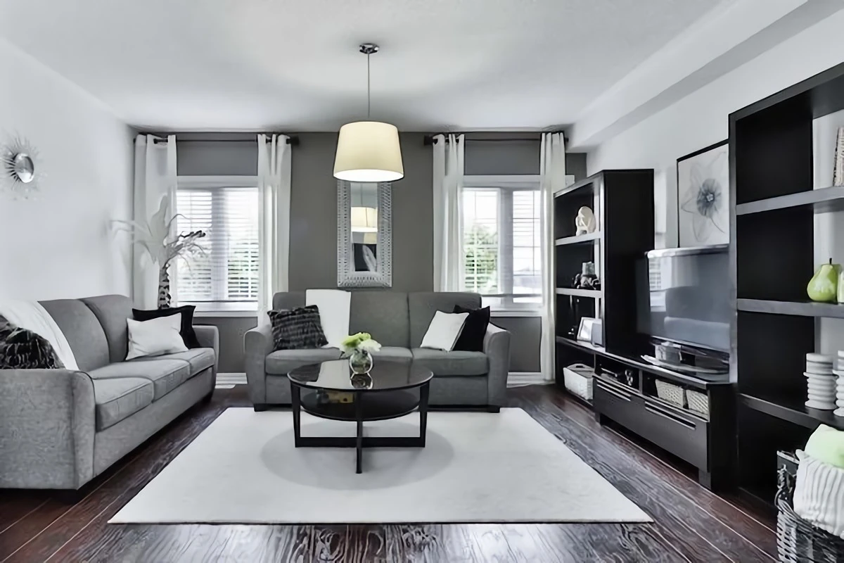
Breaking Up with the Unruly Open Floor Plan
Ah, the open floor plan. For a while there, it was the ultimate dream—a massive, airy space for living, dining, and cooking all at once. And look, for some people, it’s great. But for most families, I’ve seen it become a constant source of low-key frustration.
The biggest issue is just plain physics. Sound, smells, and light travel everywhere. Sound waves, in particular, love to bounce off all those hard surfaces like wood floors and stone countertops, turning your beautiful space into an echo chamber. To put it simply, the sound of the blender in the kitchen completely wipes out any chance of a quiet conversation in the living area. It can feel impressive, but it’s often not very livable.
How to Create Zones Without Building Walls
While putting some walls back up can be a fantastic solution, you don’t always need a full-blown renovation. The pros often use a ‘broken-plan’ layout, which keeps that sense of connection while giving each area its own identity.
Here are a few ways to get the look:
- Clever Partitions: A half-wall, maybe topped with a piece of glass, can do wonders. It separates the kitchen’s visual mess from the living area but still lets light and conversation flow. Even better, you can top it with a nice wood cap to create a functional counter or serving spot.
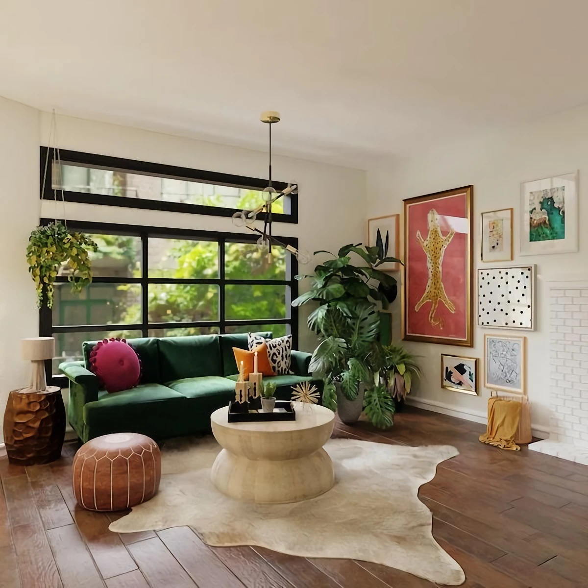
- Embrace Rugs and Furniture: This is the easiest trick in the book. A large area rug can instantly define a living room ‘zone.’ Place all your seating furniture on the rug, and you’ve created a visual room-within-a-room. For a non-permanent wall, a tall, open-backed bookcase (like the popular KALLAX from IKEA) or a beautiful folding screen can divide a space effectively without blocking all the light.
- Play with Levels: A sunken living room, even if it’s just one step down, creates a powerful psychological boundary. It makes the lounge area feel like a cozy, dedicated retreat. Obviously, this is a bigger project, but it’s something to consider in a major remodel.
- Use Your Ceiling and Floors: You can define a space from above and below. A dropped ceiling with some cool lighting over the dining table, or simply changing the flooring—tile in the kitchen that transitions to hardwood in the living room—sends a clear signal to your brain that you’re moving into a different zone.
A Quick but Critical Safety Note: Before you even think about touching a wall, please talk to a professional. Many walls are load-bearing, meaning they hold up the floor above them. I once saw a home where the owner had taken out a structural post, and the ceiling was literally sagging. It’s a terrifying and expensive fix. This is one area where you absolutely cannot afford to cut corners.
Moving Beyond the Boring White Box
The all-white or all-gray interior has been the go-to for years. It’s supposed to feel clean and bright, but honestly? I’ve had so many clients confess that their neutral home feels cold, sterile, and just… not like them. It feels more like a hotel than a home.
White paint is great at reflecting light, which can make a room feel bigger. But without texture and variation, that light can become flat and glaring. Our eyes need a little bit of shadow and texture to feel comfortable.
Heads up! A common mistake is using a crisp, cool-toned white in a room that gets northern light. That light is already cool and blueish, so the wrong white will make the room feel like an ice cave. For rooms like that, you need a white with a warm undertone. It’s a tiny detail that changes everything.
Pro Tip: Ask for the Right White
Instead of getting overwhelmed at the paint store, ask for a sample of a tried-and-true warm white. Some designer favorites are Benjamin Moore’s “White Dove” or Farrow & Ball’s “Wimborne White.” They have just enough of a creamy or yellow base to feel warm and inviting, even in a darker room.
Warming up a space is all about layering:
- The 60-30-10 Guideline: It’s a classic for a reason. 60% of your room should be a main color (like that warm white on the walls). 30% is a secondary color (maybe for a sofa or curtains). 10% is your accent, used for fun things like pillows and art. It’s a simple recipe for a balanced look.
- Lean into Natural Materials: This is the fastest way to add soul to a room. Think about a solid wood coffee table, a jute or wool rug, linen curtains, or a leather armchair. These materials have natural texture and color variation that give your eyes a place to rest and feel so much richer than a flat painted wall.
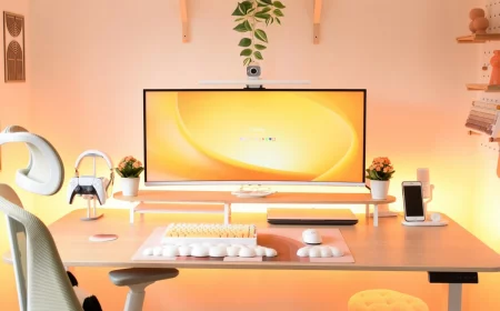
Designing for People, Not Just for Screens
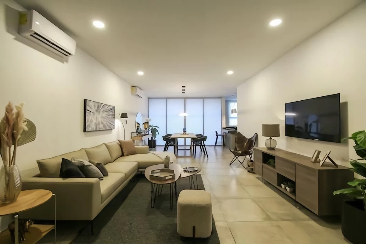
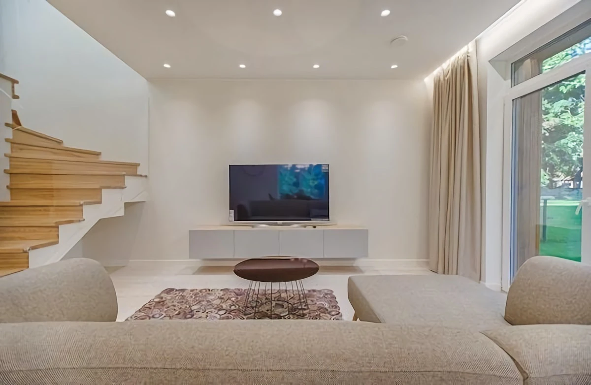
Walk into most living rooms, and what’s the focal point? A giant black rectangle. The whole room bows down to the TV. This setup sends a clear message: the main activity here is passive consumption. It’s not exactly great for encouraging conversation.
When we rearrange the furniture, it’s amazing how a family’s habits can change. The room starts working for their relationships, not just their electronics.
Your Weekend Challenge: Try This!
Seriously, try this for 48 hours. Pull your sofa just six inches away from the wall. See? It’s already breathing a little. Now, if you can, try placing two chairs opposite the sofa, creating a little conversational nook. Just live with it for a weekend and see how it changes the feel of the room.
Here are a few more tricks for creating a room that connects people:
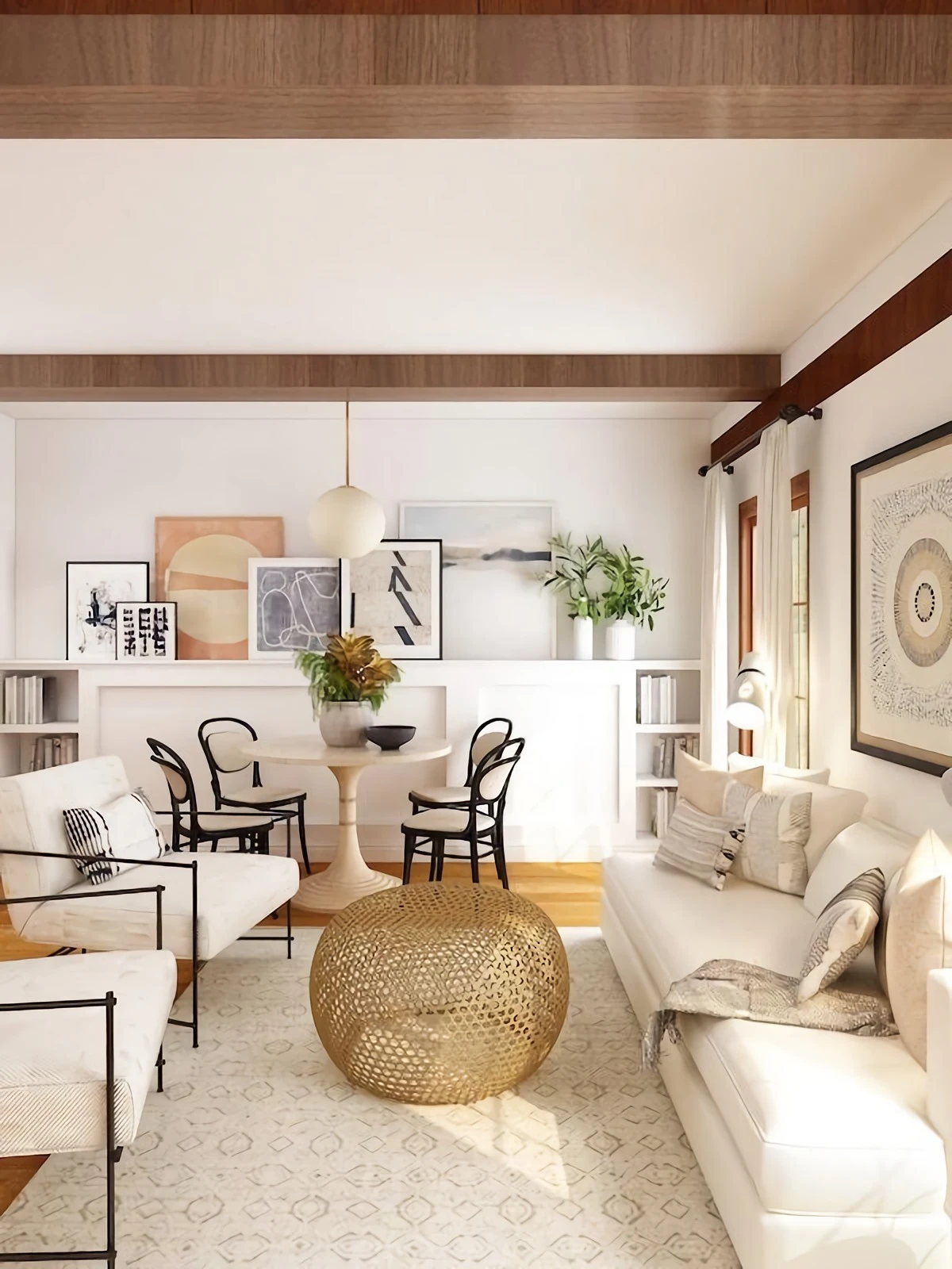
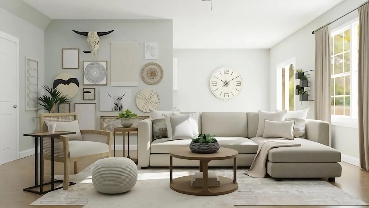
- Furniture Should Face Each Other: Arrange seating to make talking feel natural. Two sofas facing each other, or a sofa and two armchairs in an L-shape, are classic layouts for a reason. The TV can go on a side wall, not as the main event.
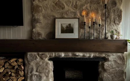
- Swivel Chairs are Your Best Friend: I love swivel chairs. They are the ultimate problem-solvers for a multi-purpose room. You can turn them to join a conversation, face the fireplace, or aim them at the TV for movie night. So much flexibility!
- Hide the TV: You can find TVs that cleverly disguise themselves as art when turned off. Or, if you’re planning for built-ins, design them with doors that can close to hide the screen completely. This lets a fireplace or a beautiful piece of art take center stage.
Quick Tip on Spacing: For a comfortable layout, aim for about 18 inches between your sofa’s edge and the coffee table—close enough to set down a drink, but far enough for legroom. And make sure your main walkways through the room are at least 3 feet wide so it doesn’t feel cramped.
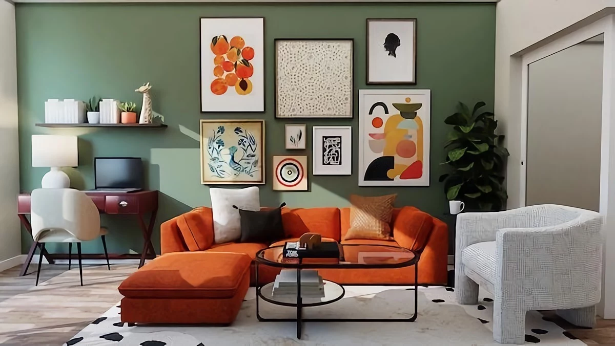
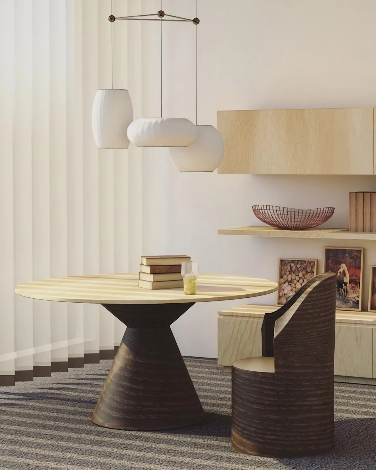
The Magic of Mixing Furniture (and Ditching the Matchy-Matchy Set)
It’s so tempting to buy the matching five-piece living room set. It’s easy, and you know it all “goes together.” But the result often lacks personality and can make your home look like a generic showroom. Plus, let’s be frank, those sets are often not the best quality.
A home that feels curated and collected over time tells a much more interesting story. The trick to mixing furniture is to create a sense of unity through other elements.
- Unify with Color: You can absolutely have a modern sofa and a traditional armchair. Just make sure there’s a common thread. Maybe the chair’s fabric picks up a color from the rug, which connects to the pillows on the sofa.
- Keep the Formality Consistent: A super ornate, formal chair will probably look a bit silly next to a casual, low-slung sectional. Try to keep the overall vibe of the pieces in the same family.
- Watch the Scale: This is where a lot of people go wrong. A huge, overstuffed sofa will make a delicate little side table look completely lost. Before you buy anything, measure your space and your existing key pieces. You want everything to feel balanced in proportion.
Choosing Furniture That Will Actually Last
There’s a whole category of cheap, trendy furniture out there that’s basically the fast fashion of the decor world. It’s mostly particleboard and plastic, and it’s not built to last. You end up having to replace it in a few years, which is bad for your wallet and the planet.
Investing in quality is one of the most important shifts you can make. Yes, it costs more upfront, but the value is so much greater. Think of it this way: a brand-new particleboard dresser from a big-box store might cost you $200 and last three years. A solid wood vintage dresser you find on Facebook Marketplace or at an estate sale could be $300, but it will last for the next fifty years and have way more character.
How to Spot the Good Stuff:
- Check the Material: Solid wood is the gold standard. High-quality plywood with a real wood veneer is also a great, durable choice. Be very suspicious of particleboard (sometimes called MDF), especially for anything that gets heavy use. It swells up if it gets wet and doesn’t hold screws well over time.
- Do the Drawer Test: This is my go-to test. Pull a drawer all the way out. Does it glide smoothly on metal runners, or does it wobble and stick? Is the bottom a flimsy piece of cardboard, or is it solid? If the drawers are well-made, the rest of the piece probably is too.
The Hard Truth About Open Shelving
Open floating shelves look absolutely gorgeous in staged photos. But in a real, working kitchen? They are magnets for dust and cooking grease. That lovely stack of white plates will have a sticky film on it within a week, and you have to keep everything perfectly tidy because it’s all on display.
Instead of going all-in, try these more practical approaches:
- Use Them Sparingly: One or two beautifully styled shelves for your most-used (and most beautiful) items is perfect. If you’re using those coffee mugs every day, they won’t have time to get dusty.
- Glass-Front Cabinets: This is the perfect compromise. You get the visual lightness of open shelves but with a door to protect everything from grime. It’s a timeless, classic look.
A Final, Crucial Installation Warning: If you’re putting up floating shelves to hold anything heavy like dishes, they MUST be anchored directly into wall studs. Drywall anchors alone will not cut it. To do this safely, you’ll need a stud finder (you can get a decent one for about $25 at any hardware store), a quality shelf bracket, and lag bolts that are long enough to go at least 1.5 inches deep into the stud itself. If you’re not 100% confident, please hire a handyman. It’s a small price to pay for peace of mind.
Decorating with Purpose: Make Every Object Earn Its Spot
The final layer of a home is all the little things—the objects on your shelves and tables. It’s so easy to accumulate stuff that’s not useful and doesn’t hold any real meaning. It just becomes clutter.
My philosophy is simple: every object needs to earn its place. It has to be either truly useful or truly beautiful and meaningful to you. If it’s both, that’s a home run.
Think about functional beauty. A stack of cozy wool blankets in a beautiful basket is decorative, but it’s also there for you on a chilly night. A set of handcrafted ceramic bowls is lovely to look at, but you can also use them for serving. When you start thinking this way, you’ll naturally create a home that is uncluttered, deeply personal, and a true reflection of the life you live within its walls.
Inspiration:
The number one mistake when using a rug to define a space?
Choosing one that’s too small. It creates a