Your Small Room Isn’t a Lost Cause. Here’s How to Make It Feel Huge.
I can’t tell you how many times I’ve walked into a home where the owner just sighs and says, “I wish this room were bigger.” It’s the most common frustration I hear. People feel trapped by their square footage, convinced it’s a problem they just have to live with. They’ve tried all the usual advice—paint everything stark white, shove all the furniture against the walls—but the room still feels cramped and awkward.
In this article
- First, Why a Room Feels Small (It’s a Brain Trick)
- Mastering Flow: Your Furniture Needs to Breathe
- Getting the Scale Right: Visual Weight Matters More Than Size
- Sculpting Your Room with Light
- The Vertical Illusion: Your Walls Are Your Secret Weapon
- Feeling Overwhelmed? Start With These Quick Wins.
- Inspiration:
Here’s the secret: the issue isn’t the actual size of the room. It’s all about how you perceive it. And luckily, perception is something we can totally manipulate.
My work isn’t about knocking down walls; it’s about changing how a space feels. This comes from a deep-rooted understanding of light, scale, and the way we move through a room. It’s about learning to think like a designer, and today, I want to pull back the curtain on the core principles we use to unlock the hidden potential in even the tiniest of spaces.
First, Why a Room Feels Small (It’s a Brain Trick)
Before we touch a single thing, we have to get what’s happening in our heads. A room’s perceived size is basically an optical illusion. Our brains are constantly scanning for cues: Where can I walk? Where is the light coming from? What’s interesting to look at? When a space is visually cluttered or the pathways are blocked, our brain flags it as ‘cramped’ and ‘difficult’.
Light is, without a doubt, our most powerful tool. The old advice to ‘paint it white’ comes from the fact that light colors reflect light. But it’s a huge oversimplification. A room with four blank white walls and a single, harsh overhead light can feel like a sterile lab. It’s flat and actually highlights the room’s boxy limitations.
Real spaciousness comes from creating depth. Another huge factor? Sightlines. This is just the uninterrupted view from one point to another, usually from the doorway to the far corner or a window. When a bulky sofa or a pile of clutter breaks that line, the room instantly feels closed in.
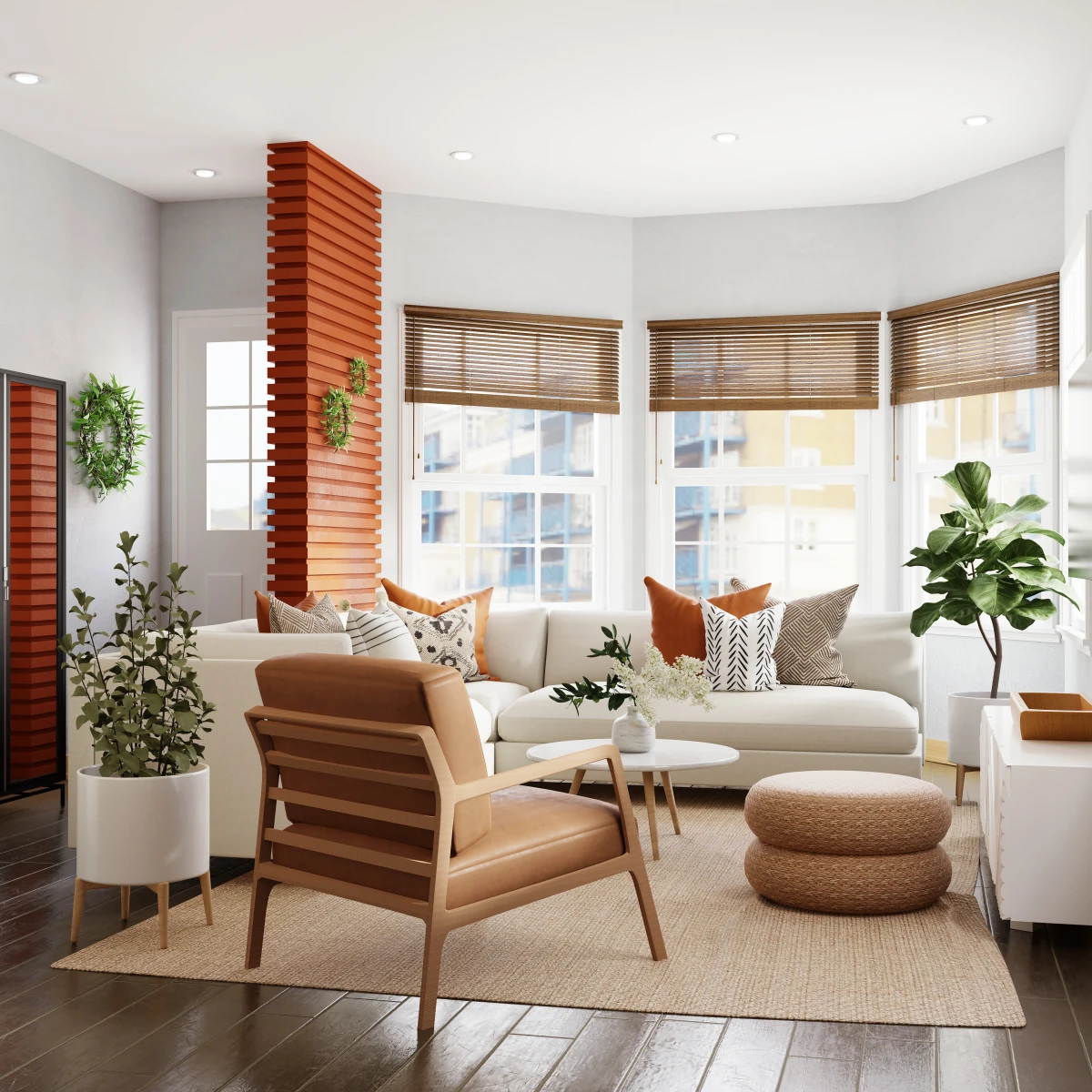
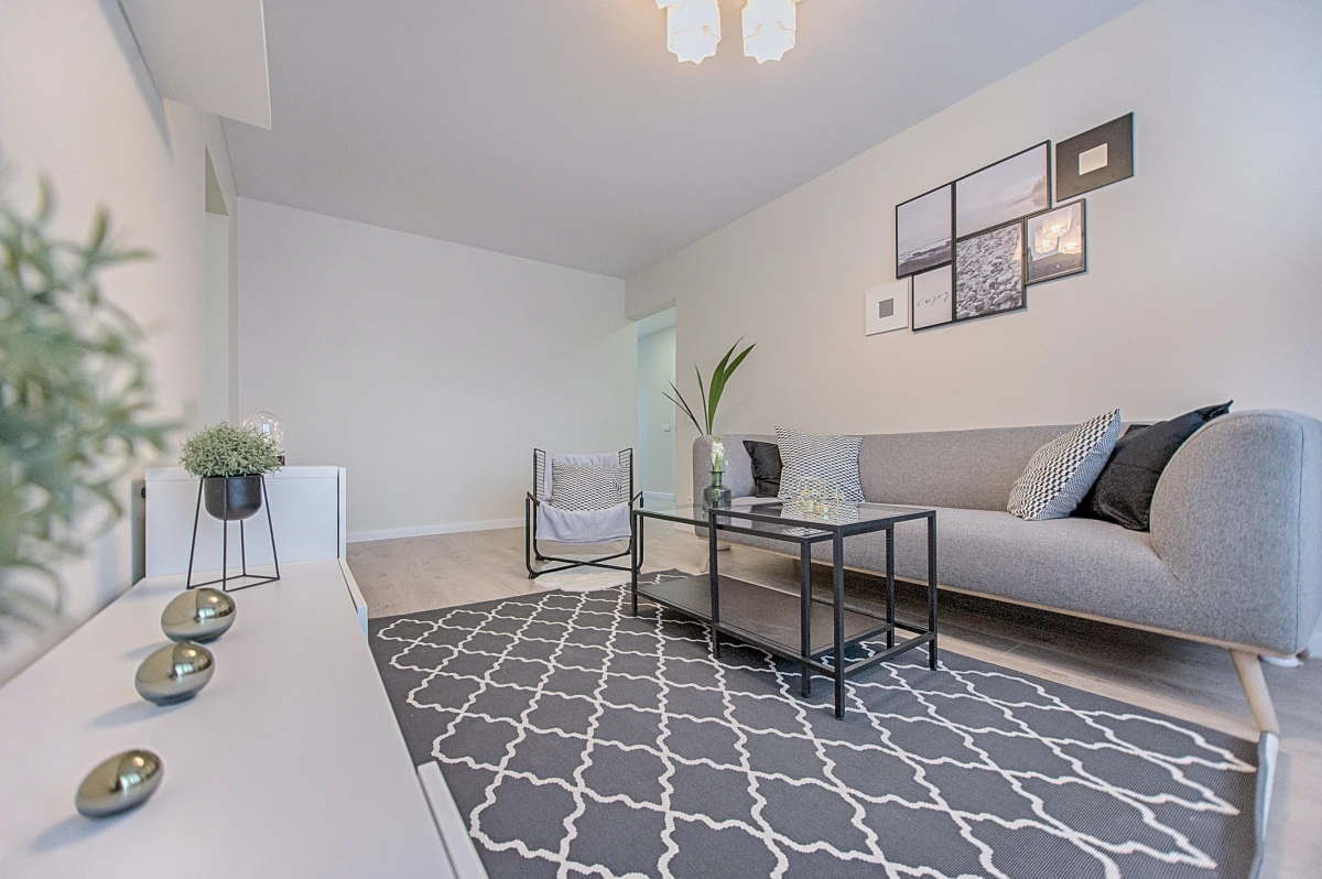
Oh, and by the way, one of the biggest sightline-killers is a tiny rug floating like a postage stamp in the middle of the floor. It chops the room in half visually. A quick pro tip: The rule of thumb is that at least the front legs of your main furniture (like the sofa and armchairs) should be sitting on the rug. This connects the pieces and makes the whole area feel larger and more cohesive.
Mastering Flow: Your Furniture Needs to Breathe
The single biggest mistake I see? Furniture slammed up against every single wall. It’s an understandable impulse—people think they’re maximizing the open space in the middle. But what they’re really doing is drawing a thick, bold outline around the smallness of the room. It’s static and, honestly, a little sad.
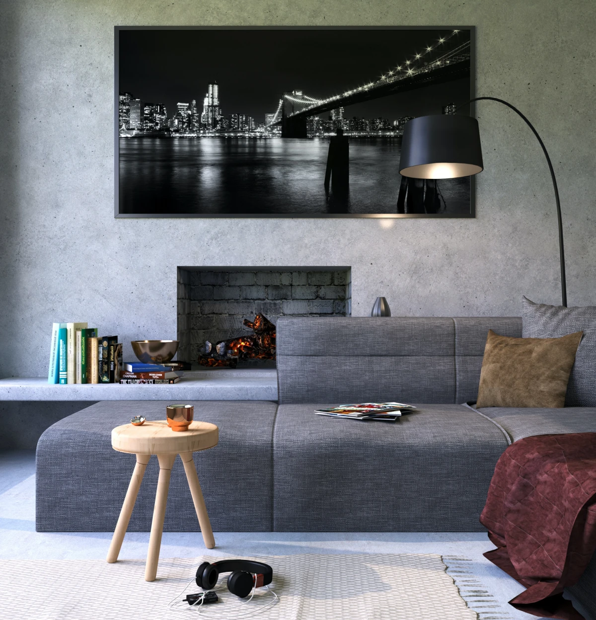
Professionals do the exact opposite. We pull furniture away from the walls.
Even giving your sofa or console table just three to six inches of ‘breathing room’ makes a world of difference. This little gap creates a shadow line that tricks your eye into seeing more depth. It subtly suggests the room continues beyond the furniture. It’s a simple move that makes everything look more intentional and less squished.
Plan Your Pathways First
Next, you absolutely have to establish clear walkways. I was once called to a home where the owners had bought this enormous, plush sectional. It was beautiful, but it forced them to turn sideways and shuffle to get to their own balcony. The room became an obstacle course. We ended up having to get a furniture pro to surgically remove a section to open up the flow—a pricey lesson.
To avoid this, grab a roll of painter’s tape. A major path, like from a doorway to the sofa, should be at least 30 to 36 inches wide. Before you buy a single thing, measure out the furniture you’re considering and create an outline on the floor with the tape. Live with it for a day or two. Can you move around easily? A $5 roll of tape can save you from a two-thousand-dollar mistake.
Getting the Scale Right: Visual Weight Matters More Than Size
Okay, so the size of your furniture is obviously important, but what’s more critical is its ‘visual weight’.
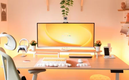
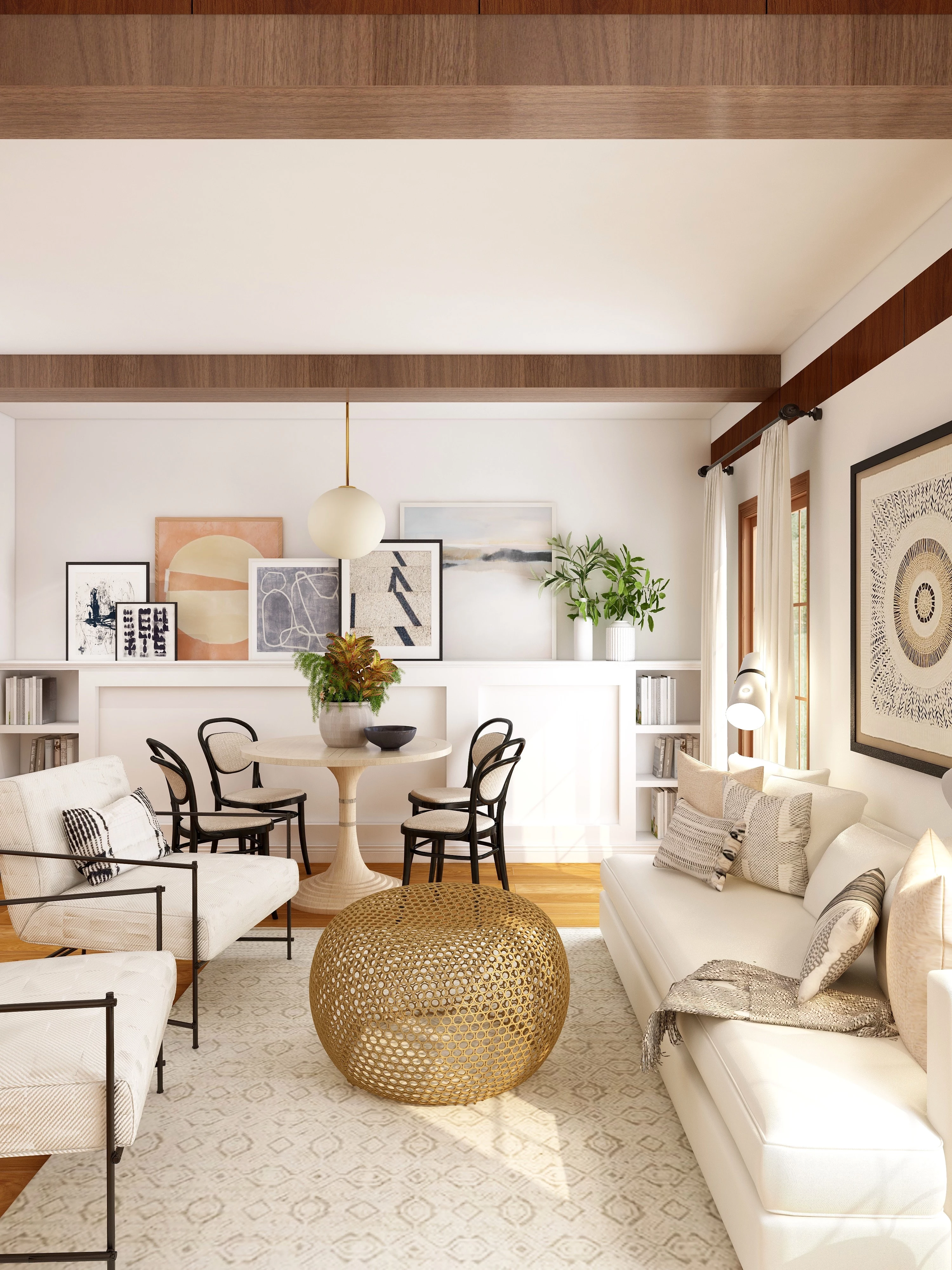
Think about it this way. Instead of a heavy, skirted armchair that sits on the floor like a brick, try one with tall, slender legs. They might have the same footprint, but the ‘leggy’ chair feels way lighter because you can see the floor underneath it. It appears to float, making the whole room feel more open.
When you’re shopping for a small space, here’s what to hunt for:
- Legs Are Everything: Sofas, consoles, media centers, even bed frames on raised legs are your best friends. The more floor you see, the bigger the room feels. Stores like Article, West Elm, and Joybird are fantastic places to find pieces with that airy, mid-century modern style that works so well.
- Go Low-Profile: Furniture with a lower back height doesn’t block sightlines. This helps preserve that open feeling, especially across a multi-use room.
- Sleek, Not Stuffy: Ditch the giant rolled arms and overstuffed cushions. They add visual bulk without adding real function. Look for cleaner lines and more tailored pieces.
- Disappearing Acts: Transparent materials are magic. A glass ‘waterfall’ coffee table or an acrylic console table can almost vanish. They do their job without taking up any visual real estate, keeping the sightline to your rug and sofa totally open.
The Ultimate Play: Custom Built-ins
For those who are in their home for the long haul and have a bit more in the budget, custom built-in furniture is the ultimate space-saving solution. A floor-to-ceiling bookshelf or a window seat with integrated storage uses vertical space that’s normally wasted. Because it’s literally part of the wall, it feels like architecture, not like furniture cramming the room.
I worked on a tiny city apartment once where the owner was a huge reader. We designed a full wall unit around the bed that included the headboard, nightstands, and bookshelves all the way to the ceiling. It provided all his storage and became this incredible focal point. Heads up, this is a real investment. For a full-wall custom project, you should probably budget anywhere from $5,000 to $15,000 or more, depending on materials, complexity, and local labor costs. It’s a splurge, but it can completely transform a small home by solving multiple problems at once.
Sculpting Your Room with Light
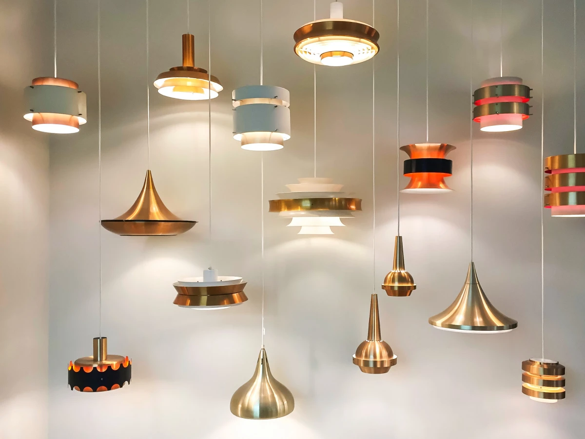
Please, for the love of good design, step away from the single, sad ceiling light. I call them ‘glare bombs’ because they cast harsh, downward light that creates ugly shadows and makes everything look flat. Good lighting is all about layers. In every room, you should aim for at least three sources of light.
- Ambient Light: This is your overall glow. It can be a central fixture, but make sure it’s diffused and on a dimmer. Think a chandelier with shades or a flush-mount with a frosted cover.
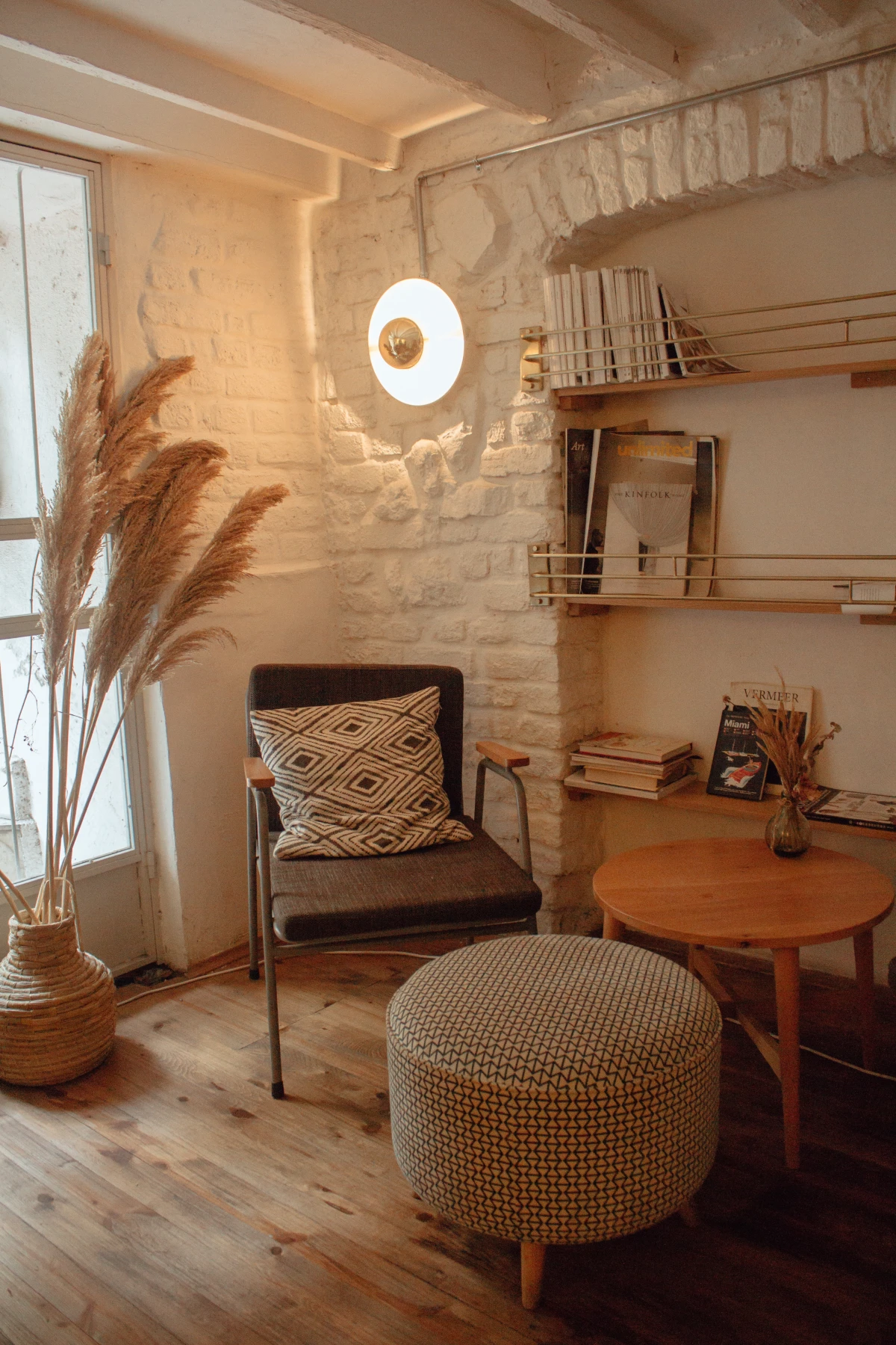
- Task Light: This is focused light for doing stuff. A floor lamp for reading, under-cabinet strips for chopping veggies, a small lamp on a desk. It’s functional, but it also creates cozy, defined zones.
- Accent Light: This is the secret sauce. It’s the light you use to highlight things you love—a piece of art, a textured wall, a cool plant. A tiny, adjustable picture light or a simple can light on the floor behind a plant adds instant drama and depth.
And here’s where I have to be direct: lighting often involves electrical work. Unless you are just plugging in a lamp, you need a pro. Seriously. The risk of fire or injury from DIY electrical is no joke. Hiring a licensed electrician to move a junction box or install a new hardwired fixture might cost you between $150 and $500, which is a small price to pay for safety and peace of mind.
The Vertical Illusion: Your Walls Are Your Secret Weapon
Your walls and windows are a massive, untapped resource for creating height and openness.
The Curtain Trick We Swear By
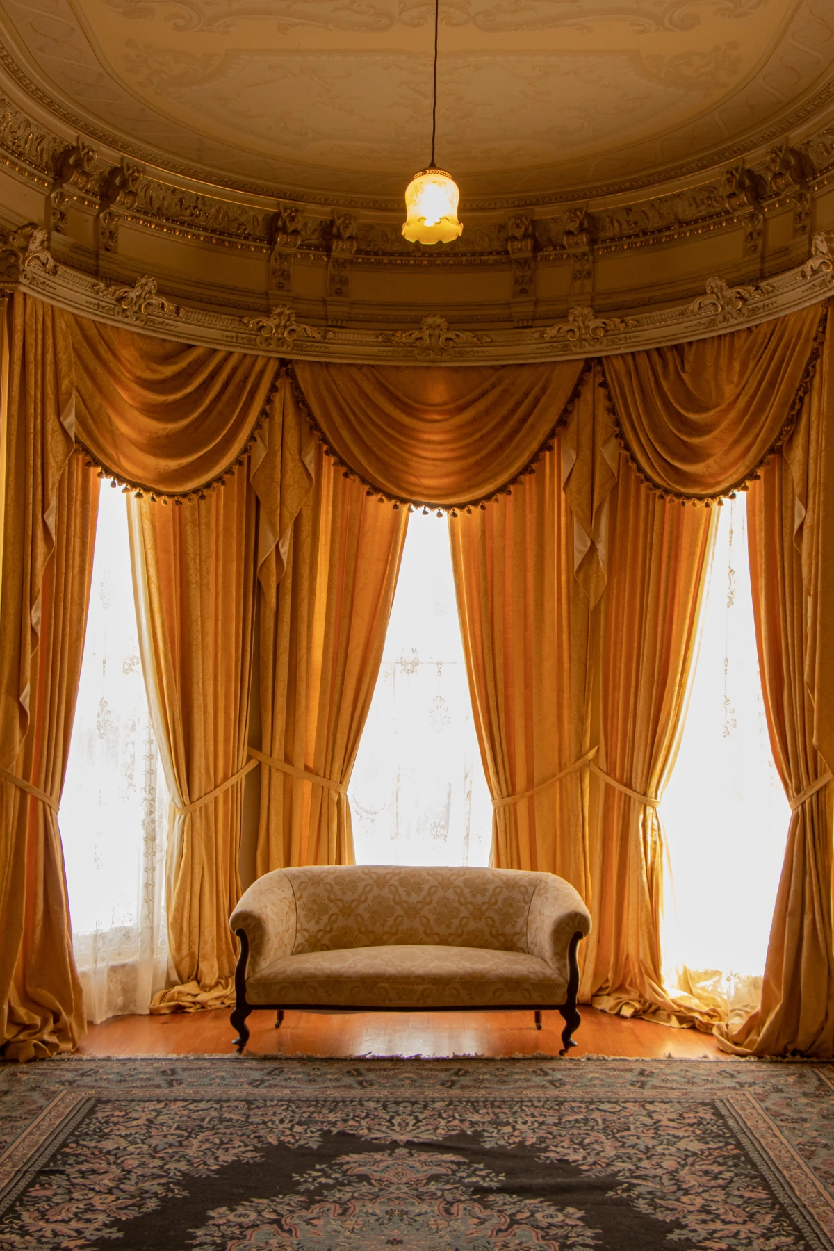
The way you hang your curtains can visually add a foot of height to your room. It’s wild. Here’s how:
- Hang the Rod High: Mount the curtain rod 4 to 6 inches above the window frame, not right on it. This simple move draws the eye upward instantly.
- Hang the Rod Wide: Extend the rod 6 to 12 inches past the frame on each side. This lets you pull the curtains completely clear of the glass, maximizing light and making the window look way bigger.
- Get the Length Right: Curtains should just ‘kiss’ the floor or hover about a half-inch above it. Panels that are too short look like high-water pants and chop the wall in half.
Rethinking Your Wall Decor
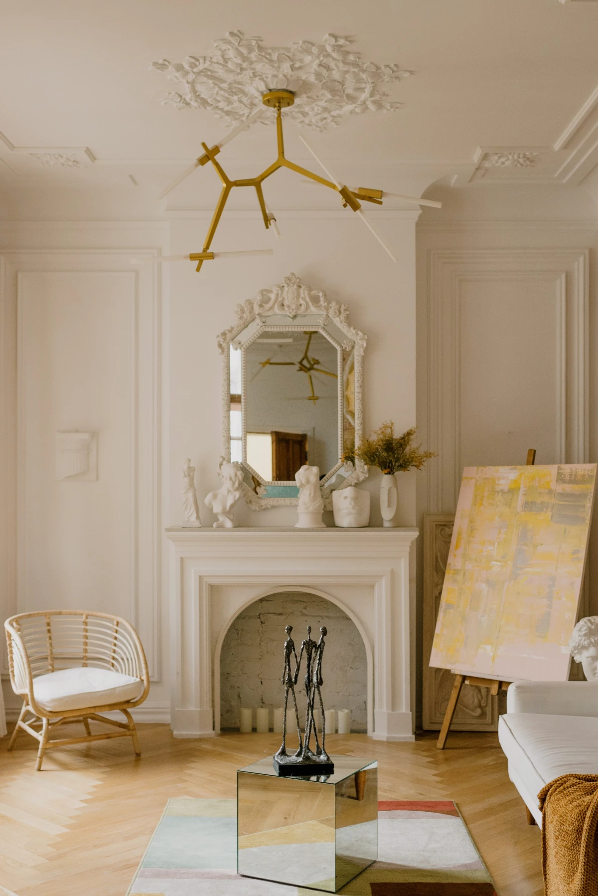
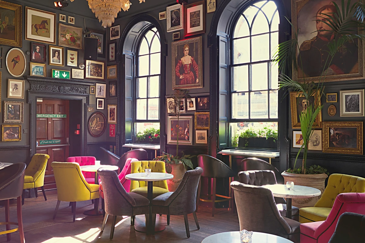
Fear of ‘clutter’ can lead to blank walls, which don’t feel bigger—they just feel temporary and boring. The trick is to go big. Instead of a busy gallery wall of tiny frames, opt for one oversized piece of art. It’s counterintuitive, but it works. A good rule of thumb is to choose a piece that is about two-thirds the width of the furniture it’s hanging over. So, for a 72-inch sofa, look for art around 48 inches wide. It creates a powerful, confident focal point that makes the whole wall feel more substantial.
Mirrors are a classic tool, but placement is everything. A mirror opposite a window is a home run—it doubles your light and your view. Just don’t hang it where it will reflect a cluttered corner or a boring blank wall.
And about that paint… instead of defaulting to sterile white, consider a soft off-white with warm undertones, a gentle light gray, or even a muted green. These colors have more depth. You can even go dark! A deep navy or charcoal in a tiny room, like a powder room or office, can be incredibly chic and cozy, blurring the corners and creating a sense of infinite space.
Feeling Overwhelmed? Start With These Quick Wins.
I get it, this is a lot of information. If you’re not sure where to begin, just try one of these high-impact changes this weekend. You’ll be shocked at the difference.
- The Breathing Room Rule: Go pull your sofa and biggest chairs three inches away from the wall. Right now. It takes five minutes and the effect is immediate.
- The Curtain Trick: Re-hang the curtain rod in your main room higher and wider. It’s a bit of work, but the payoff in perceived height is huge.
- The Painter’s Tape Test: Before you fall in love with a piece of furniture online, tape its dimensions out on your floor. It’s the best way to prevent a costly and back-breaking mistake.
At the end of the day, designing a small space is a puzzle. But once you understand the principles of flow, scale, and light, you have all the pieces. Be honest about how you live and what you really need. A thoughtful approach can make any home, regardless of its size, feel open, comfortable, and perfectly you.
Inspiration:
A mirror can double the perceived light in a space, but only if placed correctly.
The biggest mistake is hanging a mirror on a random wall. For maximum impact, place a large mirror directly opposite your main window. It will not only bounce natural light across the room, making it feel brighter and more open, but it will also reflect the view, creating a sense of depth. Think beyond the basic rectangle; an arched floor mirror, like the popular Gleaming Primrose from Anthropologie, can also add a sense of height and architectural interest.
The Grounded Sofa: A traditional sofa with a low skirt or one that sits directly on the floor can feel heavy and visually chop up a room, blocking sightlines to the floor beyond.
The
How do you make a bold color work in a tiny room?
You commit to it completely. Instead of a single ‘accent wall,’ which can visually shrink a space by breaking it up, try ‘color drenching.’ This means painting the walls, trim, doors, and even the ceiling in the same shade. Using a rich, mid-tone color like Farrow & Ball’s ‘Hague Blue’ or ‘Setting Plaster’ in this way blurs the room’s edges and corners, creating an immersive, jewel-box effect. The lack of contrast makes the boundaries disappear, making the room feel boundless and incredibly chic.