5 ‘Upgrades’ That Secretly Sabotage Your Home (And How to Fix Them for Good)
I’ve been deep in the world of home design for a long time, and if there’s one thing I’ve learned, it’s that trends are fleeting but bad function is forever. I still chuckle when I remember how proud some folks were of their brand-new, multi-level tray ceilings with that glowing rope light inside. At the time, it felt like the absolute pinnacle of luxury. Today? It’s often the first thing we rip out in a renovation.
In this article
But this isn’t about pointing fingers or calling past choices ‘tacky.’ It’s about figuring out why some design ideas feel timeless while others have a surprisingly short shelf life. It almost always boils down to one thing: function.
Good design isn’t about copying a magazine cover. It’s about creating a home that genuinely works for you. A lot of popular features, especially the ones builders push as quick ‘upgrades,’ just don’t hold up in the real world. My goal here isn’t to give you a ‘never-do-this’ list. Instead, I want to pull back the curtain and show you how a pro thinks. Let’s look at some common design choices and break down why they often miss the mark, so you can make smarter, more lasting decisions for your own space.
1. The Trapped-in-Place Kitchen Nook
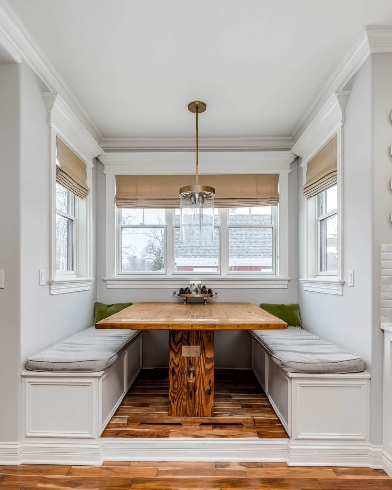
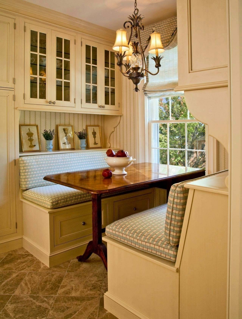
You’ve seen it: the U-shaped bench bolted to the wall around a table, a staple in homes from a few decades back. The idea was to create a cozy, space-saving diner vibe. In reality, it often becomes the most awkward spot in the entire house.
Why It Just Doesn’t Work
The problem is pure ergonomics. Think about it—a normal dining chair lets you pull it out, sit down, and slide in to the perfect distance from the table. It’s flexible. A fixed nook completely destroys that. The bench is stuck, so getting in means an awkward slide, and heaven help the person in the middle who needs to get out. It’s a daily frustration.
I once worked with a family whose beautiful, sunny kitchen had a breakfast nook that nobody ever used. The husband was tall and his knees were jammed against the table pedestal. The wife found the dead-straight backrest unbearable for more than five minutes. It was basically useless. We aim for at least 36 inches of clearance behind a dining chair for someone to walk by; a fixed nook often kills this path, creating a major traffic jam.
Smarter, Cozier Alternatives
If you’re stuck with a clumsy nook, the best move is usually to tear it out. But what if you love that cozy corner concept? Don’t worry, we can get that feeling with way more function.
- The Freestanding Banquette: This is the answer. Get a well-made, upholstered bench and place it against the wall, but pair it with a table you can actually move. Pro tip: A pedestal table is your best friend here because it gets rid of the corner legs that are always in the way.
- Keep It Simple: In a smaller corner, a small round or square table with two to four comfy chairs is way more versatile. It feels just as intimate but gives everyone their own space.
- The Budget Question: If you do decide to remove the old built-in, who do you even call? You’re looking for a good carpenter or a general contractor. Expect to budget somewhere between $500 and $2,000 for the job. The price climbs if they need to patch the flooring underneath or move any electrical outlets that were part of the old setup.
Honestly, reclaiming that corner for a more flexible arrangement is one of the highest-impact changes you can make to your kitchen’s daily flow. It’s worth every penny.
2. The Overwhelming Photo Mural
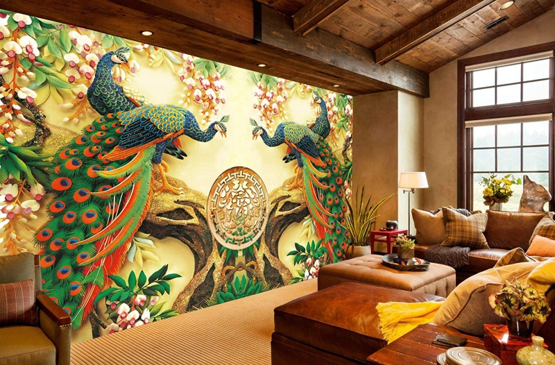
A floor-to-ceiling photograph of a misty forest or a tropical beach sounds amazing in theory, right? It’s a huge statement. But while these work in massive hotel lobbies with soaring ceilings, they can be visually deafening in a normal-sized living room or bedroom.
The Problem with Visual Shouting
In a well-designed room, your eye should be able to wander and find places to rest. A gigantic, high-contrast photo mural does the opposite. It screams for attention, creating a kind of subtle, constant tension. Designers call this having too much ‘visual weight.’
I consulted on a home office once where the owner installed a 3D mural of a jungle path to ‘bring nature inside.’ A few months later, he told me he couldn’t focus in there. The forced perspective of the path was visually demanding, and all the dark greens actually made the windowless room feel smaller. We swapped it for a simple, neutral grasscloth wallpaper. The texture added interest without yelling, and the room instantly felt calmer. A feature wall should be a whisper, not a shout.
Better Ways to Create a Feature Wall
Instead of a literal photograph, consider one of these more sophisticated and timeless approaches.
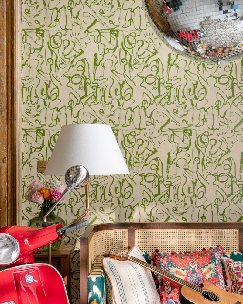
- Textural Wallcoverings: This is my go-to. Materials like grasscloth, linen, or cork add so much warmth and depth. They even absorb a little sound. High-quality grasscloth can be pricey, sometimes $100-$300+ per roll, but the effect is pure luxury. For a budget-friendly option, check out the amazing textured vinyl wallpapers available now; some look just like fabric for a fraction of the cost.
- Architectural Panels: Adding board and batten or picture frame molding is a classic for a reason. Painted the same color as the walls, it adds sophisticated texture. Painted a contrasting color, it creates a bold but structured feature. Materials are cheap (just MDF and paint), but it requires precise labor.
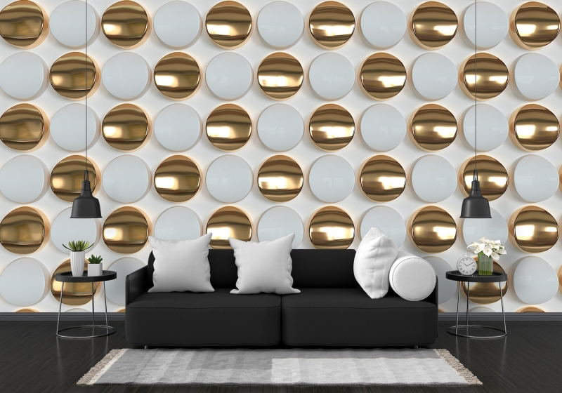
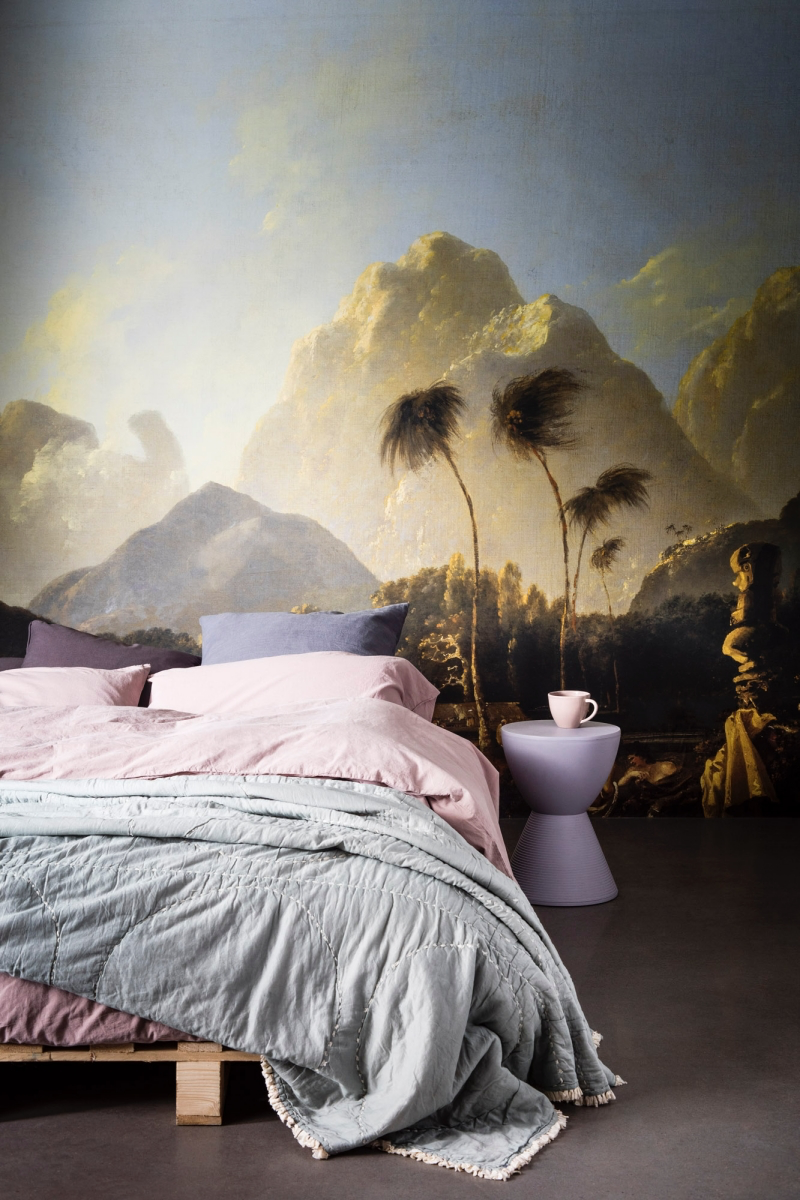
- Abstract or Tonal Murals: If you still love the mural idea, look for abstract, watercolor-style designs with a soft, muted color palette. They can give you that sense of depth without the visual noise of a photo. Check out sites like Spoonflower where independent artists sell unique designs.
Heads up! No matter what you choose, wall prep is EVERYTHING. The wall must be perfectly smooth. Always use a wallpaper-specific primer first. It helps the paper stick properly and, more importantly, makes it removable later without ripping your drywall to shreds. So many people skip this and regret it big time.
3. The Monolithic Media Wall Unit
Remember those massive, all-in-one wall units? They were the titans of living rooms for a good while, housing the TV, stereo, display shelves, and maybe a hidden bar. The intention was great—consolidate everything! The problem? These units are so visually and physically heavy they can suck the life right out of a room.
Give Your Room Some Breathing Room
Good design is just as much about the empty space (what we call ‘negative space’) as it is about the furniture. A giant wall unit eats up an entire wall, killing that negative space and making the room feel crowded and dark, especially if it’s a dark wood stain.
I’ve walked into so many homes where the first and only thing you notice is this giant piece of furniture. The goal is to create a balanced composition, not a solo performance by a bulky cabinet.
Modern Ways to Handle Storage
Today, we favor a more layered and adaptable approach to storage.
- Low and Long Credenzas: A long, sleek media unit below the TV anchors the screen without taking over. This leaves the wall above open for art, a mirror, or some cool sconces, making the room feel wider.
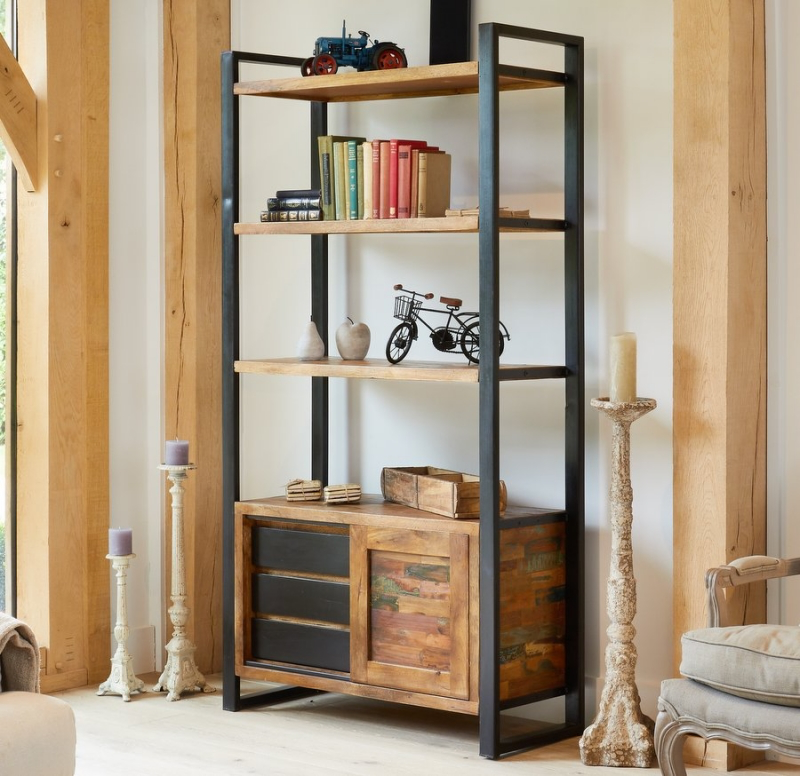
- Modular Systems: This is the ultimate in flexibility. You can combine components to fit your exact needs. IKEA’s BESTÅ system is a fantastic, budget-friendly starting point. For a higher-end look, other brands offer systems with endless configurations.
- The Built-In Solution: For a truly seamless, high-end look, custom built-ins are the way to go. They can be designed to disappear by painting them the same color as the walls. This is more of an investment, for sure, but it adds real architectural value to your home.
Quick Fix for Your Old Unit: Got an old oak behemoth you can’t replace right now? Paint it! Seriously. A few coats of paint can work miracles. Here’s a quick-and-dirty guide: First, clean it thoroughly with a TSP substitute. Give it a light ‘scuff sand’ with 120-grit sandpaper—you don’t need to strip it, just rough up the surface. Then, and this is the crucial step, use a shellac-based primer like Zinsser B-I-N. It sticks to glossy surfaces like glue. Finish with two coats of a good cabinet paint. The transformation is incredible.
4. The Dreaded Matched Furniture Set
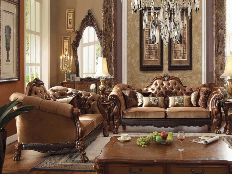
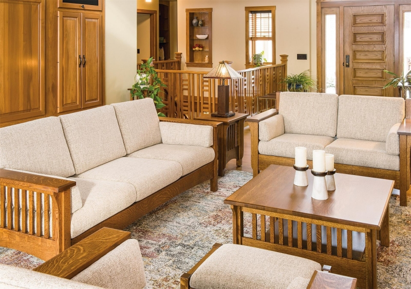
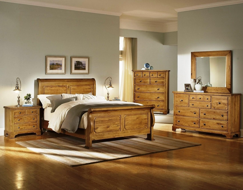
It’s so tempting, I get it. You walk into a showroom, and there it is: the 5-piece set with a sofa, loveseat, armchair, and tables that all match perfectly. It feels safe and easy. But this is exactly why so many living rooms feel boring and lack personality. It’s like wearing an outfit where your shirt, pants, and shoes are all the exact same pattern. It ‘matches,’ but it has no soul.
Why Curated Beats Coordinated
A great room needs both unity and variety. A matched set gives you 100% unity and zero variety. Your brain sees it all, processes it in a second, and then gets bored. A home should feel collected, like it tells a story about the people who live there.
How to Mix It Up Like a Pro
Creating a curated look is easier than you think. You just need to find a common thread to tie different pieces together.
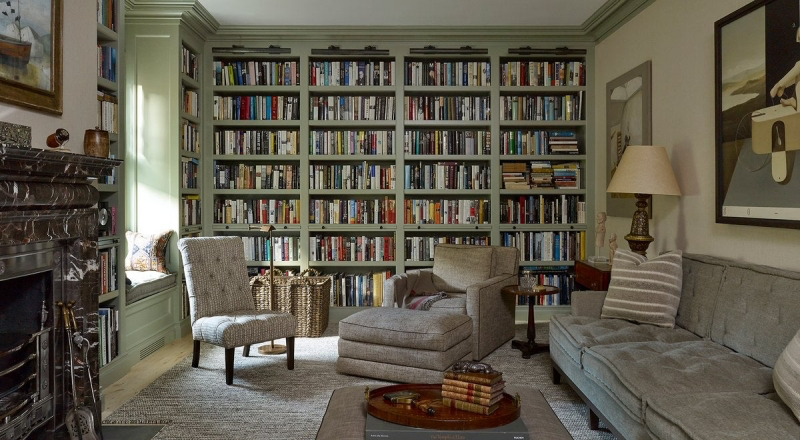
- My No-Fail Recipe: Start with a comfortable, neutral sofa. Then, add two armchairs in a completely different material—maybe a nice worn leather or a fabric with a subtle pattern. Find a coffee table made of wood or stone. Finally, add a metal side table. Boom. You’ve just created a room with texture, variety, and personality.
- Find the Common Thread: You can tie things together with a consistent color palette (pull colors from a rug!), a repeating wood tone, or even a shared metal finish (like brushed brass on light fixtures and table legs).
Quick Win for Today: If you already have a matched set, try this experiment. Take the loveseat and move it to your bedroom or den for a week. Replace the matching armchair with one from another room. Just that one change can completely break up the monotony and breathe new life into your space. See how it feels!
5. The Overly Complicated Ceiling
A few years back, builders loved to add complex, multi-level drywall ceilings as a ‘custom’ feature. You’d see swooping curves and stacked trays, often with that rope light inside. The problem is, unless these shapes relate to the home’s actual structure, they just look random and can make a room feel heavy.
What’s the Ceiling’s Job, Anyway?
In classic architecture, details like coffered ceilings follow the structural logic of the building. They add order. Those purely decorative drywall shapes, on the other hand, often just feel stuck on. Worse, any section that drops down visually lowers the ceiling, making the room feel smaller and more compressed—the exact opposite of what most of us want.
I was once hired to figure out why a huge primary bedroom felt so claustrophobic. The culprit? A massive two-tiered tray ceiling that dropped down almost 18 inches. It was like wearing a heavy hat indoors. We had it removed, and the room instantly felt twice as big.
Better Ways to Look Up
Want to add some interest overhead? There are so many elegant options.
- Crown Molding: A timeless classic. The key is getting the scale right—a bigger room with higher ceilings needs chunkier molding to look balanced.
- A Ceiling Medallion: Adding a decorative medallion where your chandelier hangs is a simple, beautiful detail that adds an instant touch of class.
- A Splash of Paint: Don’t underestimate a painted ceiling! A very pale blue can mimic the sky, or in a tall room, a dark, moody color can make the space feel incredibly cozy and dramatic.
A Very Important Warning: Removing a dropped ceiling is NOT a weekend DIY project. You have no idea what’s hiding up there—HVAC ducts, plumbing, essential wiring. I’ve seen it all. Before you even think about demolition, you must consult a licensed contractor. They can use a small camera or cut an exploratory hole to see what they’re dealing with. Messing this up can be a dangerous and shockingly expensive mistake.
Final Thoughts: Design for Your Real Life
When you look back, the design choices that don’t last are almost always the ones that picked a fleeting ‘style’ over real function, comfort, and proper scale. A fixed nook is less comfortable than a chair. A giant mural is less calming than simple texture. A matched set is less interesting than a personal collection.
My advice is always to start with function. How do you actually use this room? What has to happen here every day? Solve that puzzle first. Then, you can layer in the beauty with things you truly love.
Your turn! Pick one of these ‘problem’ areas in your own home. What’s one small step you could take this week to improve its function, based on what we talked about? Let me know in the comments!
Inspiration:
Is the classic accent wall officially ‘out’?
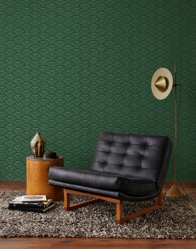
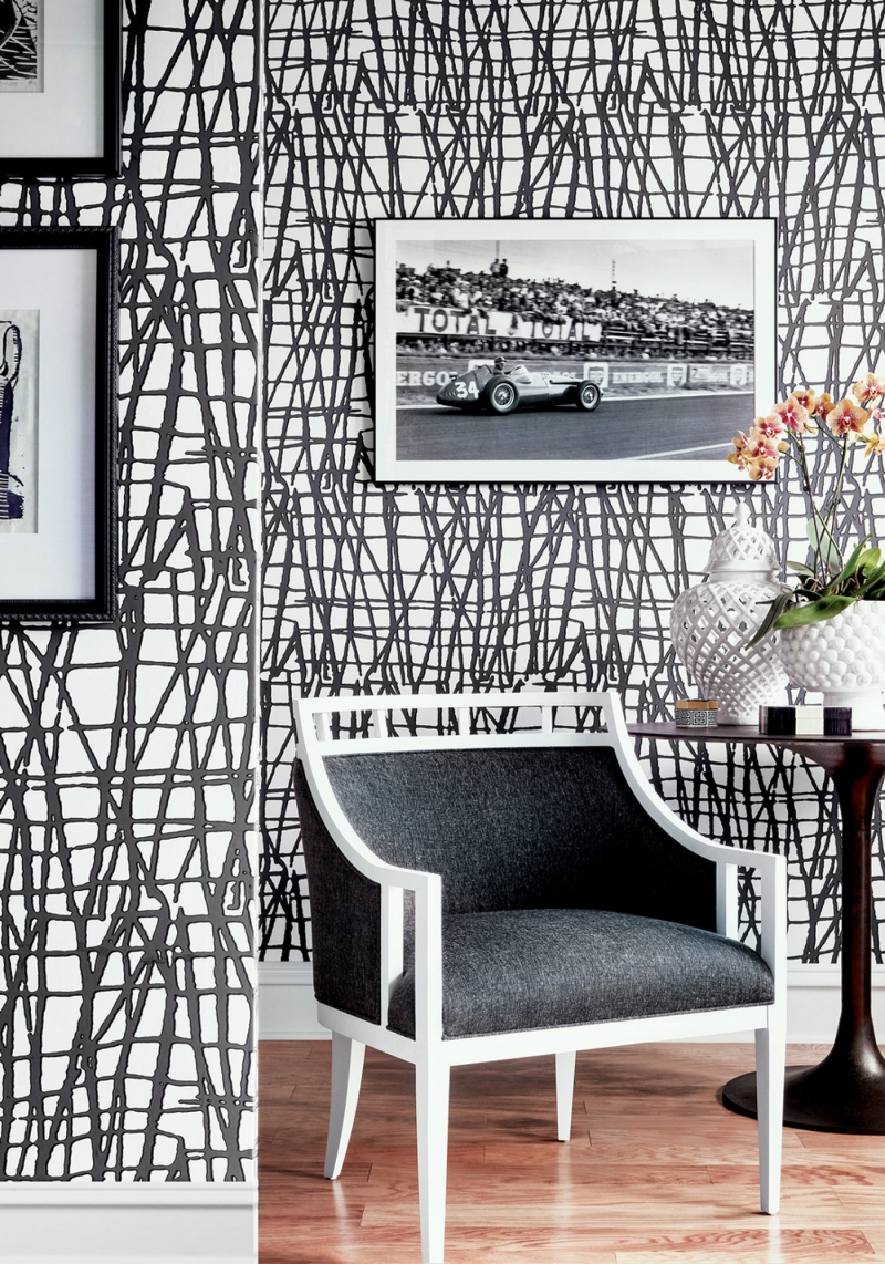
Not entirely, but the execution has evolved. A single wall painted in a shocking, high-contrast color can instantly date a room, making it feel smaller and disjointed. The modern approach favors texture and architectural depth over a simple coat of paint. Think about creating a focal point with a wall of subtle, tactile wallpaper from a brand like Graham & Brown, installing vertical shiplap for height, or embracing ‘color drenching’ by painting the wall, trim, and even the door in the same rich, matte shade. The goal is to add sophisticated character, not just a splash of random color.
More than 75% of our emotional responses to an interior space are shaped by its smell, yet it’s the most overlooked element in design.
This is why some ‘upgrades’ fail subconsciously. That off-gassing from cheap vinyl flooring, the chemical smell of a new synthetic rug, or the mustiness of a poorly ventilated, built-in wardrobe creates a subtle but constant sense of unease. Prioritizing natural materials like solid wood, wool, or linen doesn’t just look better; it creates a healthier, more welcoming atmosphere that you feel the moment you walk in the door.
The Oversized Sectional Sofa: Promises cozy movie nights for the whole family. In reality, its colossal footprint can dominate a room, kill traffic flow, and offer surprisingly inflexible seating. The deep corners are often awkward, and it’s a nightmare to rearrange.
The Modular Sofa System: Offers the ultimate in flexibility. Pieces can be reconfigured for a party, separated into chairs, or formed into a guest bed. Brands like Lovesac or Article’s ‘Beta’ series prove that you can have ample, comfortable seating that adapts to your life, rather than forcing your life to adapt to it.
- Creates a warm, inviting glow.
- Makes skin tones look healthier.
- Reduces eye strain.
The secret? Layered lighting with a high Color Rendering Index (CRI). Avoid the classic builder mistake of a single, harsh overhead fixture. Instead, ensure every room has three layers: ambient (general light), task (for reading or cooking), and accent (to highlight art). Using LED bulbs with a CRI of 90+ will render the colors in your home accurately and beautifully.

