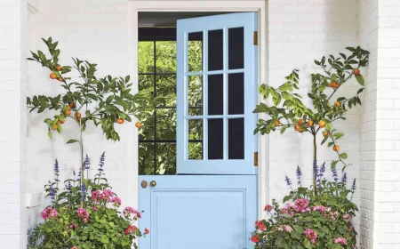
Paint Colors That Can Break Your Heart (And How to Use Them Anyway)
I’ve been a professional painter for a long time, and I’ve sloshed more than my fair share of paint onto living room walls. One question I get all the time is, “What’s the worst color you can possibly choose?” And honestly, there’s no such thing as a “worst” color. But there are definitely “challenging” ones.
In this article
These are the colors that look absolutely perfect on that tiny little swatch from the hardware store, but then turn into a total disaster once they’re covering 400 square feet of drywall. They’re the shades that lead to that sinking feeling of disappointment and, more often than not, the unexpected cost of a complete do-over.
Choosing a paint color isn’t just about what you like; it’s about how that color is going to behave in your actual home. It’s a dance between the color, the light, your furniture, and the mood you’re trying to set. So, think of this less as a list of colors to avoid, and more as a friendly guide from someone who’s seen it all. Let’s make sure you go into this with your eyes wide open.
First, a Little Bit of Paint Science (The Non-Boring Version)
Before we even whisper a color name, we have to get on the same page about how color and light work together. Trust me, getting this part right saves more time, money, and sanity than anything else in the process.
What the Heck is LRV?
On the back of a paint can, you’ll see a bunch of technical info. The most important number for you is the Light Reflectance Value, or LRV. It’s a simple scale from 0 (think absolute black, like a black hole) to 100 (pure, brilliant white). It literally tells you how much light a color will bounce back into the room.
Why should you care? Because a low-LRV color (say, under 20) in a room without much natural light can feel like a gloomy cave, forcing you to crank up the lamps. On the flip side, a super high-LRV color (like 85+) in a bright, sun-drenched room can cause a headache-inducing glare.
Quick tip: For a darker, north-facing room, you probably want to look for an LRV of 60 or higher to maximize the light you have. For a super sunny, south-facing space, staying under 80 can help cut down on that harsh glare. It’s a simple check that can prevent a big mistake.
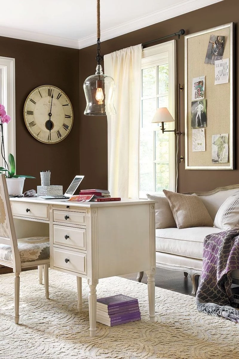
The Hidden Trouble with Undertones
Undertones are, without a doubt, the number one reason people end up hating their new paint color. They’re the sneaky, subtle colors hiding within a more complex shade. That perfect gray might secretly have a purple, blue, or even green undertone. That lovely beige might be hiding hints of pink or yellow.
I once had a client who picked a beautiful greige for their living room. But the room had those traditional, warm honey-colored oak floors. The yellow-orange of the wood brought out a sickly green undertone in the greige that you just couldn’t unsee. The whole room felt muddy and… off. We had to repaint with a warmer beige to work with the floors, not against them. The lesson? Your paint has to get along with the things you can’t change, like flooring, stone fireplaces, and countertops.
Lesser-known trick: To spot a tricky undertone, take your paint swatch and put it right next to a sheet of pure white printer paper. The stark white background forces the underlying color to pop. You’ll see that ‘blue-ish’ gray or ‘pink-ish’ beige much more clearly.
The Color-Changing Trick of Light
Ever notice how a car can look deep blue in the sunlight but almost black at night? That’s a real thing, and it happens inside your house, too. Your living room paint will look different in the morning sun, on a cloudy afternoon, and under the warm glow of your lamps at night.
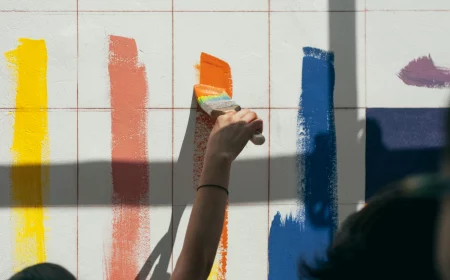
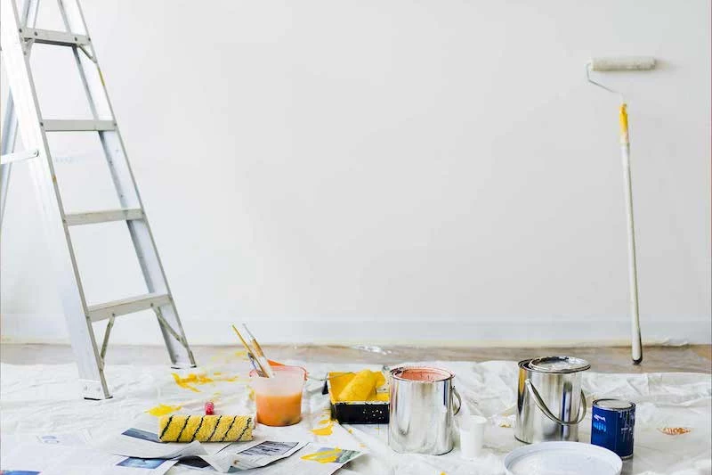
This is why you can’t just slap a test splotch on the wall. Here’s how you do it right:
- Get a sample pot of your paint—they’re usually just $5-$10 at places like Sherwin-Williams or Benjamin Moore.
- Grab a piece of white poster board (at least 2 feet by 2 feet) and paint two coats on it. Let it dry completely.
- For the next 24 hours, move that board around your room. Prop it up in a dark corner. Put it next to your sofa. Tape it next to the window trim. Check it in the morning, afternoon, and at night with all your lights on. This is the only way to see how the color will truly live in your space.
A Closer Look at the Toughest Color Families
Alright, let’s get into the specific colors that give people the most grief. I’m not saying don’t use them! I’ve seen them look incredible. But you need a game plan.
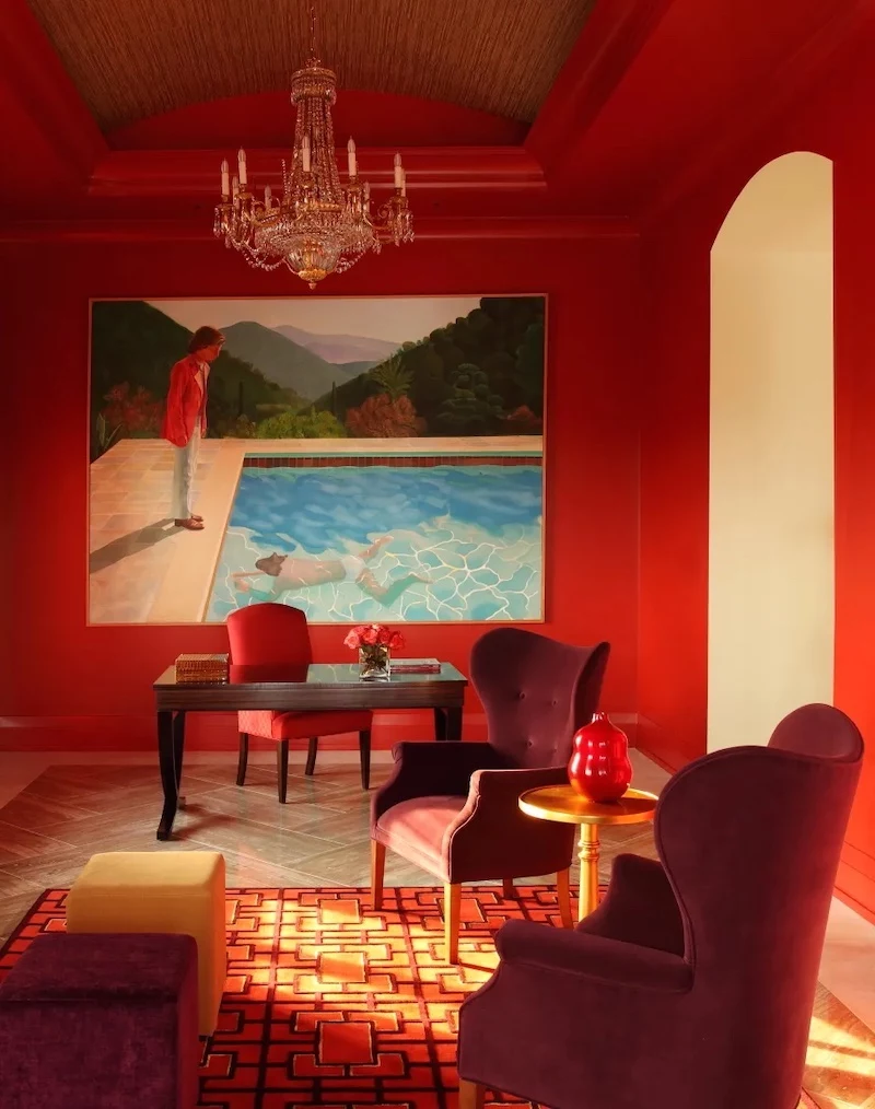
1. Pure, Saturated Reds
We’re talking about that true, fire-engine red. It’s a color of pure energy. On a psychological level, it can actually raise your heart rate. That’s great for a fast-food joint that wants you in and out, but it can feel a bit intense and draining in a living room where you want to unwind.
The Technical Challenge: From a painter’s perspective, these reds are a nightmare to apply. The pigments are very translucent, meaning they don’t cover the old color well. I learned this the hard way early in my career, when I bid a red dining room for two standard coats. It ended up needing four, and my profit completely vanished.
The Pro Approach: If you’re going for a bold red, you absolutely MUST use a deep-tinted primer first. A good paint store can mix up a specific gray or even a pinkish primer that does the heavy lifting. This helps the red look rich and true in fewer coats. Even then, expect at least two or three topcoats. Heads up: a saturated red room will always cost more in materials and labor. Plan on it being 30-50% more expensive than a standard color, between the special primer and extra paint.
Smarter Alternatives: Love red? Try a more complex, earthy version like a deep terracotta, brick, or a rich burgundy. These have some brown or black mixed in, which makes them easier to live with and, by the way, much easier to paint.
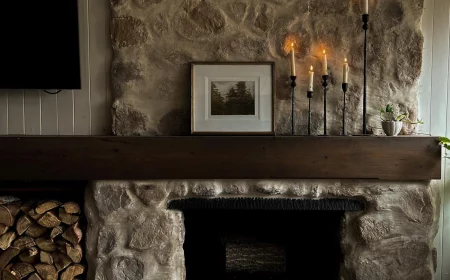
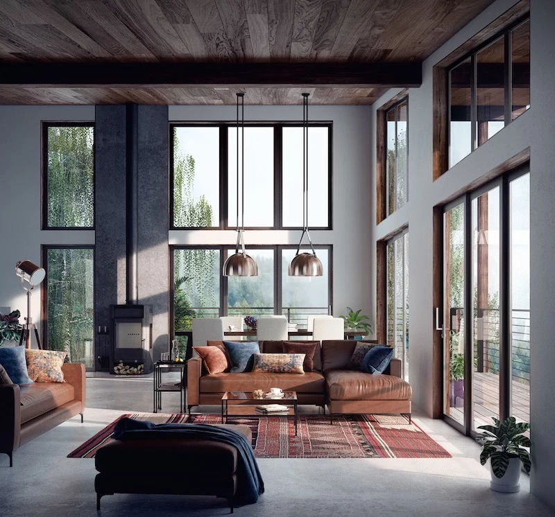
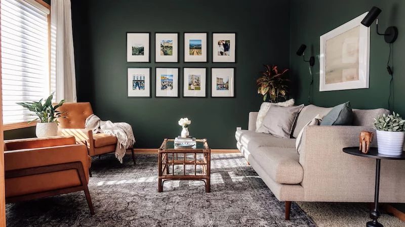
There’s a myth that dark colors automatically make a room feel small. Not true! Used the right way, a deep charcoal or navy can make the walls seem to fall away, creating a cozy, sophisticated, and intimate vibe. It’s like a warm hug for your room.
The Technical Challenge: The big issue with dark colors is that they are brutally unforgiving. They highlight every single tiny flaw on your walls—every nail pop, seam, and little bump. But the biggest enemy is sheen. If you use a standard eggshell or satin finish, you will see every place your roller overlapped. It’s called “flashing,” and it looks awful.
The Pro Approach: Here’s the secret the pros use: you have to go with a flat or matte finish. These sheens absorb light instead of reflecting it, which does a fantastic job of hiding those little imperfections and roller marks. Your walls will look like a seamless, velvety expanse of color. It’s a non-negotiable for getting that high-end, moody look.
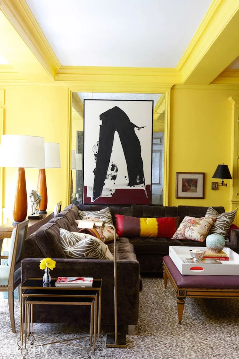
3. Bright, Sunny Yellows
Oh, yellow. It seems so happy and cheerful on the swatch. But on the wall? It can be one of the trickiest colors out there. For one, just like red, yellow pigments have notoriously poor coverage. You’ll often need multiple coats, even over a primer.
The bigger issue is intensity. A soft, buttery yellow on a 2-inch chip can become a screaming, electric, almost-neon yellow when it’s all over the room. It can end up feeling more anxious than cheerful.
The Pro Approach: If you want yellow, I strongly suggest you find a shade you like and then choose the one on the swatch that’s two shades grayer or more muted than your first choice. That muted quality will tone down the intensity on a large scale, giving you that warm, sunny feel without the unwanted vibrancy. And yes, test it on a big board first!
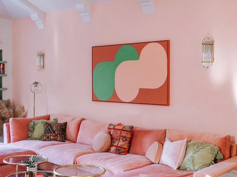
4. The “Perfect” White
Wait, white is hard? Oh yeah. Choosing the wrong white is one of the most common design mistakes. There are hundreds of shades, and they all have undertones. Cool whites have hints of blue, gray, or green, and in a room without a lot of light, they can look sterile and cold, almost like a hospital. Warm whites have undertones of yellow, pink, or cream. In a darker room, they can provide a nice glow, but in a very sunny room, they can end up looking dingy or just plain yellow.
The Pro Approach: The key is to match the white to your room’s natural light. For a darker, north-facing room, a slightly warmer white can keep it from feeling too chilly. For a bright, south-facing room, a crisper, more neutral white will look clean and bright without turning yellow. And again, test, test, test that sample board next to your trim, floors, and furniture.
So there you have it. No color is off-limits, but some just require a bit more planning and respect. A little knowledge goes a long way in making sure the color in your head is the one that ends up on your walls.
Alright, your turn to share. What’s the one paint color that gave you the biggest headache? Tell me your story in the comments below!