The Real Secret to Picking a Calming Paint Color You Won’t Regret
I’ve been painting homes for a long, long time, and if there’s one thing I’ve learned, it’s this: that little paint chip on the store wall is a liar. Well, maybe not a liar, but it’s definitely not telling you the whole truth. I’ve seen homeowners practically in tears because the “relaxing gray” they chose now looks like a giant, purple slab of concrete on their walls. It’s a classic story.
In this article
The biggest secret to creating a genuinely calm space isn’t about finding the perfect color name. It’s about understanding how that color will actually behave in your home, with your lighting and your stuff. My job isn’t just slapping paint on walls; it’s about guiding people to a choice they’ll love for years. So, let’s go beyond the color names and look at the stuff the pros really focus on.
First Things First: Light and Undertones
Before you even think about blue versus green, you have to get a handle on the two things that cause 90% of all paint-picking headaches: Light Reflectance Value (LRV) and undertones. Get these right, and you’re most of the way there, I promise.
The Magic Number: LRV
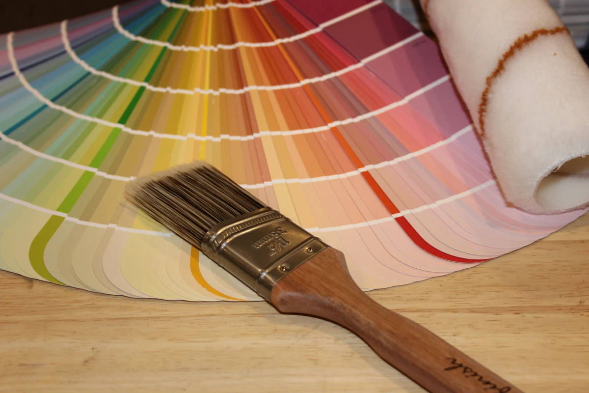
On the back of pretty much every paint swatch, there’s a number, usually from 0 to 100. That’s the LRV, and it tells you exactly how much light a color reflects. A 0 is pure black (it eats all light), and 100 is pure white (it bounces all light back). This number is your new best friend.
For a calm, soothing vibe, I almost always point people toward colors with an LRV somewhere between 45 and 65. Here’s why:
- Too low (under 40): These colors start to feel heavy. They absorb more light than they reflect, which can shrink a room and feel a bit somber. Great for a moody, cozy den, but not what most people mean by “calming.”
- Too high (over 70): In a sunny room, these colors can be almost blinding. They bounce so much light around that they create a glare, which can feel sterile and visually noisy—the total opposite of calm.
That 45-65 range is the sweet spot. It’s enough color to create a mood but still reflects enough light to keep the space feeling airy and open. They just feel balanced and easy on the eyes.
The Hidden Culprit: Undertones
An undertone is the sneaky little color hiding inside another color. It’s the reason one gray looks blue, another looks green, and a third looks, well, purple. This is the #1 trap. You see a perfect beige, but on your wall, it suddenly looks pink. Why? Probably a red undertone that was invisible in the store’s fluorescent lights but came alive in the warm afternoon sun of your living room.
Quick tip: To spot an undertone, compare your paint chip to its purest version. Put a gray swatch next to a piece of pure white paper. Does the gray suddenly look bluer? Or maybe a bit brown? This simple comparison forces the hidden color to show itself.
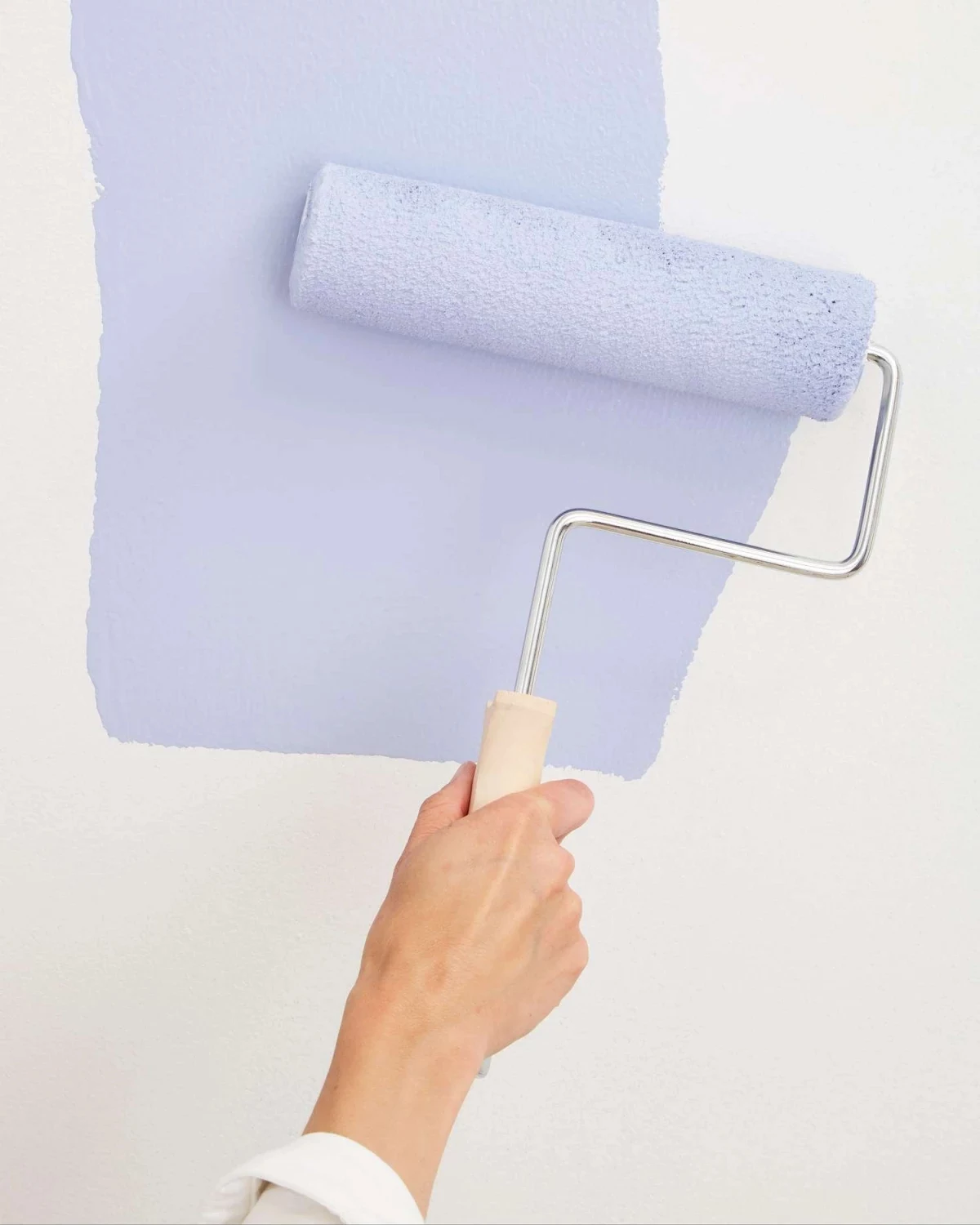
The Only Way to Test Paint (Seriously, Don’t Skip This)
Please, for the love of all that is good, do not paint a tiny test splotch directly on your wall. The old color will mess with your perception, and you can’t move it around. I once had a client who was so sure about a gray they saw online. They refused to test it. We painted the whole room, and the second the afternoon sun hit it, the whole space turned a bright, chalky purple. We had to repaint everything. A $20 test would have saved them over $500 and a massive headache.
Here’s the foolproof method we use on every single job.
1. Buy a Sample Pot. This will cost you about $7-$10. It is the best money you will spend on this entire project.
2. Get Two Big Sample Boards. Head to a craft or hardware store and grab two pieces of white foam core or heavy poster board, at least 2 feet by 2 feet. A tiny swatch is useless.
3. Paint Them Right. Put two full coats on each board, letting it dry completely between coats (give it at least an hour). This shows you the color’s true depth.
4. Live With Them for a Day. Now, for the next 24-48 hours, move these boards around. Tape one near a window and the other on a dark interior wall. Check them in the morning, at noon, and at night with the lights on. This is the only way to see how the color really lives in your room.
Don’t Forget the Finish!
The sheen of your paint makes a huge difference. For a calming feel, you want to diffuse light, not reflect it. Shiny walls can create distracting hotspots and highlight every tiny imperfection on the wall.
Here’s my simple breakdown:
- Matte (or Flat): This is the most calming finish. It has virtually no shine, so it gives walls a soft, velvety look. The downside? It’s the least durable and tough to clean. I save it for low-traffic areas like adult bedrooms and home offices.
- Eggshell: This is the workhorse and what I recommend for 90% of jobs. It has just a tiny hint of sheen, making it way more wipeable than matte but not so shiny that it causes glare. It’s the perfect sweet spot for family rooms, hallways, and most bedrooms.
- Satin: Now we’re getting into a noticeable glow. While it’s super durable and great for trim, doors, or even a bathroom, I usually steer clear of it for walls in primary living areas. That reflection can feel a bit energetic, even institutional.
Calming Color Families That Actually Work
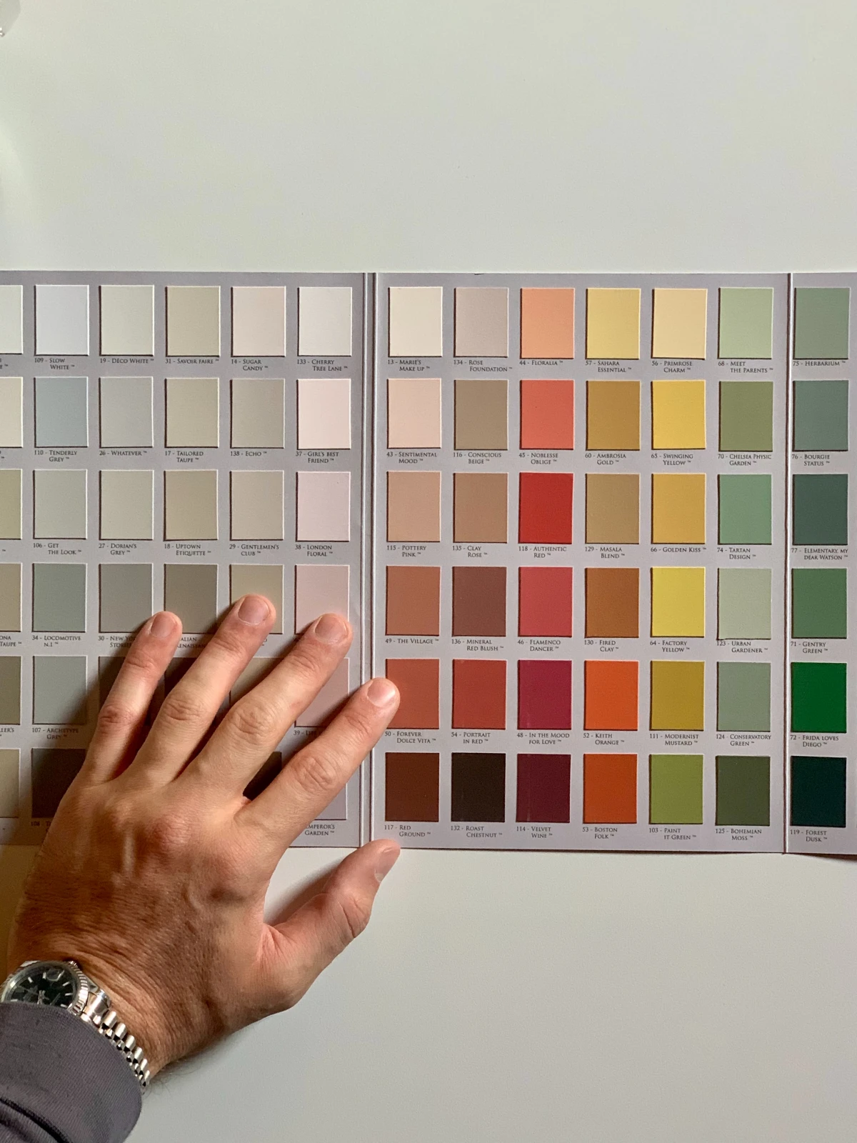
Okay, with the technical stuff out of the way, let’s talk colors. But remember the golden rule: test, test, test! A gallon of premium paint is going to run you between $50 and $80, so you want to be sure. Trust me, the good stuff is worth it—the cheaper paints just don’t have the same complex pigments that create these rich, calming effects.
The Blues (But the Right Kind)
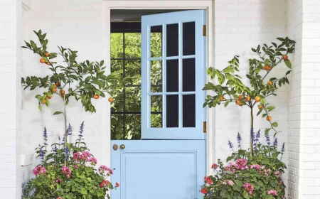
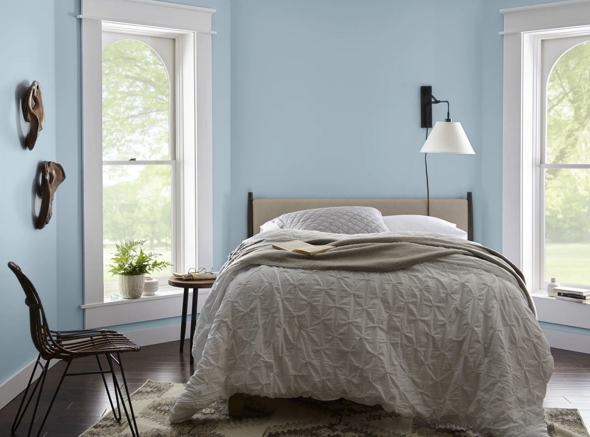
Blue is a classic choice for calm, but it’s tricky. The wrong blue feels cold or, honestly, like a little kid’s room. The secret is to find blues that are a bit “dirty”—meaning they have a healthy dose of gray or green mixed in. Think of a complex blue-green that shifts from blue to green to gray depending on the light. That complexity is what makes it restful.
Heads up! In a room that faces north and gets cool, indirect light, a cool blue can feel like an icebox. You might need a blue with a tiny bit more warmth or green in it to balance things out.
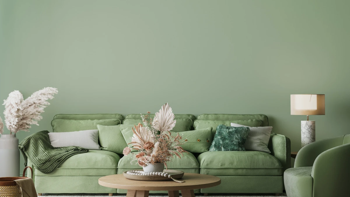
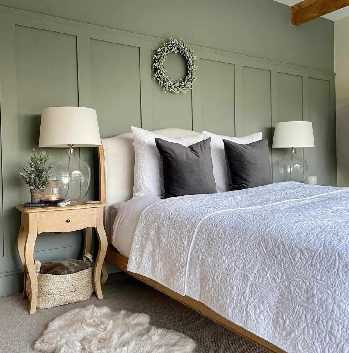
The Greens (Your Connection to Nature)
Green connects us to the outdoors, which is naturally grounding. The best calming greens are muted and complex. You want to look for the soft gray-greens of sage or eucalyptus, not the electric green of a freshly cut lawn. These shades have a green that brings life, but a gray undertone that adds a layer of quiet sophistication.
Be careful with greens that have too much yellow in them. I once had to repaint a kitchen because the “soft celery” the owner chose looked like a neon highlighter under their warm LED lights.
The Grays & Greiges (The Modern Neutrals)
Gray is popular for a reason, but a straight, cool gray can feel like a warehouse. The most livable and calming grays are warm or what we call “greige”—a perfect mix of gray and beige. These colors have the modern feel of gray but the inviting warmth of beige. They’re calming because they don’t scream for attention; they just create a warm, sophisticated envelope for your room. This is a fantastic choice for open-concept homes.
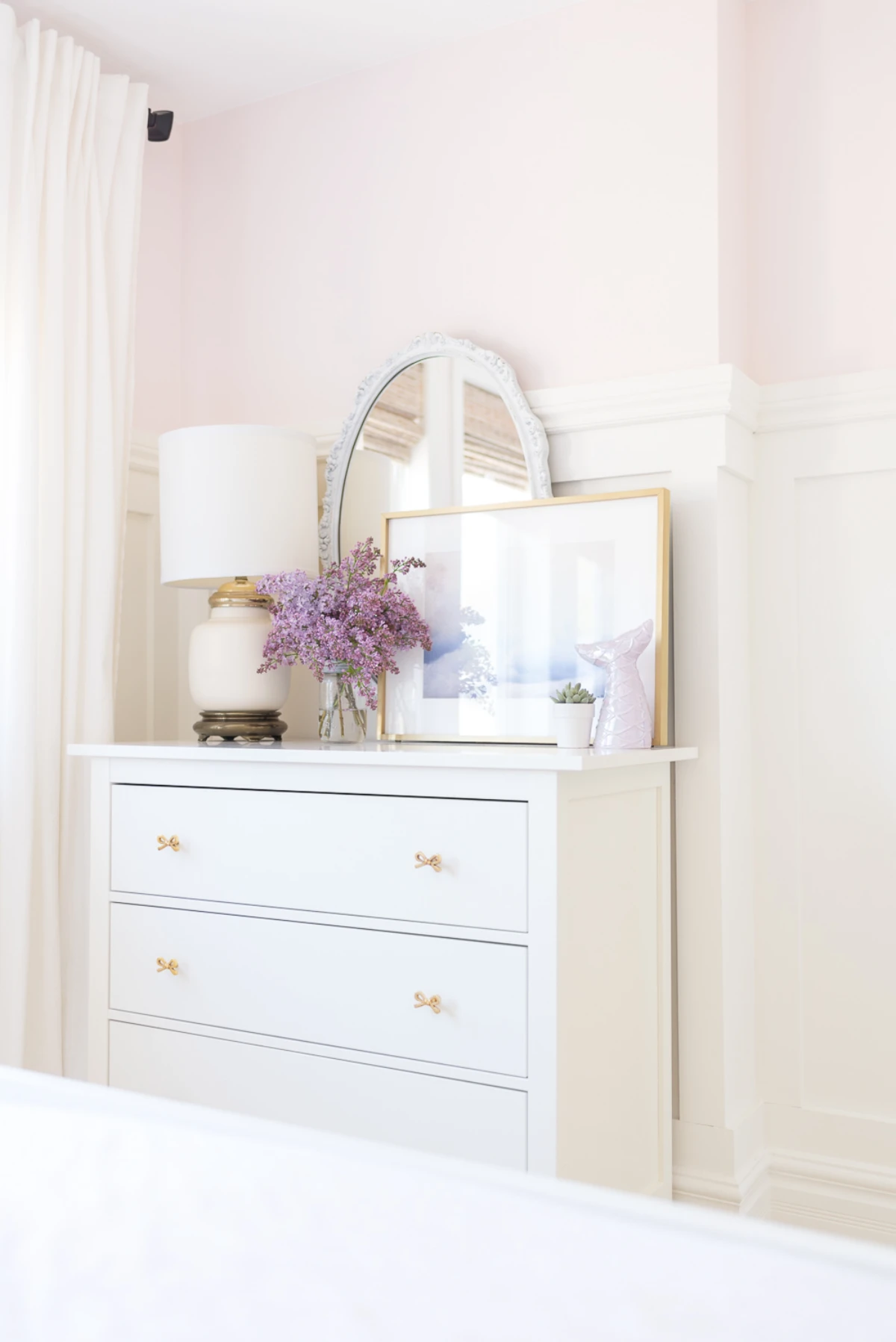
The Off-Whites (The Beauty of Softness)
Stark, builder-grade white can feel clinical and harsh. But a soft, warm off-white can be one of the most serene choices out there. The key is to find whites with just a drop of cream, beige, or gray in them. They feel bright and airy without the sterile vibe. A quick tip: for a really high-end, cohesive look, try painting your trim the same off-white as your walls, just in a satin finish. It softens all the hard lines in the room.
Your First-Timer’s Shopping List
Feeling ready to go? A beginner often has no idea what to grab besides the paint itself. Here’s a quick, no-fuss list of what you’ll actually need:
- A gallon of your chosen paint (I’d recommend an Eggshell finish)
- A good 2-inch angled brush for cutting in along the trim
- A 9-inch roller frame and a few roller covers (get the right nap for your wall texture!)
- A paint tray and a few disposable liners (makes cleanup so much easier)
- A roll of quality painter’s tape
- A canvas drop cloth (they’re way better and less slippery than the cheap plastic ones)
A Final Word of Caution
Before you start, a couple of really important things.
First, always opt for low-VOC or zero-VOC paint. These are the chemicals that evaporate as paint dries and can cause headaches and pollute your indoor air. Most premium paints today are already low or zero-VOC, so you’re not even paying extra for it anymore. It’s a no-brainer for your health.
Second, if you live in an older home, you might have lead-based paint. Sanding or scraping this creates hazardous dust, especially for kids. This is not a DIY job. You either need to safely paint over it (called encapsulation) or hire a certified pro for removal. Seriously, don’t mess with lead.
And remember, paint is powerful, but it’s just one piece of the puzzle. The most serene room is one where the calming color is supported by soft textures, good lighting, and a lack of clutter. When all those things work together, that’s when the magic really happens.
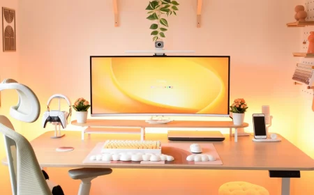
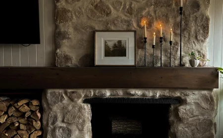
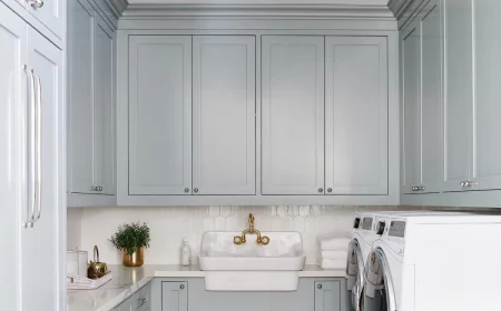
Inspirational Gallery
The biggest testing mistake: Painting small test squares directly onto your current wall color. The old color will trick your eye and alter your perception of the new one. Instead, get a large peel-and-stick sample from a service like Samplize, or paint two full coats onto a large white poster board. Move it around the room at different times of day to see how it truly behaves in your morning, afternoon, and artificial light. This is the only way to meet the real color.
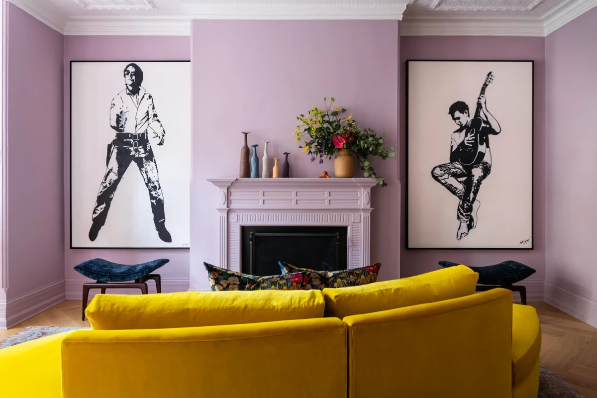
- Creates an immersive, enveloping space that feels like a hug.
- Makes ceilings appear higher by blurring the boundary between wall and ceiling.
- Gives the room an intentional, high-end designer look.
The secret is a technique called “color drenching.” Simply paint your walls, trim, and even the ceiling in the exact same color. For a subtle, sophisticated contrast, use a matte finish on the walls and a satin finish on the trim.
My beautiful, calming gray looks purple on the wall. What went wrong?
You’ve discovered metamerism, a phenomenon where a color appears to change under different light sources. Many grays have subtle undertones of blue, lavender, or even green. In the balanced light of a paint store, they look neutral. But in the cool, blue-toned light of a north-facing room or under certain LED bulbs, those undertones can pop, turning your sophisticated gray into an unexpected lavender. Always test in the room itself!
Did you know? According to the principles of color psychology, soft, muted shades of blue can trigger the body to produce calming chemicals, which can actually help lower heart rate and blood pressure.
The finish you choose is just as important as the color for creating a calm atmosphere. A matte or flat finish, like that in the Benjamin Moore Regal Select line, absorbs light and reduces visual noise, giving your color a soft, velvety depth. It hides minor imperfections on the wall and prevents the kind of harsh glare that can make a room feel busy and unsettled, even in the most soothing hue.
For ultimate coziness: Farrow & Ball’s ‘Pigeon’ (No. 25). This is a complex blue-grey with distinct green undertones. It feels grounded and moody, perfect for a study or bedroom where you want to feel enveloped and secure.
For an airy, spa-like feel: Sherwin-Williams’ ‘Sea Salt’ (SW 6204). A chameleon color that shifts between green and blue, it’s light, breezy, and incredibly refreshing. Ideal for bathrooms and sunny living spaces.
Both are calming, but one cocoons while the other uplifts.
Beyond the walls, consider the
A standard can of paint can release Volatile Organic Compounds (VOCs) for years after it has dried, impacting your home’s air quality.
A truly calming room is a healthy one. When selecting paint, look for a