Gray Walls are Tricky. Here’s How to Pick Colors That Actually Work.
Over my two decades of painting homes, I’ve seen color trends come and go. But gray? Gray has serious staying power. It’s the go-to for anyone chasing that clean, modern vibe, and honestly, my phone rings for it every single week. But here’s the thing most people don’t realize until it’s too late: gray is way more complicated than it looks.
In this article
I’ll never forget this one client. They had a gorgeous, light-filled home and picked what seemed like a perfect, simple medium gray for the living room. We got it on the walls, and during the day, it was stunning. The next day, I get a panicked call. At night, under their lamps, their sophisticated gray walls had morphed into a weird, dusty lavender. To say they were unhappy is an understatement.
That taught me a huge lesson early on: gray is never just gray. It’s a chameleon. It shifts and changes with the light and bounces off every other color in the room. So choosing the right companion colors isn’t just about what looks good on a tiny paper chip in a hardware store. It’s about understanding how color and light play together. This guide is basically years of me fixing color mistakes, all distilled into something that can help you get it right the first time.
First, You Have to Understand Your Gray
Before you even think about accent colors, you have to get to know the gray you’re planning to use. The first mistake people make is thinking of it as just a mix of black and white. Nope. Almost every gray paint you can buy has a secret color mixed in, what we in the biz call an undertone. This is what gives the gray its unique personality.
The Super Critical Role of Undertones
Every can of gray paint leans toward a color. The big three are typically blue, green, or violet. You’ll also find warmer grays, often called ‘greige,’ which have beige or brown undertones mixed in. Figuring this out is hands-down the most important part of building a color scheme.
- Cool Grays: These have those blue, green, or purple undertones. They create a feeling that’s crisp, clean, and can make a room feel bigger. But be careful! In a room with cool, northern light, that modern and airy gray can suddenly feel chilly, or even a bit like an office.
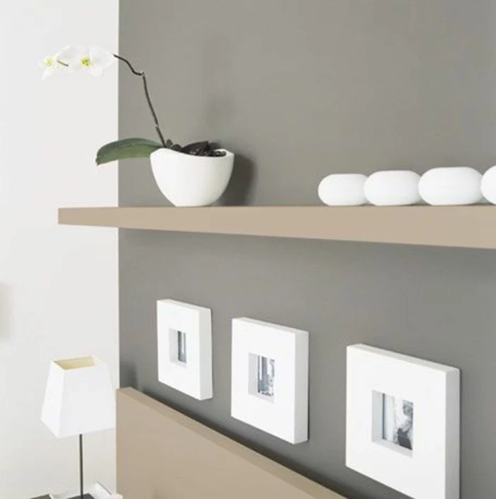
- Warm Grays (aka Greige): These have beige, taupe, or brown undertones. They just feel cozier and more inviting. There’s a reason some of these are the most popular paints out there; their warm base works in all sorts of lighting situations, giving you a neutral backdrop that never feels cold.
So, how do you actually see this hidden color? The easiest trick is to compare it to other colors. Grab your gray paint chip and hold it right next to a true, primary blue. Then a green. Then a red. The undertone will usually pop because it’ll feel related to one of the primary colors. Putting the chip on a piece of pure white paper also works wonders for revealing its true character.
Let’s Talk LRV (It’s Not as Scary as It Sounds)
Another technical thing we pros always look at is the Light Reflectance Value, or LRV. It’s just a number from 0 to 100 that’s printed on the back of most paint chips. It tells you exactly how much light a color reflects. Think of it this way: pure black is 0, pure white is 100. This isn’t about style; it’s just physics.
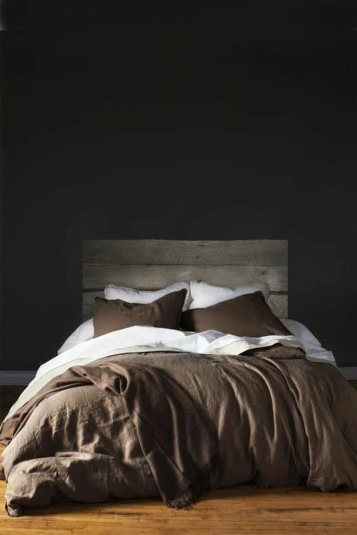
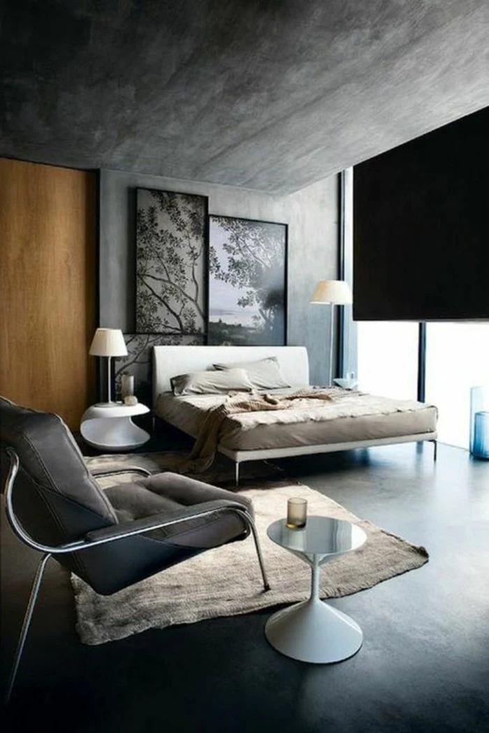
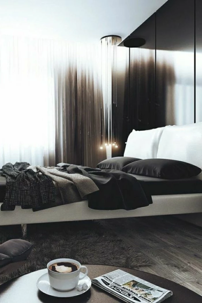
- Low LRV (0-35): These are your dark, moody grays like charcoal and slate. They soak up light, making a room feel smaller and more intimate. They’re fantastic for a dramatic accent wall, a den, or a bedroom where you want that cozy, cocooning feeling.
- Mid-Range LRV (35-60): Super flexible. This is the sweet spot that works in most rooms. These grays are clearly gray, but they don’t feel too dark or overwhelming.
- High LRV (60+): These are the light, airy grays. They bounce a ton of light around, which can make a small or dark room feel bigger and brighter. They’re a great choice for main living areas and hallways that don’t get a lot of sun.
Understanding LRV just helps you manage expectations. If you want to brighten up a dark hallway, a gray with an LRV of 25 isn’t your friend, no matter how pretty it looks on the chip.
Why Your Perfect Gray Looks… Weird at Night
Remember my client with the surprise lavender walls? That’s a real thing, and it’s called metamerism. It’s a fancy word for when a color seems to change under different kinds of light. The light from the sun, an old-school halogen bulb, and a modern LED are all made up differently, and each one interacts with the paint pigments in its own way. This is why you can never, ever, ever pick a paint color in the store and expect it to look the same in your home. It won’t. That’s why testing is not a suggestion; it’s the golden rule.
The Pro’s Method for Nailing Your Color Palette
When an interior designer or a painter helps someone with colors, we don’t just hold up a few tiny chips and hope for the best. We follow a process. And it’s a process you can easily use yourself.
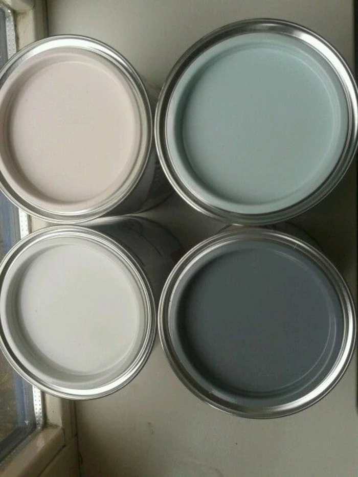
Step 1: Make BIG Sample Boards
Please, I’m begging you, do not paint little swatches directly on your walls. The color that’s already there will mess with how you see the new color. Plus, it creates a different texture that can sometimes show through the final coat, a problem we call ‘flashing’.
Here’s the pro move: make large sample boards. Go to a craft store and buy a few pieces of white foam board—at least 2 feet by 2 feet. They’re about $5 each. Then, get sample pots of your top paint choices, which usually run between $5 and $10 a pop. Paint two full coats on each board. Spending $20 on proper testing is so much better than spending $500 to repaint a room you hate.
By the way, if you hate the idea of painting boards, there are companies online now that sell pre-painted, peel-and-stick samples. They’re a fantastic alternative and make this whole process even easier.
Step 2: The 24-Hour Watch
Once your sample boards are dry, you start watching. Move those boards all around the room at different times of the day and night.
- Stick one on the wall that gets the most sun.
- Put another on the darkest wall in the room.
- At night, turn on your lamps and see what happens.
- Hold the board right next to your sofa, your wood floors, your kitchen cabinets, and your window trim. You have to see how the gray gets along with all the things that aren’t changing.
A gray that looks perfectly neutral in the morning might suddenly flash a weird blue undertone next to your warm oak floors at sunset. You have to see it in all conditions before you commit.
Step 3: Do a Quick Light Bulb Audit
The light bulbs you use have a massive impact on your paint color. Seriously. Before you make a final decision, check your bulbs. The color temperature is measured in Kelvins (K).
- Warm White (2700K – 3000K): This light is cozy and yellowish. It will bring out the warmth in a greige and can make a cool gray feel less sterile.
- Cool White / Bright White (3500K – 4100K): This light is more neutral and white, and it will make cool grays look very crisp and clean.
- Daylight (5000K+): This light has a bluish tint. It can be pretty harsh for living spaces and will seriously amplify any blue or violet undertones in your paint.
If your samples look ‘off’ at night, try swapping a light bulb before you give up on the color. Sometimes that’s all it takes.
Proven Color Pairings and Why They Work
Okay, so you’ve gotten to know your gray. Now for the fun part. I often guide clients using the 60-30-10 rule. It’s a classic for a reason: 60% of your room is your main color (the gray walls), 30% is a secondary color (think furniture, curtains, maybe a rug), and 10% is your accent (pillows, art, little decor pieces).
Quick Win: Feeling stuck on that 30%? Don’t overthink it. Look at the biggest piece of furniture in your room—probably your sofa. That’s your starting point. Now find a pillow (your 10% accent) that looks great with both the sofa and your gray sample board. Boom. You’re building a palette.
Warm and Inviting Palettes
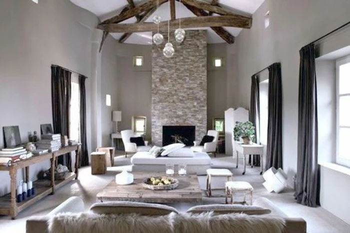
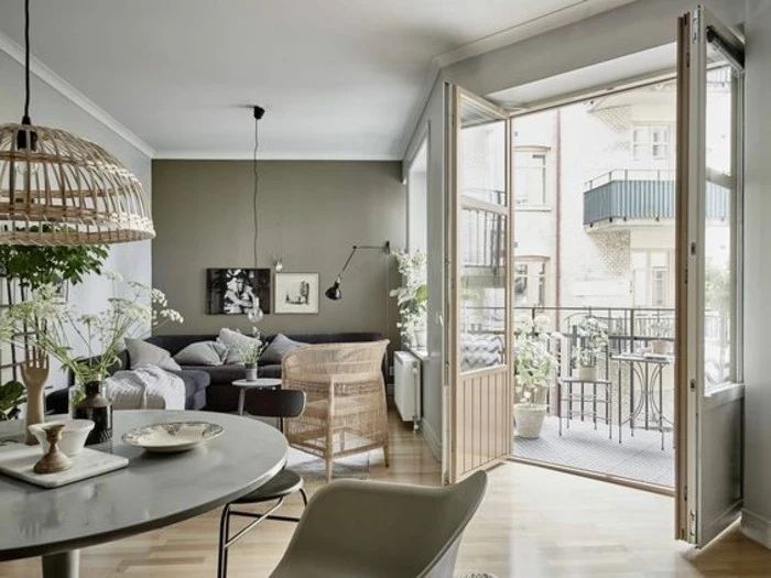
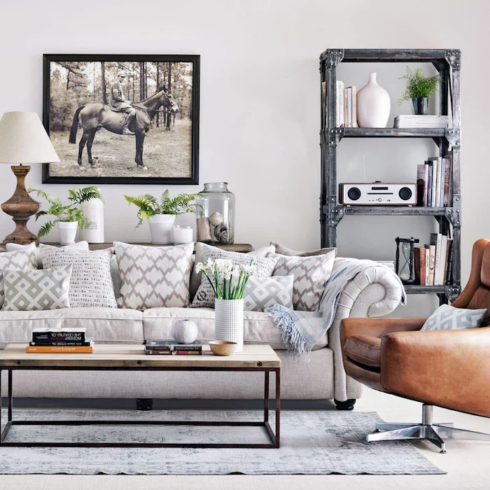
- Gray + Warm Whites & Woods: This is a slam dunk. It’s timeless. Instead of a stark, bright white for your trim, try a creamy off-white. It softens the whole look. Then, bring in natural wood tones with your furniture, shelves, or floors. The warmth of oak or walnut is a beautiful, organic balance to a cool gray.
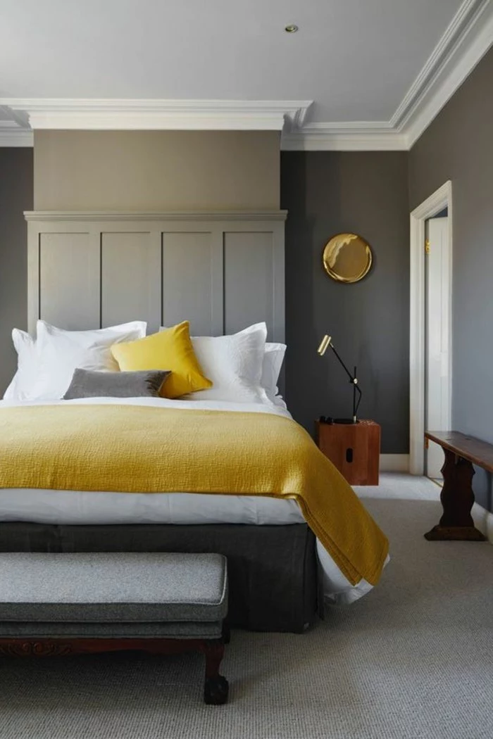
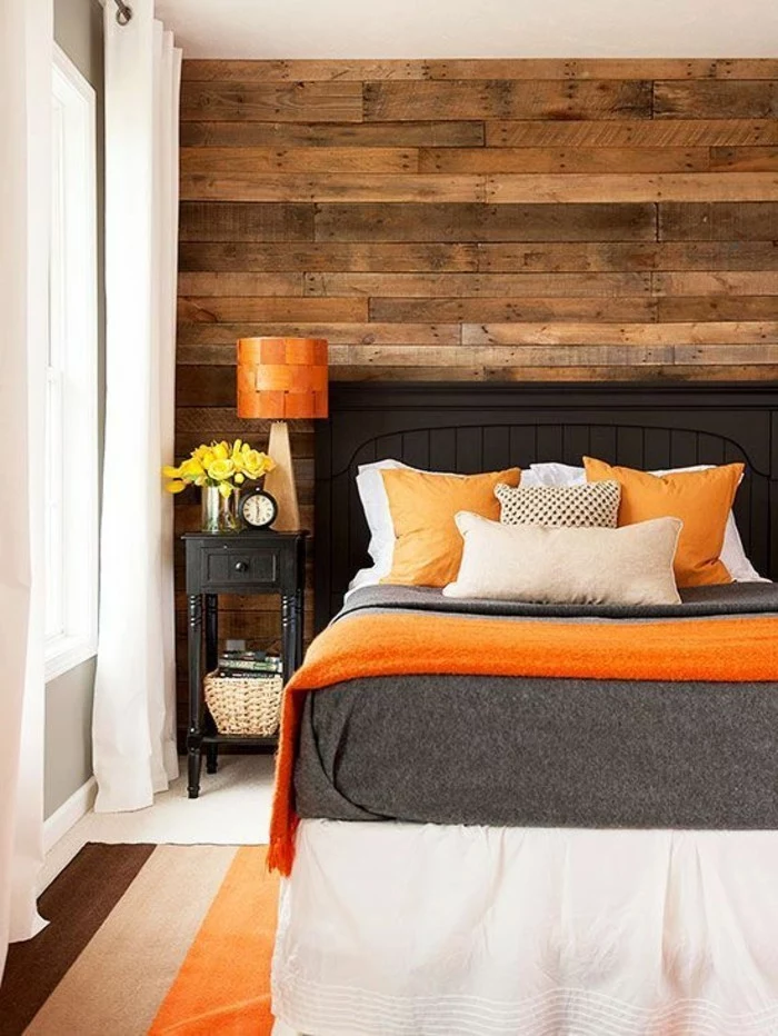
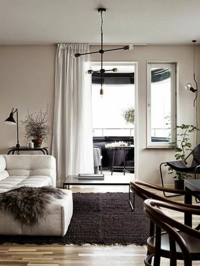
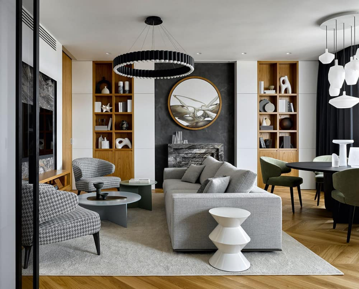
- Gray + Earth Tones: Think terracotta, rust, olive green, or mustard yellow. A dark charcoal wall with a cognac leather sofa and a few olive green pillows? That’s a sophisticated, earthy look that feels both modern and cozy.
Cool and Serene Palettes
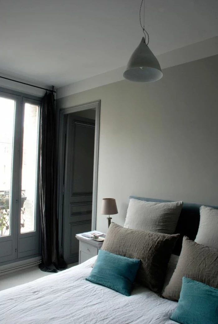
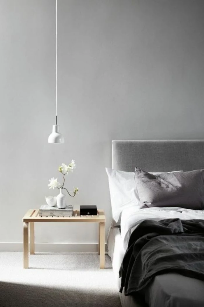
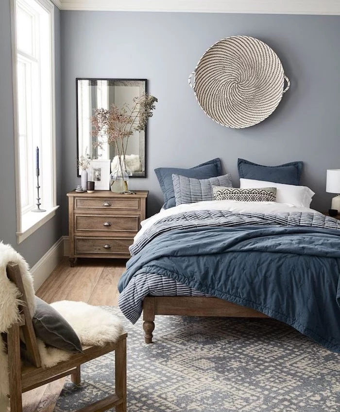
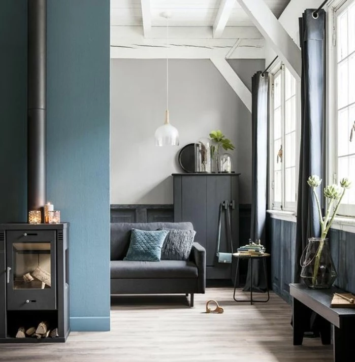
- Gray + Blues: A classic pairing for a reason. For a subtle, layered look, pair a light gray wall with shades of navy, denim, or slate blue. The key is to use different tones to create depth. It’s incredibly restful for a bedroom or office.
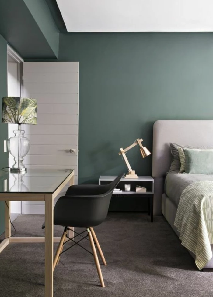
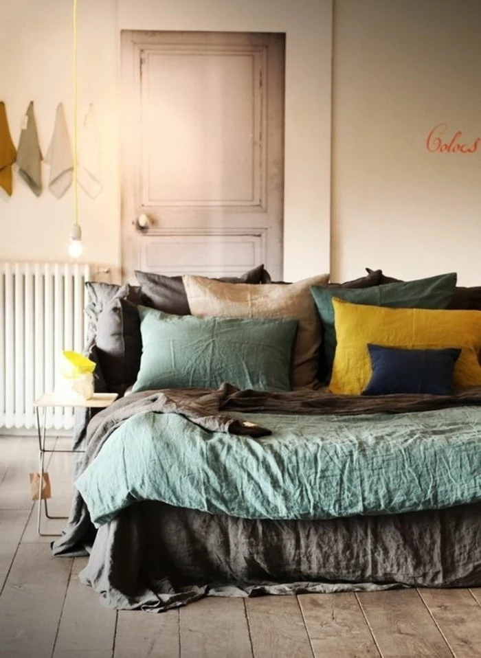
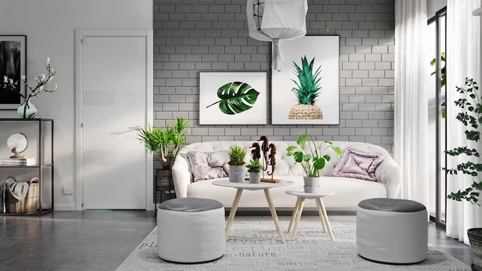
- Gray + Sage or Mint Green: Green brings a dose of nature and calm inside. A medium gray that has a slight green undertone is a perfect match for soft sage green fabrics and, of course, lots of real plants.
Dynamic and Modern Palettes
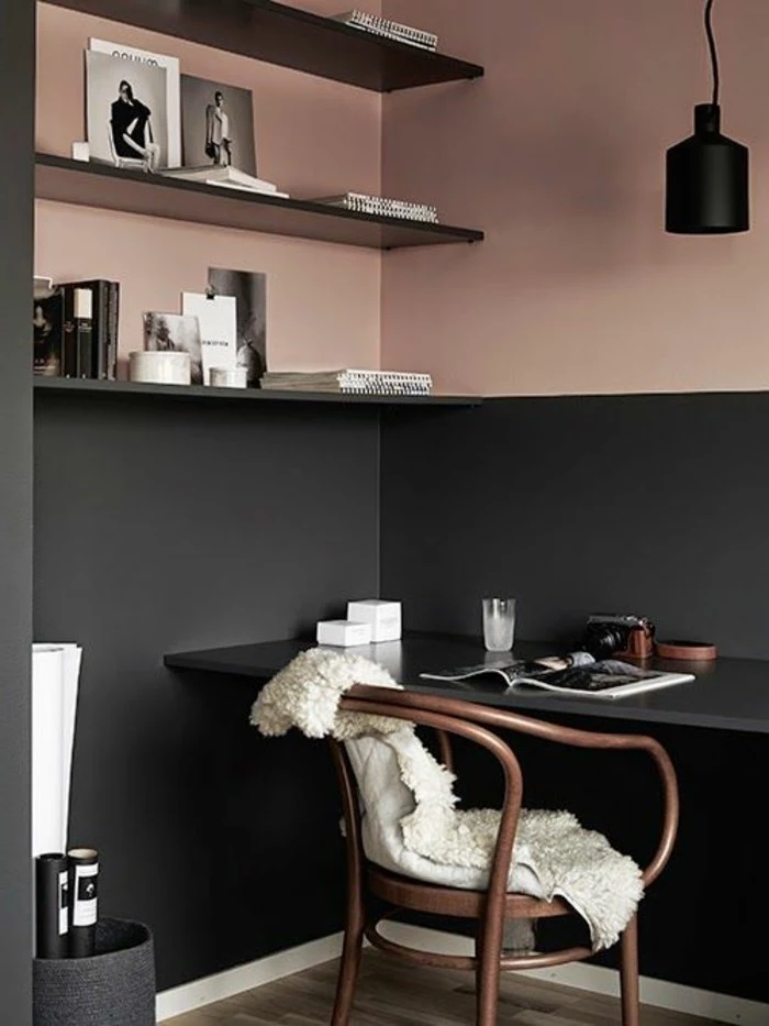
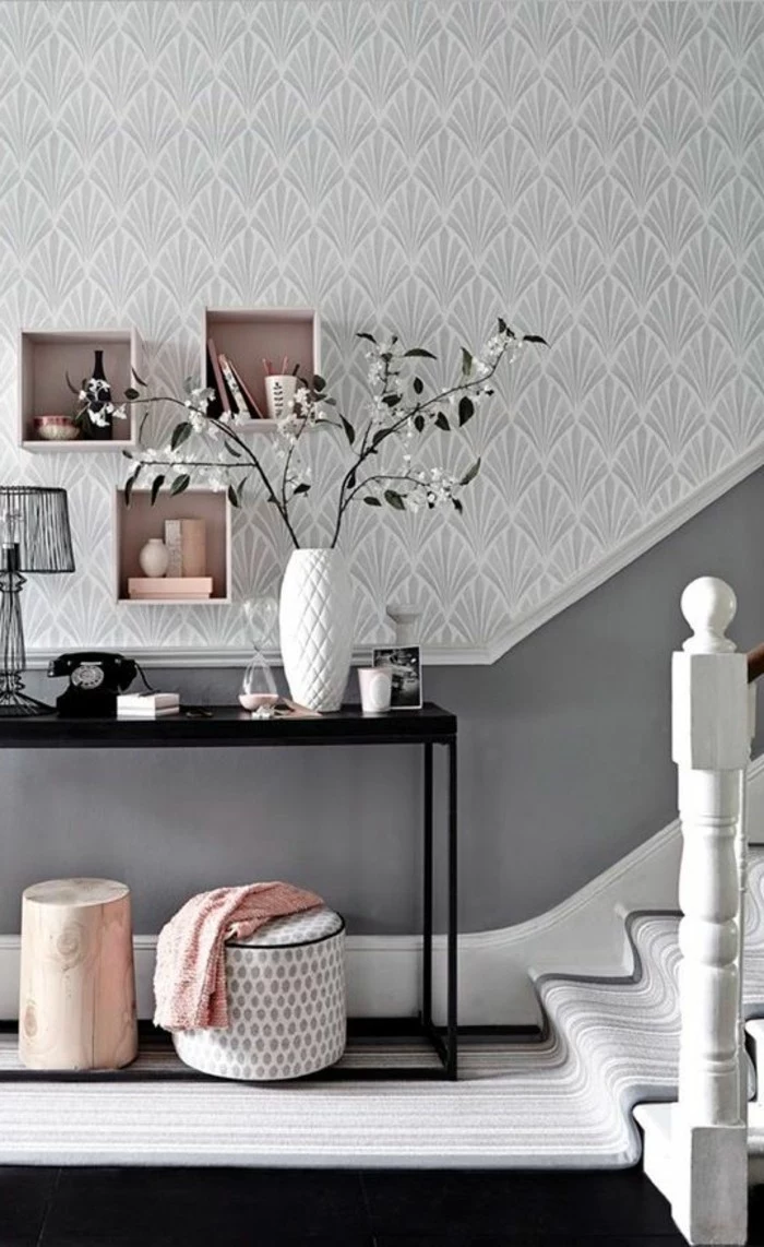
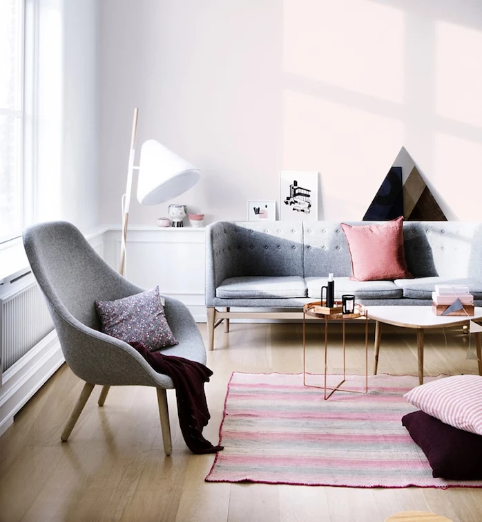
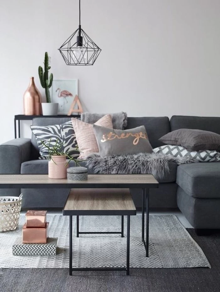
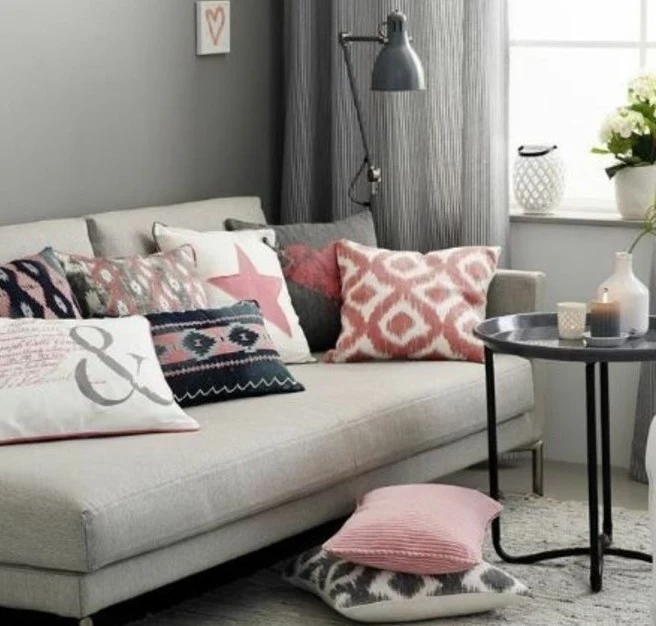
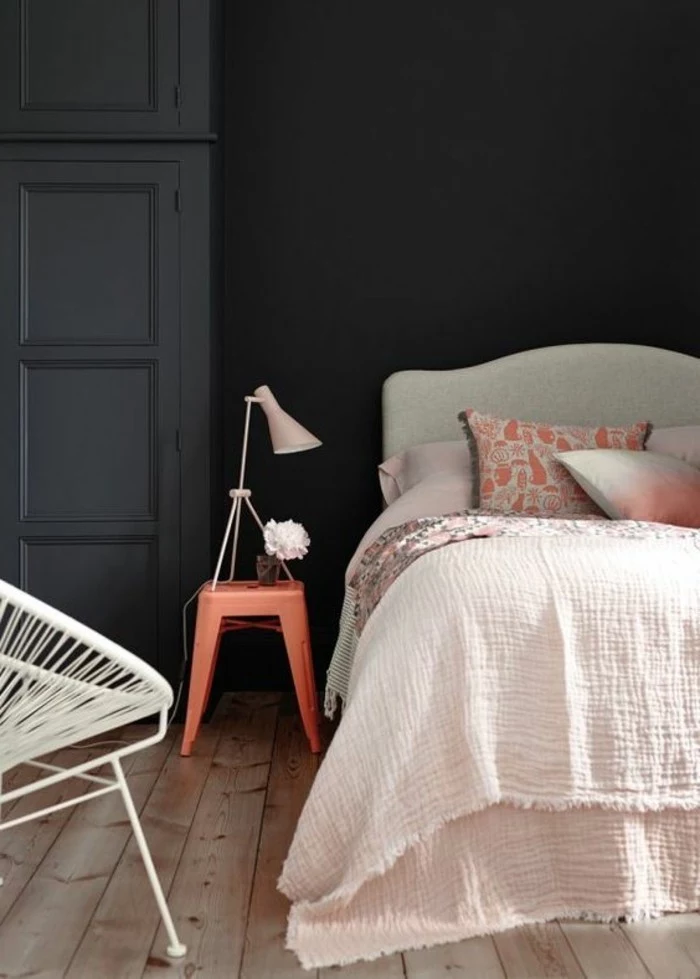
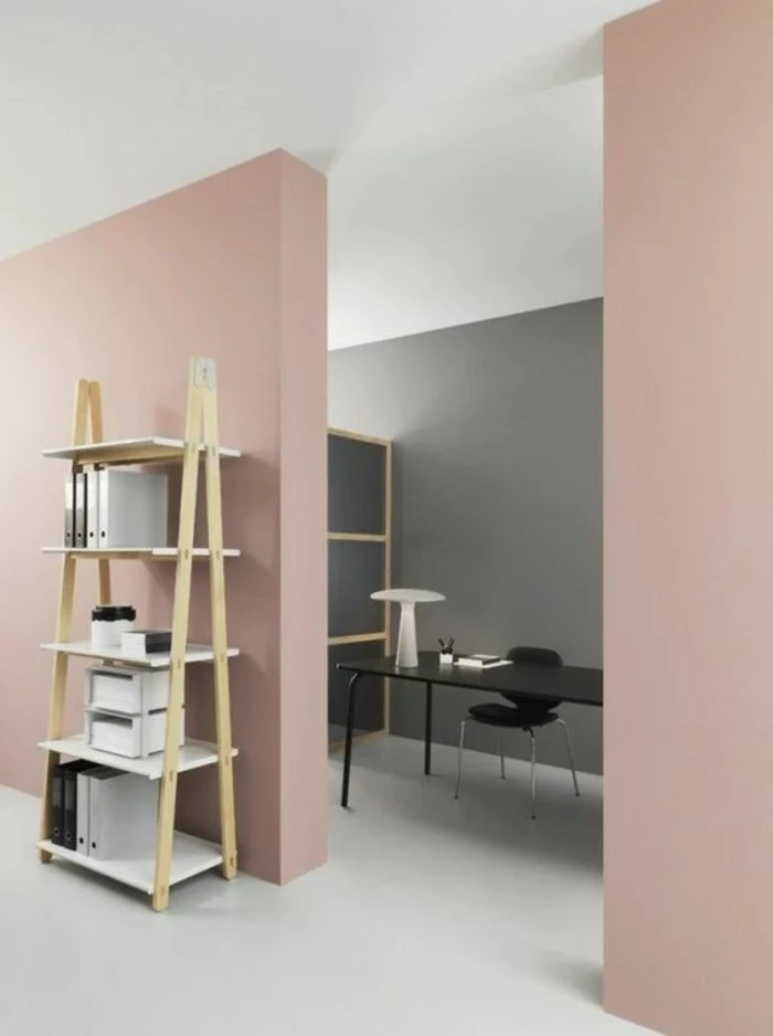
- Gray + Blush Pink: This combo has been popular for a while because it just works. A soft blush pink cuts the seriousness of an architectural gray, preventing it from feeling too industrial or masculine. The key is to use it sparingly in things like velvet cushions or a piece of art.
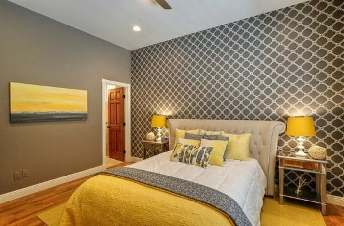
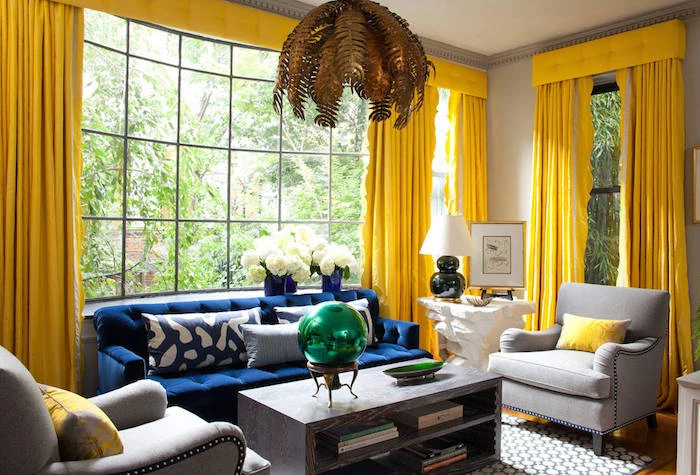
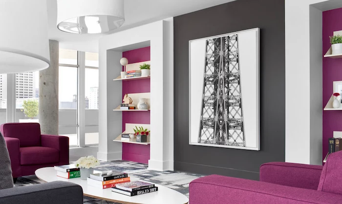
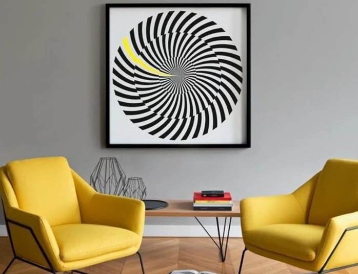
- Gray + A Bold Pop: A deep charcoal room is the perfect backdrop for a jolt of high-contrast color. Think bright yellow, a rich emerald green, or even a daring magenta. The secret is to keep that bold color contained to a few small items: a vase, a throw blanket, a single statement chair.
Prep and Paint Like You Know What You’re Doing
Even the most perfect color palette will look terrible if the paint job is sloppy. Trust me, the real work is in the prep. Plan for a full weekend for a standard room—most of day one will be just getting ready to paint.
First, a Quick Shopping List
Walking into a giant hardware store can be overwhelming. Here’s a simple breakdown:
- For Testing: A couple of foam boards, a cheap 2-inch brush, and your sample pots. That’s it.
- For the Real Job: A good quality paint, a roller frame, a couple of roller covers (a 3/8-inch nap is great for most walls), a roller tray, a high-quality 2.5-inch angled brush for cutting in edges (spend the $15, it’s worth it), painter’s tape, and drop cloths.
Safety First (Especially in Older Homes)
All paint has fumes (what we call VOCs), so you need good ventilation. Open the windows and get a fan going. But here’s the most important thing:
Heads up! If your home was built several decades ago, you must test for lead paint before you do any scraping or sanding. Lead dust is incredibly toxic. Test kits are cheap and available at any hardware store. If it’s positive, I seriously recommend hiring a certified pro. It’s just not worth the risk.
The Steps to a Pro Finish
- Clean the Walls: Wash them with a degreasing cleaner to get rid of dust and grime. Paint hates sticking to dirty surfaces.
- Patch and Sand: Fill nail holes and cracks with spackle, then sand smooth. A smooth wall is critical, especially if you’re using any finish with a shine.
- Always Prime: Primer isn’t just thin paint. It seals stains, helps your paint stick, and gives you an even base so your final color looks uniform. If you’re going from a dark color to a light gray, a tinted primer will save you a lot of headaches.
- Time-Saving Hack: I hate cleaning paint trays. Line yours with aluminum foil or a plastic shopping bag before you pour the paint in. When you’re done, you just bundle it up and toss it. Clean-up is done in 10 seconds.
A Final Thought: When to Call for Backup
You can absolutely tackle this project. By understanding undertones, testing colors in your own space, and paying attention to the details, you can create a room you’ll love. But sometimes, it’s smart to call for help. If you have a huge open-concept space with tricky lighting, or you just can’t seem to find a gray that doesn’t feel ‘off,’ a one-hour consultation with a color expert might be the best money you spend. It can run anywhere from $100 to $300, but that can easily save you from a $600 mistake.
Oh, and one last thing: a quick word on color matching. You can take a chip from one brand and have it matched at another store, but be warned—it’s never 100% perfect. Different bases and sheens can make the ‘same’ color look slightly different. For the truest color, I always recommend sticking with the original brand. Good luck!
Inspirational Gallery
- Creates a soft, ethereal glow.
- Blurs the edges of a room, making it feel larger.
- Hides imperfections on walls and ceilings.
The secret? Painting your trim and ceiling the same shade of gray as your walls, but in a different finish. Try walls in a matte or eggshell and trim in a sleek satin for a subtle, sophisticated contrast.
Don’t underestimate the power of flooring. A cool gray wall paired with warm, honey-toned oak floors will feel balanced and inviting. The same gray with a cool-toned concrete or gray tile floor can feel stark and industrial. Always place your paint swatch near the floor to see how they interact.
More than 60% of our brain is involved in processing visual information, which is why the right lighting is as crucial as the paint itself.
Your beautiful, warm ‘greige’ can turn sickly yellow under old incandescent bulbs. Switch to LED bulbs and pay attention to the Kelvin scale. A bulb around 3000K provides a soft, warm white light that is generally flattering for most gray paints, while 4000K-5000K offers a cooler, brighter light ideal for task areas.
Think beyond paint for your accent color. If you’re hesitant to commit to a bold feature wall, introduce color through textiles. A rich velvet sofa in emerald green, mustard yellow linen curtains, or a large-scale rug with deep navy blues can provide that perfect color counterpoint to gray walls without the permanence of paint.
Can you pair gray with beige or brown?
Absolutely, it’s the foundation of one of today’s most popular palettes. The key is to choose the right gray. A warm gray, often called ‘greige’ like Sherwin-Williams’
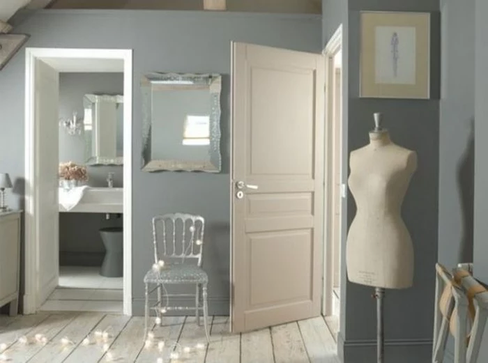
The Wrong White: A common mistake is pairing a beautiful, complex gray with a stark, sterile builder-grade white for the trim. It can create a jarring contrast that cheapens the look. Instead, opt for a softer off-white or a white that shares the same undertone as your gray.
- For a serene, biophilic feel: Try Benjamin Moore’s

To create a truly cohesive space, apply the classic 60-30-10 design rule. Your gray walls will be the 60% dominant color. A secondary color, perhaps on a sofa or curtains, should make up 30% of the room. Finally, sprinkle in 10% of a bold accent color through small items like cushions, vases, or art.

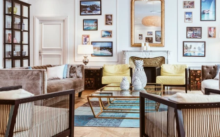
For a touch of luxury: Warm metallics are gray’s best friend. The coolness of a blue- or green-toned gray is beautifully balanced by the warmth of brushed brass, bronze, or copper. Think light fixtures, cabinet hardware, or picture frames. It’s an easy way to add instant sophistication.

Matte Finish: Hides imperfections beautifully and has a velvety, modern appearance. However, it’s the least durable and can be difficult to clean, making it better for low-traffic areas like bedrooms or formal living rooms.
Eggshell/Satin Finish: Offers a soft glow and is much easier to wipe clean than matte. It’s the go-to choice for most living spaces and hallways. Farrow & Ball’s Estate Emulsion is a classic matte, while their Modern Emulsion is the more durable, washable alternative.


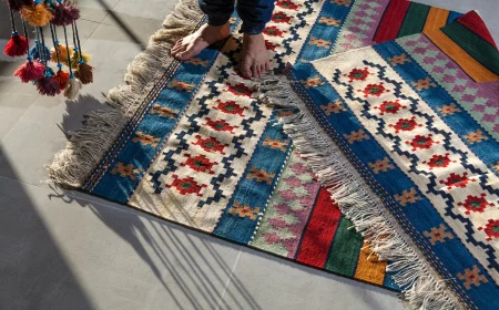
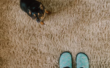
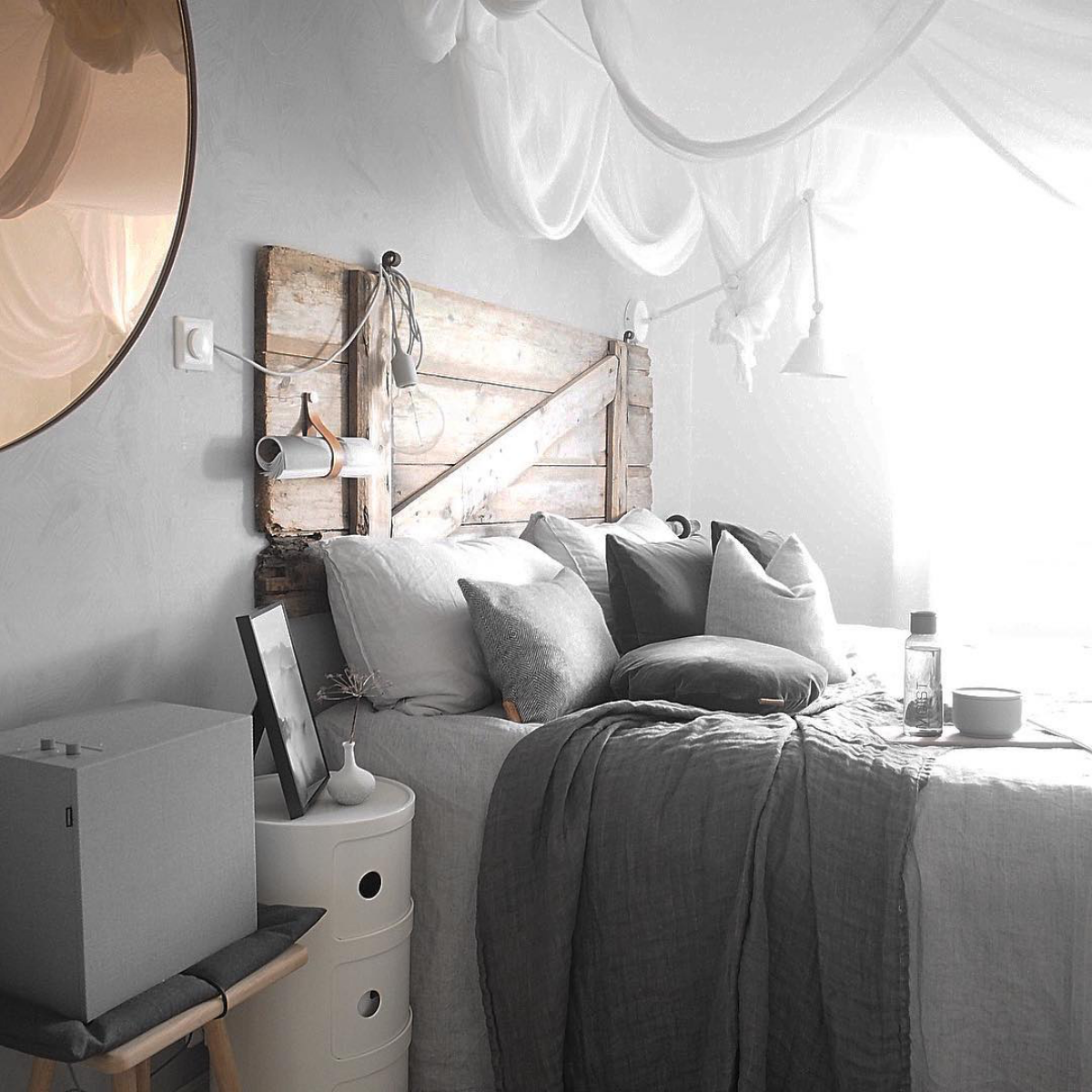
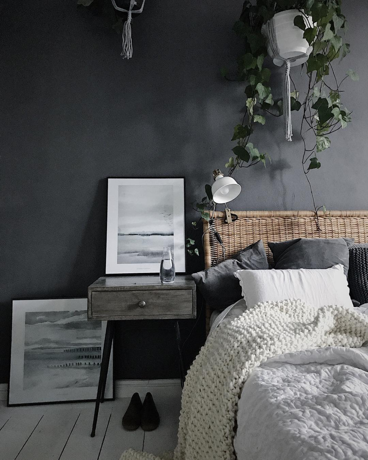
The Scandinavian secret to using gray is to layer textures. Against a flat gray wall, introduce a chunky knit throw, a fluffy wool rug, smooth leather accents, and light-grained wood. This prevents the neutral palette from feeling boring and creates a cozy, tactile environment known as ‘hygge’.

My gray looks blue in my north-facing room! How do I fix it?
North-facing rooms receive cool, indirect light that amplifies blue and green undertones in paint. Instead of fighting it, lean into it with a grayer shade that has deliberate blue or green notes. Alternatively, counteract the coolness by choosing a noticeably warm gray or ‘greige’ with strong beige or even pinkish undertones, like Farrow & Ball’s

Never, ever choose your final paint color from a phone or computer screen. Digital screens are backlit and can’t accurately reproduce the subtle undertones that are critical to getting gray right.


A tone-on-tone gray palette can be incredibly chic. The trick is to use a spectrum of shades from the same family. For instance, paint the walls a medium gray, choose a sofa a few shades darker, and use lighter grays and charcoals in your rug and accessories. It’s a minimalist approach that delivers maximum impact.
- Test in multiple locations: Paint a large swatch on the main wall, one near a window, and one in the darkest corner of the room.
- Check at different times: Observe the color in the morning, at midday, in the late afternoon, and at night under artificial light.
- Use a white backdrop: Paint your sample on a large white poster board, not directly on your old wall color, to see its true hue without interference.


For a soft, feminine, and surprisingly modern look, blush or dusty rose is a perfect partner for gray. It works with both cool and warm grays. With a dark charcoal, it feels sophisticated and romantic. With a light, airy gray, it creates a gentle, calming atmosphere perfect for a bedroom or a quiet reading nook.

Important point: The finish you choose will change the color’s appearance. A glossy finish will reflect more light and can make a gray appear lighter and cooler than its matte counterpart. Always get a sample pot in the exact finish you plan to use for the most accurate test.


- A feeling of calm and serenity.
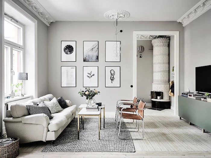
- A timeless backdrop that highlights art and furniture.
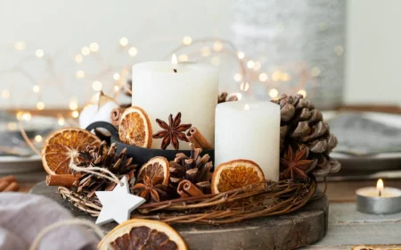
The secret? Look to nature. Pairing gray with deep forest greens, earthy browns, and natural textures like stone and wood creates a grounding, organic atmosphere that feels both modern and restorative.

Want to go bold in a small room?
Don’t be afraid to use a dark charcoal gray in a small space like a powder room or study. Contrary to popular belief, a dark color can make a room feel more intimate and dramatic, blurring the corners and creating a sense of depth. Pair it with a large mirror and good lighting to keep it from feeling claustrophobic.

Did you know that Benjamin Moore’s
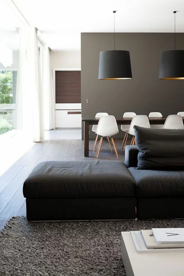
For an urban, graphic look, nothing beats the combination of gray, black, and white. Use a mid-tone gray on the walls, then introduce sharp black accents through metal-framed furniture, window frames, or picture frames. Crisp white trim and ceilings will keep the look fresh and prevent it from feeling too heavy.

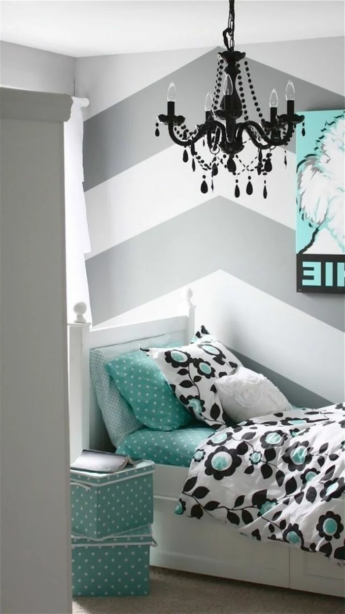
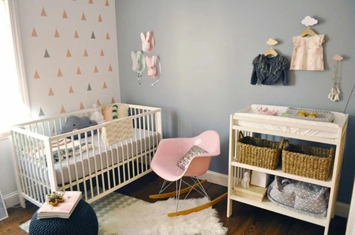
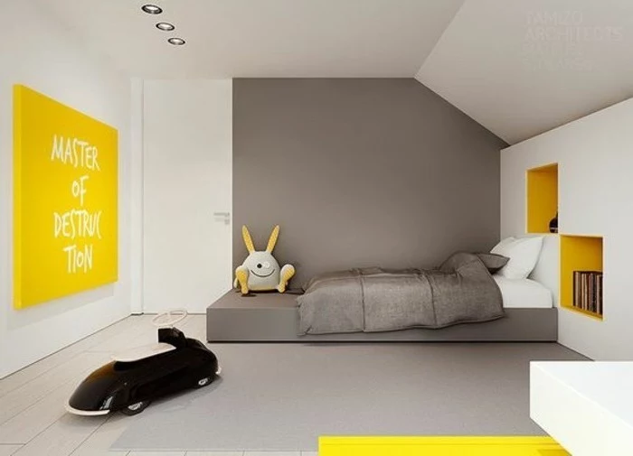
For a child’s room: A medium gray provides a fantastic neutral base that can evolve with your child. Start with playful accents like coral, teal, or sunny yellow. As they grow older, you can easily swap these out for more sophisticated colors like navy or olive green without ever having to repaint the entire room.

High-End Look: Farrow & Ball’s
The architectural trend of ‘Japandi’—a hybrid of Scandinavian function and Japanese rustic minimalism—relies heavily on gray. To get the look, pair soft gray walls with natural materials like bamboo, light-toned wood, and paper light fixtures. The palette is muted and calm, focusing on craftsmanship, simplicity, and the beauty of natural imperfections.