Valentine’s Backgrounds That Don’t Suck: A Pro’s Guide to Finding & Making Them
Alright, let’s talk about Valentine’s Day visuals. For years, I’ve been in the trenches of design, and this holiday is always a fascinating challenge. It’s built on a visual language so strong—hearts, roses, red, pink—that it can easily tip over into being, well, a bit cheesy.
In this article
The real goal isn’t just to use these symbols, but to use them with a little bit of style and intention. It doesn’t matter if you’re a business owner trying to make a nice social media post or just someone who wants a phone background that feels special, not generic.
You could just google an image and call it a day, sure. But once you understand the why behind a good design, you get so much better at picking one out. It’s like learning a few key cooking techniques; you suddenly know why one recipe shines and another falls flat. This guide is packed with things I’ve learned in the studio, from mentoring new designers, and honestly, from my own design fails. (I once created a moody, romantic piece that a client said looked more like a horror movie poster. Ouch. Lesson learned: context is everything!)
So, let’s get into the stuff that makes a visual feel genuinely romantic, not just like a stock photo.
The (Not-So-Secret) Science of a Romantic Vibe
Great design rarely happens by accident. It’s all about tapping into how our brains react to color, shape, and space. For a theme like Valentine’s, these principles are working overtime to create a feeling of warmth and connection. Once you get them, you’re in control.
The Psychology of the Color Palette
Color is your most powerful tool here. It hits us with emotion way faster than any words or shapes can. And while red and pink are the stars of the show, how you use them changes the entire story.
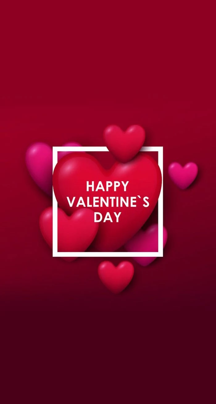
- Passionate Red: This color is all about love, passion, and urgency. It literally gets the heart pumping and grabs attention. A deep, rich crimson feels mature and intense, while a bright cherry red is more fun and energetic. A quick tip from my experience: flooding an entire image with pure red can be really overwhelming. I prefer to use it as a powerful accent—like a single red element against a calmer background. It just hits harder that way.
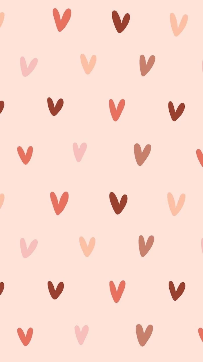
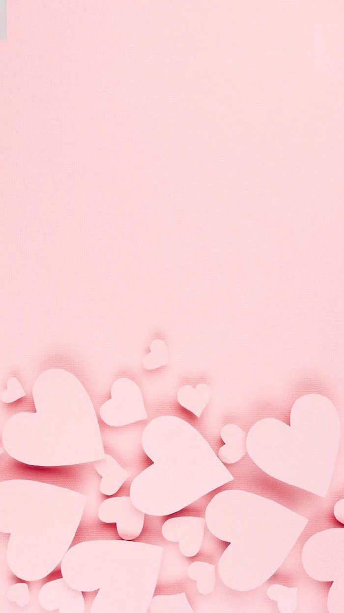
- Tender Pink: Think of pink as red’s gentler cousin. It carries all the romance but without the intensity. Soft, pastel pinks feel innocent and sweet. Bolder shades like magenta or hot pink bring a modern, confident vibe. To be frank, some of the best designs I’ve seen pair a deep red with a soft pink. It tells a more complete story, showing both the passionate and the gentle sides of affection.
- The Supporting Cast (Neutrals): You need neutrals to make your main colors shine. A crisp white makes reds and pinks feel clean and modern. An off-white or cream adds a vintage, cozy warmth. And don’t sleep on dark backgrounds! A charcoal gray or even black can add a layer of drama and sophistication, making a single pink or red detail feel incredibly luxurious.
A common mistake I see all the time is throwing too many bright colors together. It just creates visual noise. The pro approach is usually a limited palette: two main colors and a neutral. It looks intentional and feels cohesive.
Symbolism: Thinking Beyond the Candy Heart
The symbols of love are ancient, but you can definitely use them in fresh ways. Their power is that everyone gets them instantly.
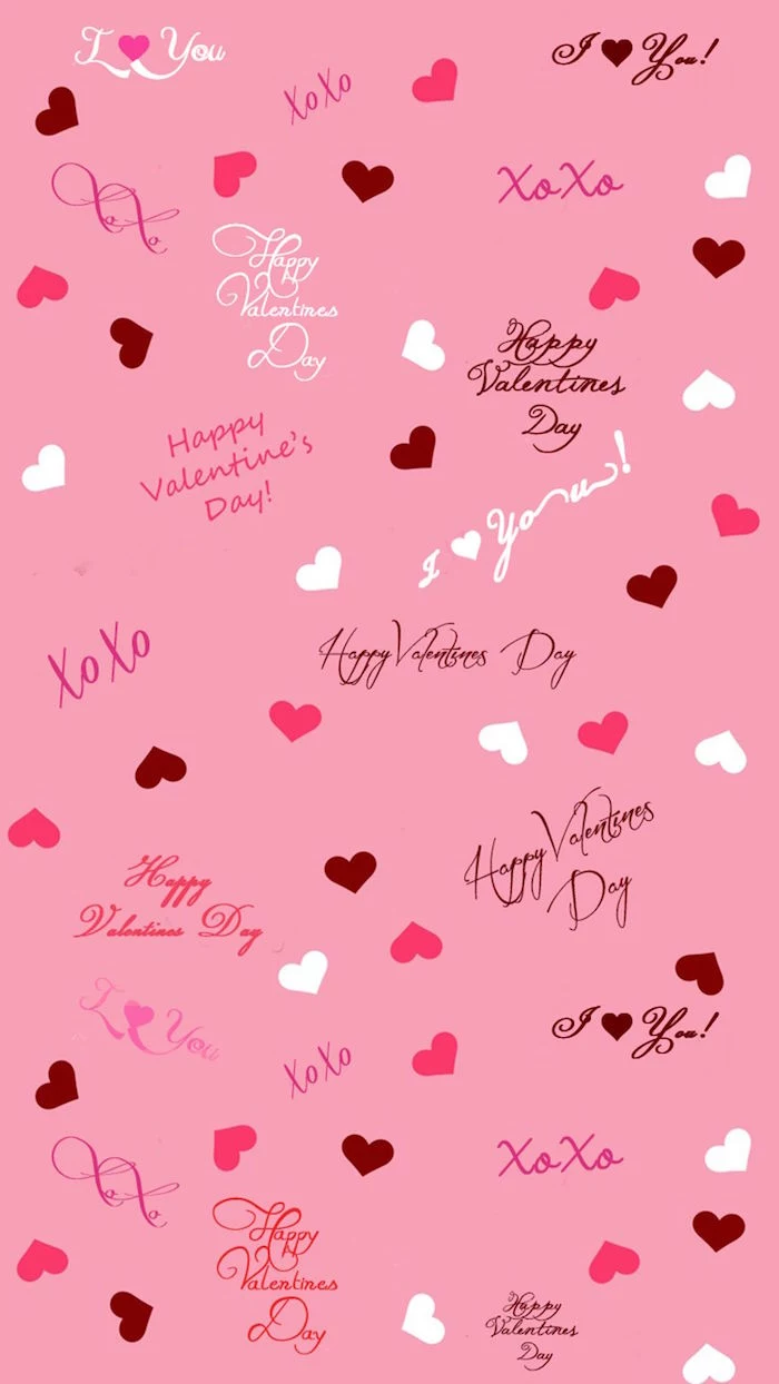
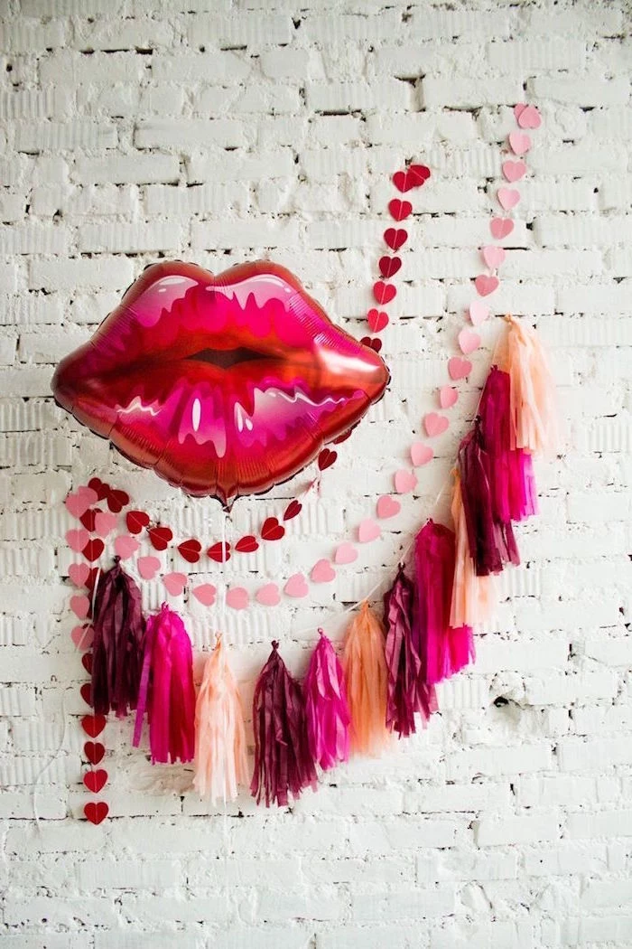
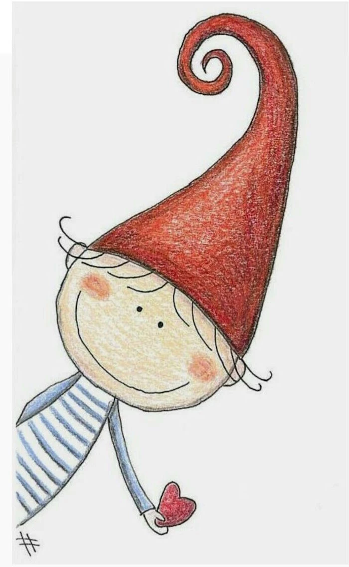
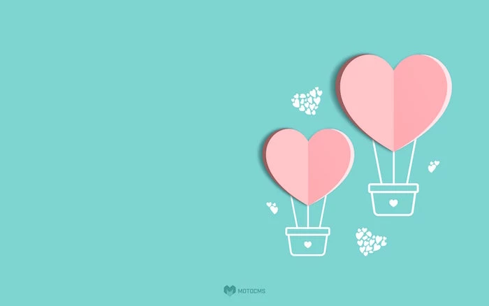
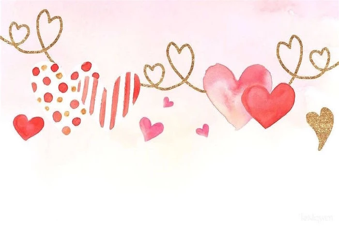
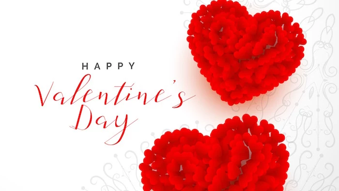
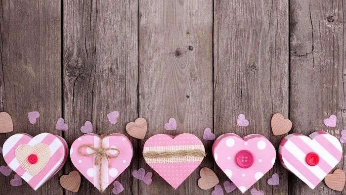
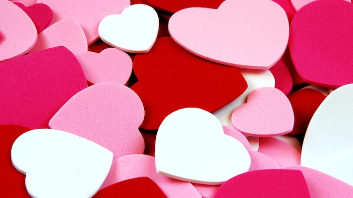
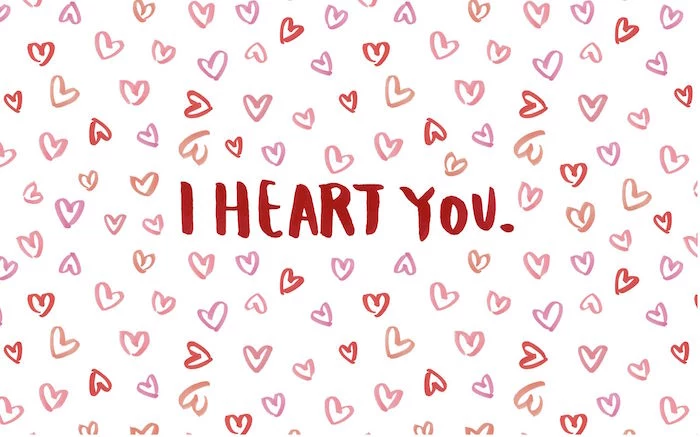
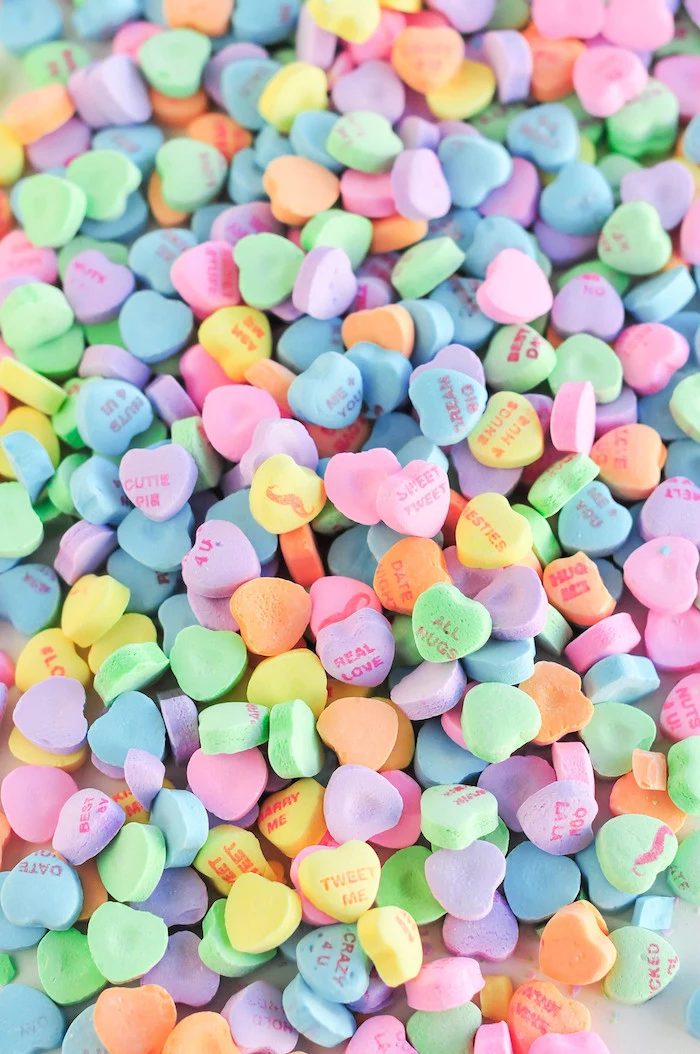
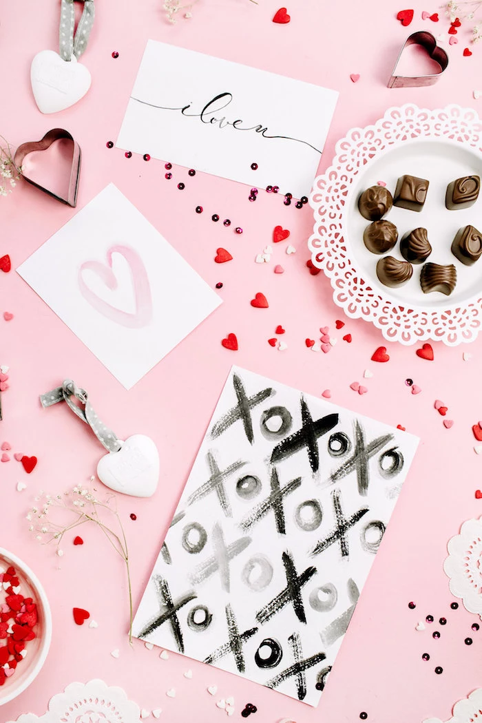
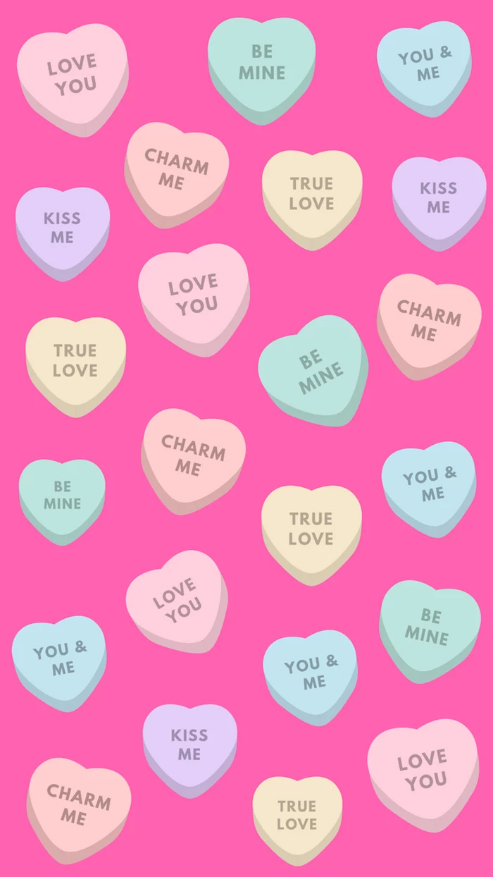
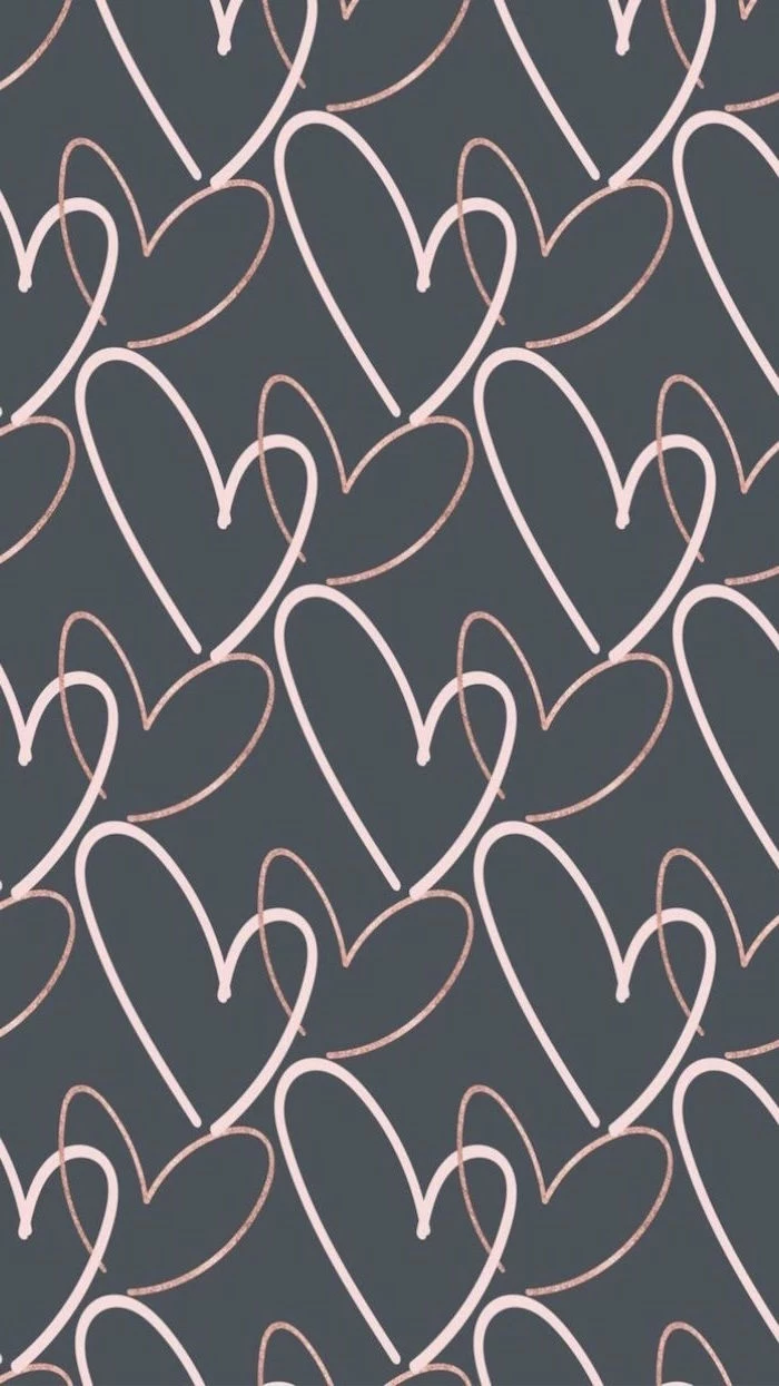
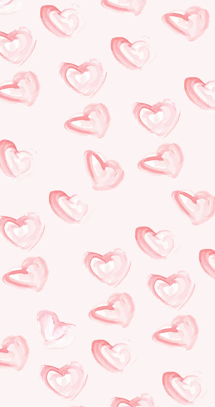
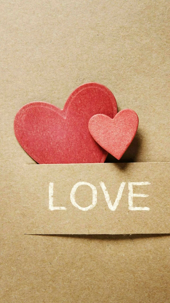
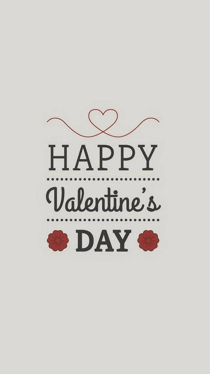
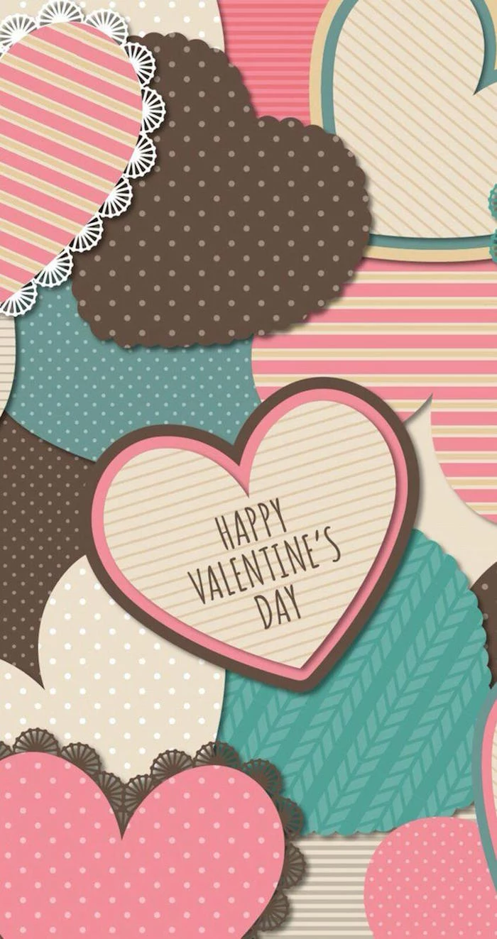
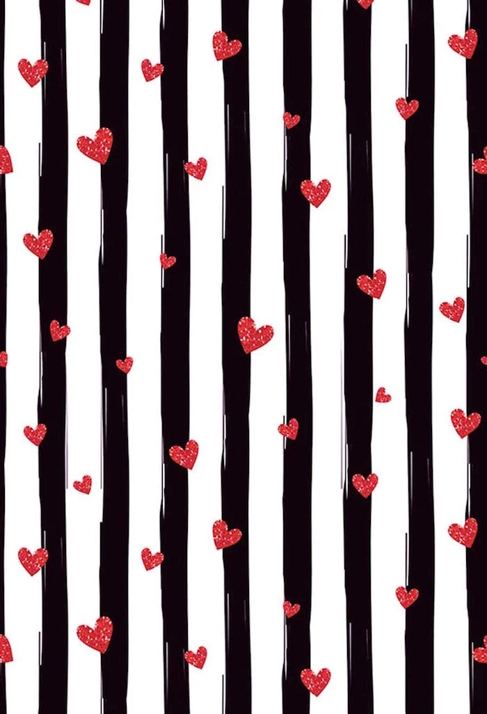
- The Heart: The classic, symmetrical heart is a graphic icon, not an anatomical one. It stands for a clean, idealized version of love. You can use it as a bold centerpiece, a repeating pattern, or even a super subtle watermark. For a more modern or edgy take, some designers use anatomical heart illustrations. They suggest a more raw, visceral kind of love, which can be really powerful for the right audience.
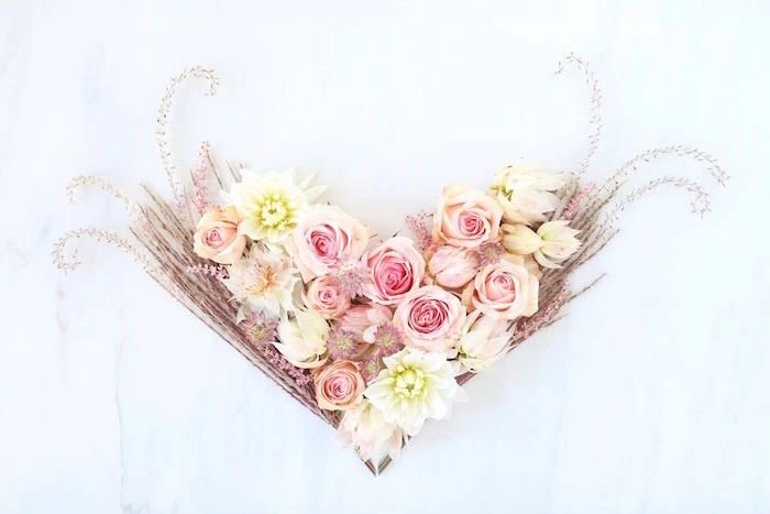
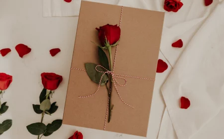
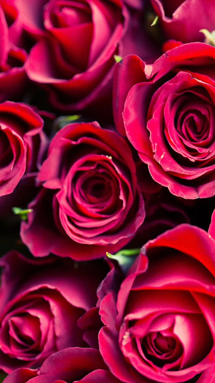
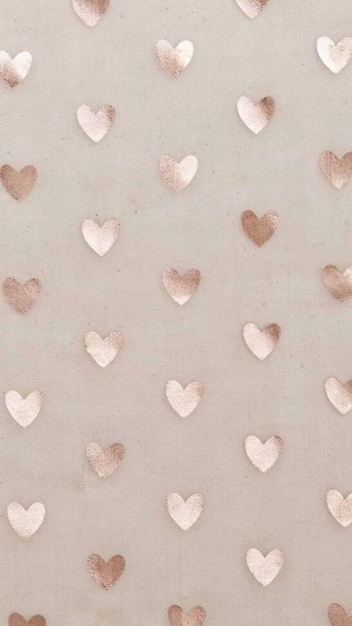
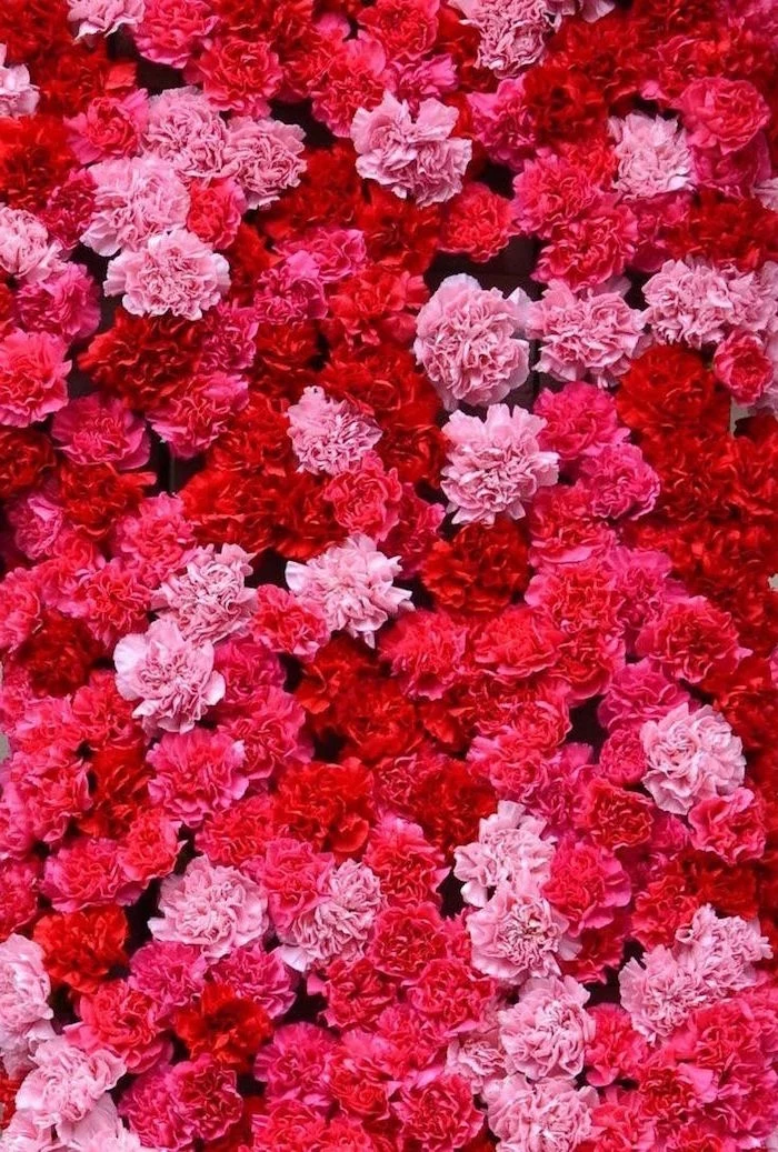
- Flowers, Flowers, Flowers: A red rose is the default, but other flowers have their own language. Tulips can represent a declaration of love, while daisies suggest innocence. Using a less-common flower can make your design feel way more unique and personal. The state of the flower matters, too—a small bud can feel like new love, while a full bloom suggests something more established.
- Cupid and Arrows: Let’s be honest, this one can feel a bit old-fashioned or kitschy. I’d typically steer clear of it for a modern design unless you’re intentionally going for a retro or classical vibe. If you do want to nod to the theme, a stylized, minimalist arrow is a much cooler, more subtle way to do it than a full-on cherub.
Pro Techniques for Making (or Choosing) Great Visuals
When I start a new design, I don’t just wait for a lightning bolt of inspiration. I follow a process and apply a set of techniques to build the mood I’m going for. You can use these exact same ideas to judge an existing background or even create a simple one yourself.
Arranging Things for Emotional Impact
How you place elements in an image is called composition, and it’s what directs the viewer’s eye and sets the mood.
- The Rule of Thirds: This is a design 101 classic for a reason. Imagine your screen has a 3×3 grid on it. By placing your main subject (like a flower or some text) along those lines or where they cross, you create a much more dynamic and interesting image than just sticking it in the dead center. A centered object feels static; an off-center one feels more natural.
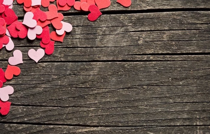
- Negative Space is Your Friend: The empty space around your subject is just as important as the subject itself. Generous negative space gives the main element room to breathe and creates a feeling of calm and focus. Heads up! This is especially important for phone or computer backgrounds. You need clean areas where your app icons or files can sit without turning your screen into a cluttered mess. I often look for photos with a clear subject on one side and a soft, out-of-focus area on the other.
- Leading Lines: Use lines within the image to guide the eye. This could be the stem of a rose, a trail of petals, or the edge of a piece of furniture. These lines create a sense of flow and draw attention right where you want it.

Adding Depth with Texture and Light
A flat digital image can feel cold. Texture and light are what bring it to life and make it feel almost touchable.
- Soft vs. Hard Light: The lighting changes everything. Soft, diffused light (think: an overcast day) creates a gentle, dreamy feel with minimal shadows—perfect for romance. Hard, direct light (like a bright, sunny day) creates high contrast and sharp shadows, which gives you a more dramatic, high-impact look.
- That Blurry Background Thing (Bokeh): “Bokeh” is the term for that beautiful, out-of-focus blur you see in the background of professional photos. It often looks like soft, glowing circles of light. A background with nice bokeh instantly makes the subject pop and adds a touch of magic. It’s a dead giveaway of a quality photograph.
- Adding a Sense of Touch: I often overlay subtle textures on my digital designs to give them more character. A fine paper or linen texture can make a graphic feel warmer and more tangible. Oh yeah, here’s a lesser-known trick for that. In a tool like Canva, it’s super easy: upload a texture image (you can find these on sites like Pexels), place it over your design, and then find the “transparency” slider. Dial it down to somewhere between 5-15%. It adds a subtle, professional touch without being distracting.

When Your Words Are Part of the Design
If you’re adding text, the font choice is a huge deal. The right font boosts the message; the wrong one totally undermines it.
Instead of a formal chart, think of it this way:
- Serif fonts, the ones with the little “feet” on the letters, feel traditional, classic, and elegant. Think timeless romance.
- Sans-serif fonts, the ones with clean, modern lines, feel straightforward and friendly. They’re great for a contemporary, clean vibe.
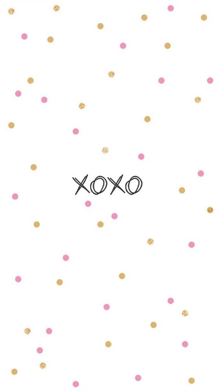
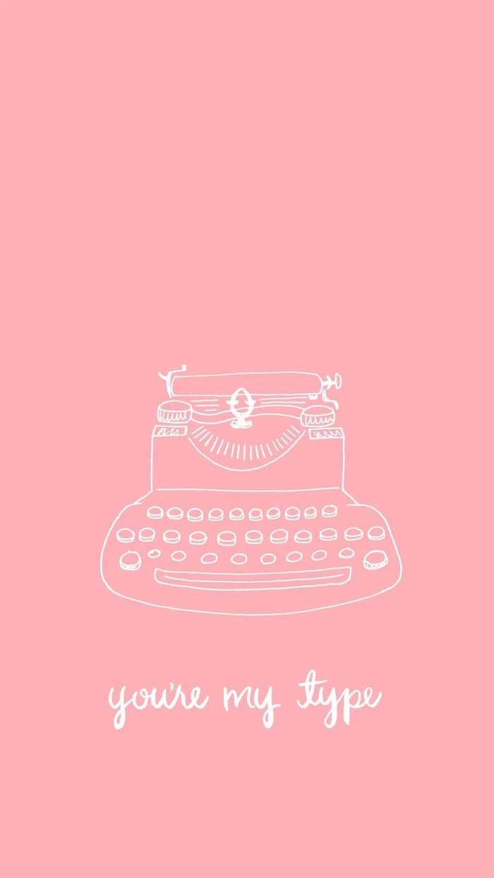
- Script fonts mimic handwriting and feel very personal and intimate. But be careful! They can be hard to read, so they’re best for short, punchy words like “Love” or “XOXO,” not long sentences.
And if you have more than one line of text, create a clear hierarchy. Make the main message big and bold, and the secondary info (like a quote or a name) smaller and lighter. It just makes it easier for people to read.
My Go-To Toolbox (and Common Mistakes to Avoid)
Okay, theory is great, but you probably want to know what to do right now. Here are the tools I actually use and recommend, plus some common pitfalls to watch out for.
My Quick-Start Toolkit:
- For Free Photos & Videos: Pexels and Unsplash are my top two. The quality is fantastic, and the licensing (mostly CC0) is a lifesaver. You can use the images for free for personal or commercial projects.
- For Easy Design & Templates: Canva is the undisputed king for non-designers (and a lot of designers, too!). The free version is incredibly powerful. The Pro version, which runs about $13/month, gives you access to a huge library of stock photos, fonts, and other elements.
- For Great Free Fonts: Google Fonts is a massive library of high-quality, free-to-use fonts.
- For Checking Accessibility: I always run my text and background colors through a contrast checker to make sure people with visual impairments can read them. WebAIM’s Contrast Checker is simple, free, and excellent.
Quick Win: Your 30-Second Background
No time? I get it. Go to Unsplash and search for “abstract gradient red pink.” You’ll find a beautiful, icon-friendly phone background in about 30 seconds. Done.
Top 4 Rookie Mistakes to Avoid:
- Using a Low-Resolution Image. It will look blurry and pixelated on your high-res screen. It just screams unprofessional.
- Choosing an Unreadable Font. That super-fancy, loopy script font might look pretty, but if no one can read it, it’s useless.
- Forgetting About Your Icons. A super busy background will make your apps impossible to find. Remember: negative space!
- Clashing Your Brand. If you’re a business, don’t just slap a generic red-and-pink graphic on your feed if it doesn’t match your vibe. Try pairing just one festive color with your existing brand colors for a classier look.
A Quick Note on Cultural Differences
It’s good to remember that Valentine’s isn’t the same everywhere. In Japan, for example, the visual focus is often on beautiful chocolates that women give to men. A month later, on “White Day,” men reciprocate. The visuals change accordingly, with more white and silver tones.
And in many parts of Latin America, it’s the “Day of Love and Friendship,” so the celebration includes friends and family, not just romantic partners. The imagery is often broader, showing groups and symbols of friendship. It’s just a good reminder that visual language has a cultural context.
The Final Word on Copyright (Please Read This!)
Okay, this is the serious part, but it’s probably the most important advice in this whole guide. Never, ever just grab an image from a Google search for any public or commercial use. Seriously. Most of those images are copyrighted.
I personally know a small business owner who pulled a photo from a random blog for a social media post. A few weeks later, they got a demand letter from a major stock photo agency for thousands of dollars. It happens, and it’s awful.
Your Safe Options Are:
- Public Domain (CC0): These are images you can use for anything, no strings attached. Pexels and Pixabay are great sources for this.
- Royalty-Free Licenses: This is what you get from paid stock sites like Adobe Stock or Getty Images. You pay a one-time fee (maybe $10-$30 for a single image credit) to use the image in multiple ways. Just read the license to see if there are any restrictions.
- Create Your Own: The safest bet is always to take the photo or create the graphic yourself. Then you know you own it 100%.
At the end of the day, a background or a graphic is a tiny piece of communication. But when it’s done with a bit of thought and skill, it can make a big impact. Hopefully, these tips help you create something that not only looks good but feels right, too.
Inspirational Gallery

Don’t underestimate the power of texture. A perfectly flat color can look sterile and digital. Try adding a subtle paper or canvas texture overlay in an app like Procreate or Photoshop. Even a fine ‘noise’ or ‘grain’ filter can add depth and a tactile quality, making your background feel more organic and high-end.

Looking for a sophisticated, non-traditional color scheme?
Move beyond the expected red and pink. A palette of deep burgundy, soft cream, and a touch of metallic gold creates an atmosphere of mature romance and luxury. Another striking combination is dusty rose paired with a cool sage green, offering a modern, earthy take on the theme. These unexpected pairings immediately set your visual apart.
- A unified, professional color scheme.
- Perfectly balanced visual harmony.
- An end to clashing colors.
The secret? Use a palette generator. Upload an image you love to a free tool like Adobe Color or Coolors.co. It will automatically extract the dominant colors, giving you a perfect, ready-to-use palette for your design. It’s the fastest way to achieve a professional look.
JPG (or JPEG): Your go-to for photographs. This format is great at compressing complex images with lots of colors, keeping file sizes small. Perfect for a background photo of roses or a romantic landscape.
PNG: The champion of transparency. Use this format for graphic elements like a heart icon or text that you want to place on top of another image without a white box around it. It keeps sharp lines crisp.
For an animated touch that isn’t distracting, think subtle. A simple GIF can elevate your design immensely. Imagine text with a gentle ‘flicker’ effect or tiny, softly pulsing hearts. Tools like Canva offer easy animation options, while pros can use Adobe After Effects to create beautifully fluid, cinematic motion graphics that capture the eye.
Important: Resolution is non-negotiable. Using a beautiful but low-resolution image is the quickest way to make a design look amateur. For a phone wallpaper or an Instagram Story, aim for a canvas size of at least 1080 pixels wide by 1920 pixels tall. This ensures your background looks sharp and clear, not pixelated or blurry, on modern screens.
Want to create a quick, custom background on your phone? Try these steps in an app like Canva or Adobe Express:
- Start with a ‘Phone Wallpaper’ template.
- Search in the ‘Elements’ library for abstract terms like

Is a dark background a good idea for Valentine’s Day?
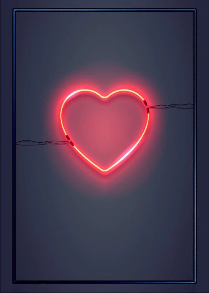
Absolutely. In fact, it can be more impactful. A deep charcoal grey, rich navy blue, or even a soft black background creates a sense of intimacy and drama. It makes bright accents like a single red heart or a metallic gold script pop with intensity, resulting in a sophisticated and moody aesthetic that feels very grown-up.

A 2023 study on design trends showed a 45% increase in searches for

Embrace the abstract. Instead of a literal, perfectly formed heart, suggest the shape. This can be more artistic and intriguing. Think of a swirl of red paint from a brushstroke, the soft focus of bokeh lights forming a heart-like glow, or the natural curve of two swan necks meeting. It evokes the feeling without relying on the cliché.

For a truly unique and authentic touch, scan a real object. A pressed flower from a meaningful bouquet, a snippet of a handwritten letter, or a piece of textured lace. Use a mobile app like Adobe Scan to capture it. The subtle shadows and real-world imperfections add a layer of sincerity that digital graphics can’t replicate.


- Playful & Cute: Use rounded, bubbly fonts like ‘Fredoka One’. Pair them with simple, hand-drawn style illustrations and a bright, candy-colored palette.
- Elegant & Luxe: Opt for high-contrast serif fonts like ‘Playfair Display’ or graceful scripts. Combine with high-quality photos, metallic textures, and a deep, rich color scheme.
The term ‘Kitsch’ originated in the 1860s to describe cheap, popular, and sentimental art.
While the article helps you avoid it, intentionally embracing kitsch can be a style in itself! Think over-the-top glitter, cheesy 8-bit hearts, and clashing pinks and reds. For a playful, ironic, or retro-themed message, leaning into the cheese can be a bold and memorable choice.


Sometimes, the background is simply the typography itself. A single, beautifully chosen word or short phrase can be incredibly powerful. Find a stunning font on a site like MyFonts or even Font Squirrel, type out

The Anti-Valentine’s Vibe: Not feeling the lovey-dovey stuff? Create a background that reflects that. Use a monochrome palette, spiky ‘black metal’ inspired fonts, or sarcastic phrases. Imagery like a anatomical heart, a wilted rose, or a broken heart emoji can create a witty, alternative aesthetic that connects with a whole different audience.
Create breathing room. One of the most common design mistakes is overcrowding the space. Negative space—the empty area around your text and images—is a powerful tool. A single, well-placed element on an otherwise empty background often feels more confident and sophisticated than a dozen elements competing for attention.
Where can I find unique icons that don’t look like generic clip art?
Instead of a basic search, get specific. On sites like The Noun Project or Flaticon, search for styles like
- A vintage, handmade feel.
- A touch of historical romance.
- A design that stands out from digital perfection.
The inspiration? Old-world charm. Look at historical Valentine’s cards from the Victorian era or medieval manuscript illuminations. The slightly imperfect, hand-drawn hearts and intricate floral motifs can inspire a beautifully unique and timeless background.
According to a Shutterstock report, searches for ‘line art’ and ‘minimalism’ have consistently grown over the last five years.
This trend is perfect for an understated Valentine’s background. A single, continuous line drawing of a face profile, intertwined hands, or a flower is elegant and modern. It communicates the theme without visual noise, creating a calm and sophisticated mood.
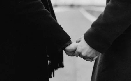
Photography can be more evocative than graphics. Forget stock photos of smiling couples. Think closer. A macro shot revealing the velvety texture of a single rose petal, the intimate detail of two hands gently holding, or the soft focus on steam rising from two coffee mugs side-by-side. It’s about capturing a moment, not just a symbol.
Light & Airy: This style uses bright, natural light, soft shadows, and a desaturated or pastel color palette. It feels optimistic, gentle, and fresh. Perfect for a sweet, daytime romance vibe.
Dark & Moody: This style embraces deep shadows, rich colors, and dramatic, focused lighting (chiaroscuro). It creates a sense of intimacy, passion, and mystery. Ideal for an elegant, evening-themed design.

To add a touch of instant luxury, incorporate a metallic element. It doesn’t have to be overwhelming. A few flecks of digital gold foil, text rendered in a reflective rose gold, or a simple heart outlined in silver can elevate the entire design. Search for

- Grainy Gradients: Soft, blurred color fields with a vintage film grain effect are very current.
- Minimalist Typography: Bold, simple text as the main design element.
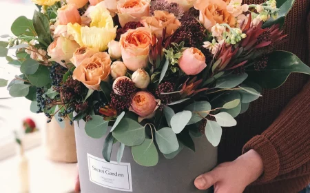
- Nature-Inspired: Close-up, detailed photos of flowers, like the peonies in the gallery.
A key to great design: Visual hierarchy. Decide what the single most important element of your background is. Is it a photo? A date? A single word? Make that element the largest, boldest, or most centrally located. Everything else should be secondary, supporting the main star. This guides the viewer’s eye and makes your message clear and impactful.