Your Guide to a Cozier Home This Winter (It’s All About Color & Texture)
I’ve noticed that when winter rolls around, a lot of us instinctively reach for the same old blacks and grays. It’s like we feel the season demands a quiet, muted mood. But honestly, I think that’s a huge missed opportunity. The low, cool light of winter can make colors sing in ways they just can’t during the bright glare of summer. It’s not about chasing a trendy color palette for one season; it’s about understanding a few key ideas about light and texture to make your home and your wardrobe feel genuinely comforting, year after year.
In this article
I remember helping someone with a living room in an old city apartment. They had chosen this beautiful, warm beige for the walls that looked incredible in photos. But in the reality of a northern winter, the room just felt… sad. The cool light was completely neutralizing the warmth in the paint, making it look flat and muddy. So, we switched gears completely. We went with a deep, warm gray and brought in pops of cranberry and rich cream. The whole room came alive. The key was to work with the winter light, not fight it. And that’s the secret sauce right there.
Why Colors Look Different in Winter (It’s Not Just You!)
Okay, before we get into the fun stuff like picking colors, we have to talk about the light itself. In winter, the sun is lower in the sky. Its light has to travel through more of the atmosphere, which scatters the shorter, blue wavelengths. What does that mean for you? It means winter light has a distinctively cool, almost bluish tint, especially on overcast days. This isn’t just a vibe; it’s physics, and it dramatically changes how we perceive color.
A color that looks perfectly normal in the warm, yellowy light of summer can suddenly look dull or even a little dirty in winter. That cool light can bring out any hidden blue or green undertones. It’s the reason a seemingly neutral gray can suddenly look lavender, or a nice taupe can take on a sickly green hue. Understanding this is the first step to choosing colors that will actually look good from November through March.
Oh yeah, and let’s not forget about artificial light, because it gets dark at 4:30 PM! When you’re choosing light bulbs, look for the color temperature, measured in Kelvin (K). For that warm, cozy, candle-lit feeling, you’ll want bulbs around 2700K. Anything higher (like 4000K+) will give off a cooler, more bluish light that can make your cozy colors feel sterile.
Building Your Foundation with the Right Neutrals
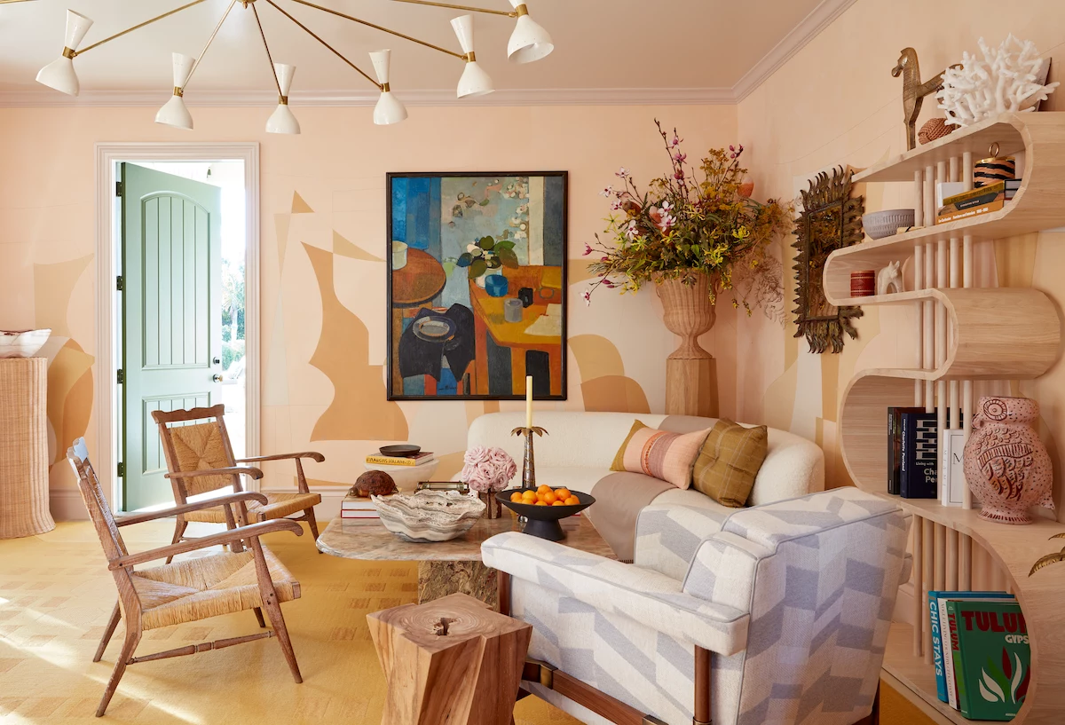
A great winter palette isn’t about a bunch of flashy colors. It’s built on a solid foundation of versatile neutrals. These are the workhorses for your bigger investments, like a coat, a sofa, or the paint on your walls. Think of them as the steady beat that lets the fun accents do their thing.
Beyond Black: The Power of Charcoal
So many of us default to black in the winter. It’s easy, sure, but it can also be incredibly harsh. Pure black can drain the color from your face, especially in the pale light of the season. For years, I’ve been a huge advocate for charcoal gray instead. It has all the versatility of black but with a softer, more sophisticated vibe.
Let’s break it down. Black is dramatic and crisp, perfect for small accents like picture frames or when you need that sharp contrast. But a whole black sofa can feel like a black hole that sucks all the light out of a room. Charcoal, on the other hand, feels more grounded and soft. A charcoal felt sofa (you can find great ones at places like Article or Crate & Barrel) anchors a room without overwhelming it. It’s a bit more forgiving and pairs beautifully with pretty much any color you throw at it.
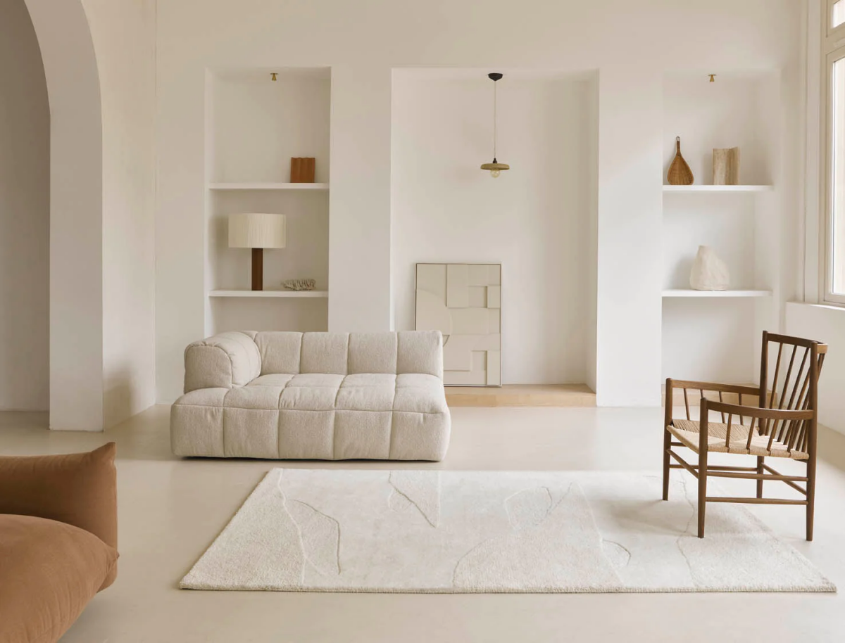
Warmth in White: Why Cream & Ivory Win
Pure, stark white can be stunning, but it can also feel really cold and clinical, especially if your style is more minimalist. I almost always steer people toward off-whites like cream, ivory, or alabaster. These shades have a tiny drop of yellow or beige in them, and that little bit of warmth makes all the difference.
Try This Now: Grab a few off-white paint chips from the hardware store and hold them up against a plain sheet of printer paper near a window. You’ll immediately see the undertones pop! Is it a warm, creamy yellow? A soft pink? For winter, that warm undertone is your best friend. It makes a space feel bright but also cozy, like you’re wrapped in a thick, cream-colored wool blanket. You can find some amazing ones on a budget at places like H&M Home or splurge a bit at a store like Pottery Barn.
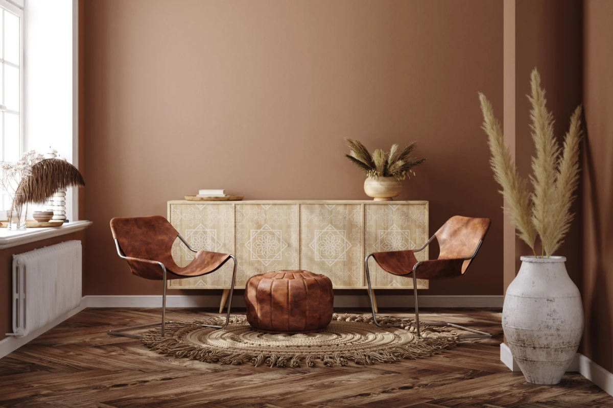
A Softer Darkness: Espresso & Chocolate
Browns are fantastic because they connect us to the natural world—wood, soil, leather. They offer a rich, warm alternative to black and gray. The trick is to find a brown with the right undertone for your space. An espresso brown is very deep and has an almost-black coolness that feels modern and chic. A warmer chocolate or cocoa brown has reddish undertones, making it feel super cozy and traditional. It’s a perfect match for cranberry reds and forest greens.
I remember a client who was convinced she couldn’t wear brown. It turned out she’d only ever tried yellowish, khaki-toned browns that washed her out. The moment she tried on a deep chocolate brown cashmere sweater—one with cool, reddish undertones—her whole face lit up. So never write off a whole color family; you probably just haven’t found your shade yet.
Let’s Talk Accents: How to Add a Pop of Color
Once your neutral base is set, it’s time for the fun part: accent colors. These are for your pillows, scarves, art, or that one cool armchair in the corner. You don’t need a rainbow; just pick one or two that you love.
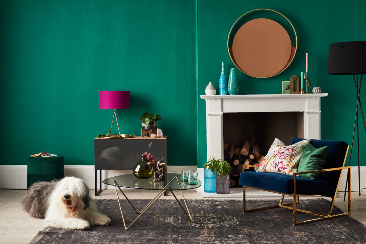
Quick Tip for an Instant Refresh: Want the fastest way to make a room feel cozier for the season? Just add one thing in a rich texture and a jewel tone. Seriously, that’s it. Think about a forest green velvet pillow cover, which you can snag for around $25 at World Market or HomeGoods. Or maybe a chunky burgundy knit throw. It’s the simplest, most effective way to add that perfect pop of warmth.

For Energy: The Jewel Tones
When everything outside is gray, rich jewel tones bring life indoors. These saturated colors are strong enough to hold their own against the cool winter light.
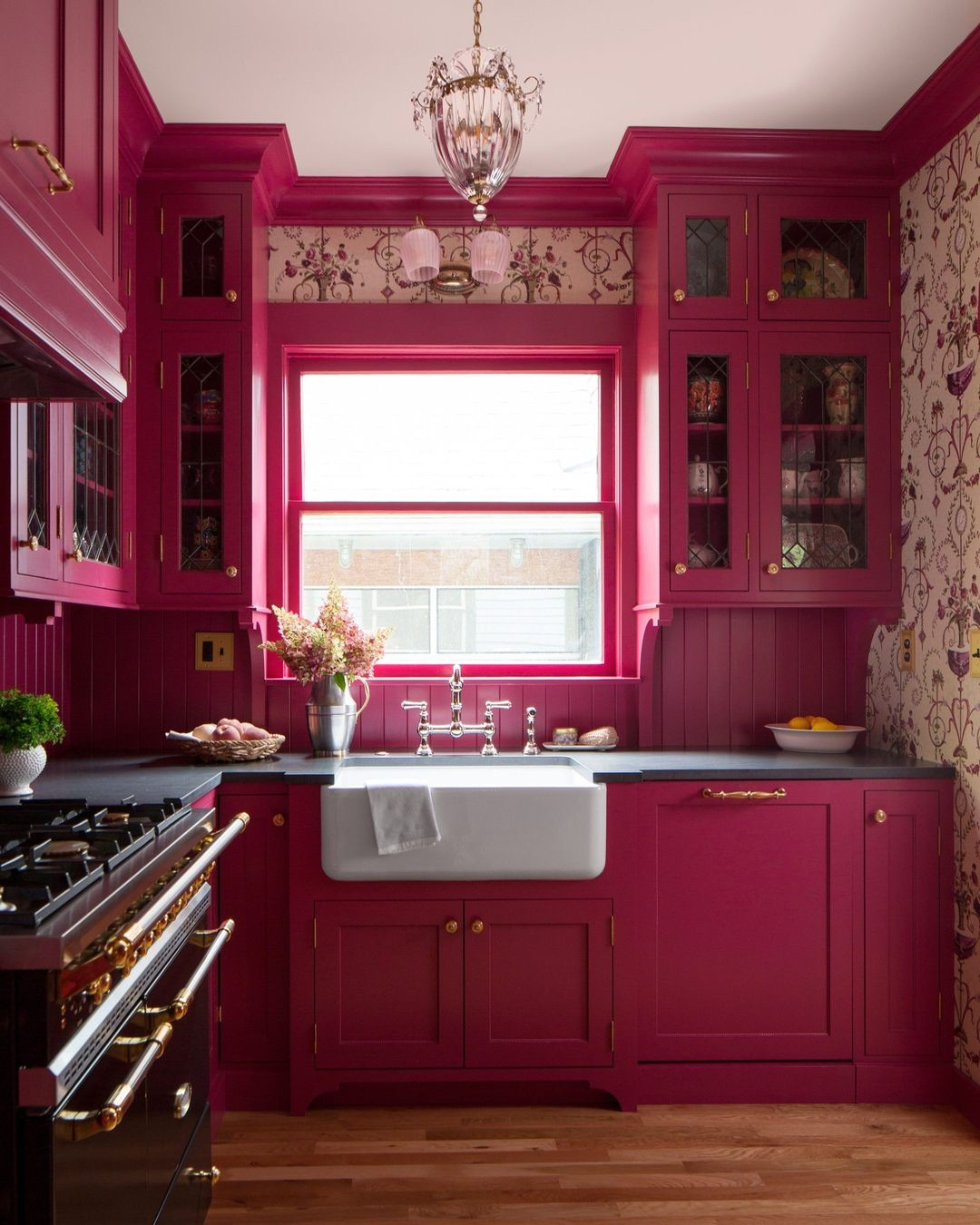
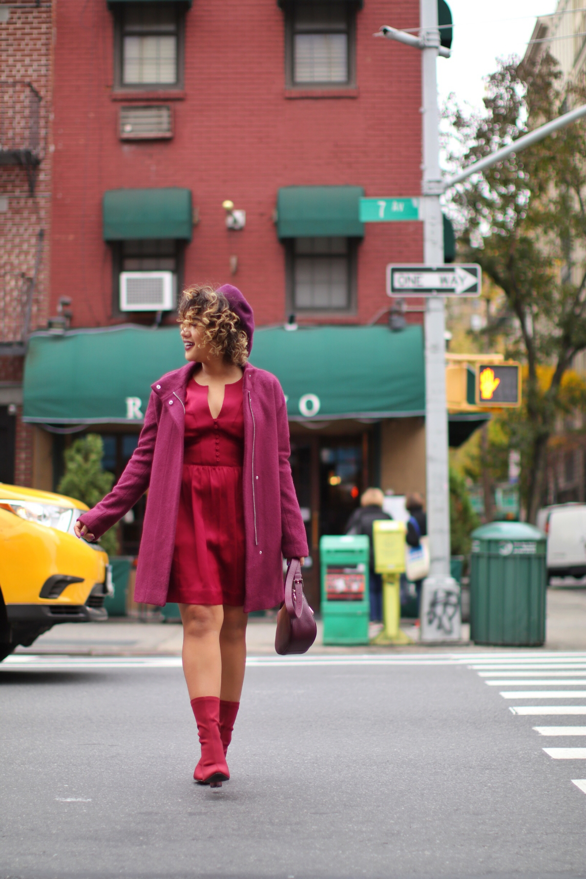
- Cranberry & Burgundy: These reds are the heart of a winter palette. They feel like warmth, holidays, and comfort all rolled into one. Texture is everything here—a burgundy velvet pillow looks totally opulent, while the same color in a matte linen feels more rustic.
- Forest & Emerald Green: In the middle of winter, our eyes are desperate for green. Bringing a deep forest green into your home taps into that primal need for nature. It’s incredibly grounding. A quick heads-up for painters, though: green paint is notoriously tricky. A north-facing room can pull out its blue undertones and make it feel chilly.
Pro Tip for Testing Paint: Please, please do not just paint a small square directly on your wall! It will never give you a true read. Instead, get a sample pot and paint a big poster board with two coats. This way, you can move it around the room and see how the color looks in the morning, in the afternoon, and at night next to your sofa. It takes an extra 30 minutes but can save you hundreds of dollars and a ton of regret.
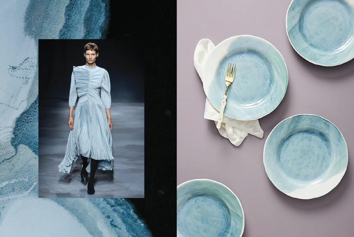
For Light & Clarity: The Icy Hues
Instead of fighting the cold, why not lean into it? Icy colors mimic the crisp beauty of a winter landscape and can make a dark space feel brighter and more open.
- Icy Blue & Silver: These colors are amazing at reflecting light. An icy blue throw on a charcoal sofa can instantly lift the mood. The key is to pair these cool colors with warm, soft textures. A silver silk top might feel a bit chilly, but an icy blue cashmere sweater? Perfection.
- A Note on Metallics: Silver, brass, and other metallics are fantastic accents. They catch the light beautifully on things like lamp bases or picture frames. Just be practical—some metallic fabrics can be a pain to clean and show water spots easily, so always check the care label before you buy.
Putting It All Together Like a Pro
Knowing the colors is one thing; combining them is another. Here are a few timeless, no-fail ways to create a palette that looks amazing.
The Monochromatic Move
This is probably the most elegant and foolproof method out there. You just use different shades and textures of a single color. Imagine an outfit: a dark charcoal wool coat, a medium-gray sweater, and a light silver-gray scarf. It’s all gray, but the different textures and shades make it look incredibly chic and put-together. It adds depth without adding chaos.
The 60-30-10 Rule
This is a classic design guideline that just plain works. My go-to cozy living room recipe often looks something like this:
- 60% Dominant Color: This is your main background, usually the walls. A warm, creamy off-white (think a shade like Sherwin-Williams’ Alabaster) is a great, versatile choice.
- 30% Secondary Color: This is for your bigger furniture pieces, like the sofa and chairs. This is where that solid, grounding charcoal gray comes in.
- 10% Accent Color: This is where you have fun! Use it for pillows, throws, art, and other little details. This would be your pop of cranberry red or forest green.
This simple ratio keeps a room from feeling messy and gives your eyes a clear, calming path to follow.

Final Thoughts: It’s Your Space, Your Rules
At the end of the day, the advice for someone living in a snowy climate is going to be different than for someone in a place with mild, sunny winters. The quality of your light and your surroundings are everything.
If you’re surrounded by snow and gray skies, those deep, saturated colors provide a welcome and necessary dose of cheer. A bright red door on a house just feels right. But in a place where the winter light is still strong and the landscape is full of warm earth tones, that same red might feel a bit loud. The most important thing is to look around, see what colors and textures make you feel good, and start there. Trust your gut—it’s usually right.
Galerie d’inspiration
“The fifth wall is the most important one. Painting the ceiling a colour other than white instantly adds intimacy and cosiness.” – Joa Studholme, Colour Curator for Farrow & Ball
It’s a trick designers swear by for a reason. In winter, when we crave sanctuary, a stark white ceiling can feel cold and vast. Painting it a soft, warm hue—even a deep cream like Farrow & Ball’s ‘Wimborne White’ or a muted, earthy pink—lowers the room’s visual height. This simple change creates an enveloping, cocoon-like effect that makes lamplight feel warmer and conversations more intimate. It’s the ultimate secret weapon for a truly cozy space.
How do you bring texture in without just adding more blankets?
Think beyond the usual suspects and focus on materials that interact beautifully with low, ambient light. Introduce a fluted glass vase that catches and refracts the winter sun, or swap standard lampshades for ones made of pleated linen or raw silk. Even small touches, like leather-wrapped handles on a cabinet or a single bouclé armchair, add a layer of tactile sophistication that elevates the entire room’s sense of comfort.
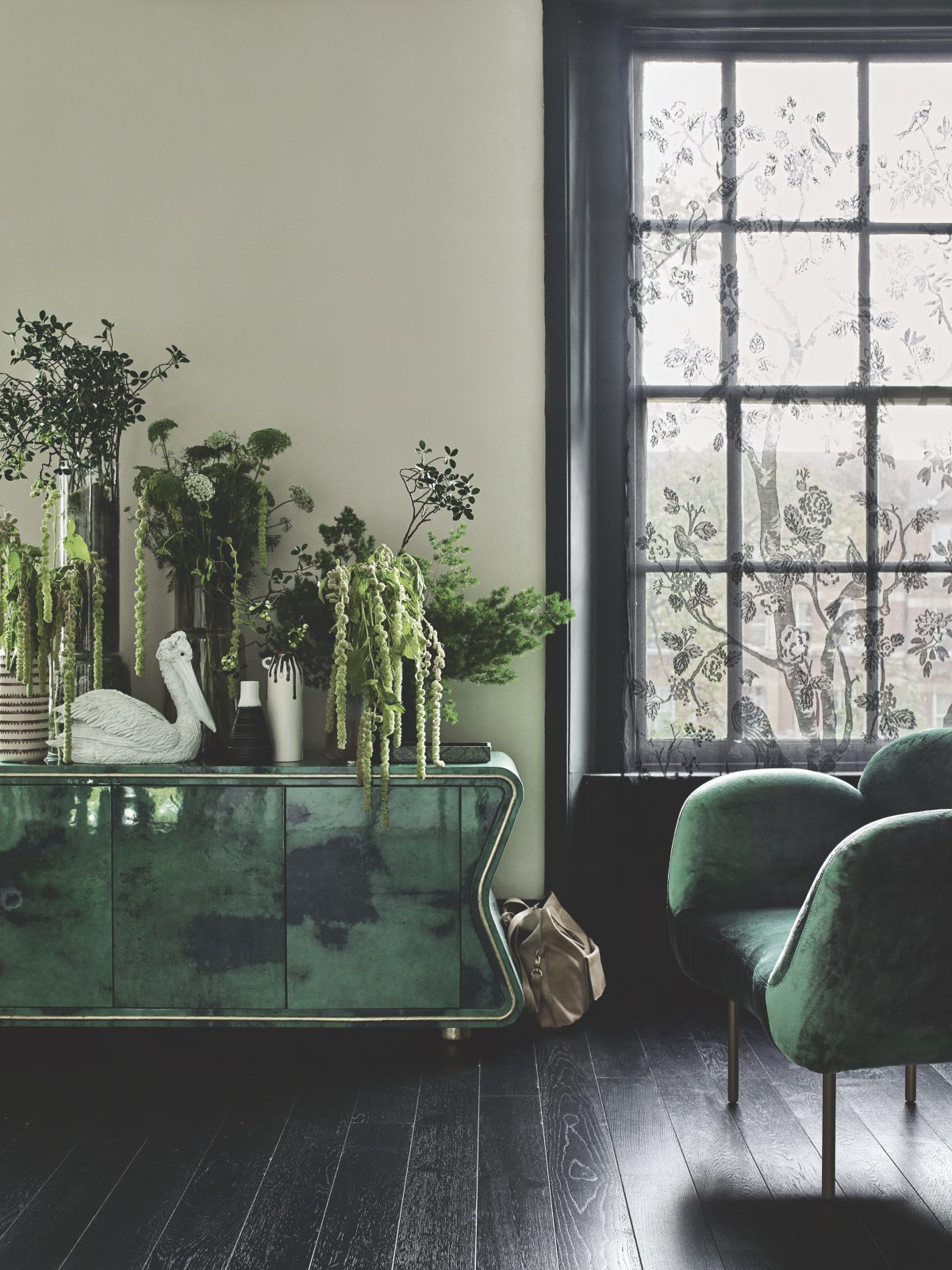
For an instant mood lift, lean into the greens. Not the bright, zesty greens of summer, but their deeper, more contemplative cousins. A rich forest green or a muted olive has enough weight to stand up to gray winter days, creating a sense of calm and connection to nature.
- Forest Green: Evokes a sense of sheltered woodland. Pairs beautifully with brass accents and walnut wood.
- Olive Green: A sophisticated neutral that feels both earthy and modern. Complements natural linen and terracotta pots.


