White Walls Aren’t Boring: A Pro’s Guide to Getting Them Perfect
I’ve been swinging a paintbrush in people’s homes for a long time, and I’ve seen it all. Those deep Tuscan golds, the cool gray craze, and more bold accent walls than I can count. Trends come and go, but one thing has always been there, steady as a rock: a classic white wall.
In this article
A lot of folks see white as the ‘I give up’ choice. The safe, maybe even boring, option when you can’t decide. But honestly, I see it completely differently. For a pro, a white wall is the ultimate canvas. Get it right, and the entire home feels more thoughtful, clean, and elevated. But get it wrong? Oh boy, it shows every single little mistake.
Nailing a white wall is a real craft. It’s about so much more than just grabbing a can of ‘white’ and going to town. It’s a game of light, texture, and tiny shifts in tone that all look identical under those harsh hardware store lights. These are the lessons you learn from years of practice, from chatting with designers, and yeah, from fixing your own blunders. So, let’s talk about how to choose the right white and get it on the wall with the skill it deserves.
What’s Really in That Can of White Paint?
Before you even think about popping that lid, it helps to know what you’re dealing with. Paint is a pretty sophisticated formula, and understanding the basics will make you a much smarter painter.
There’s No Such Thing as ‘Just White’
This is the first thing I tell anyone who asks for advice. Every white has a subtle undertone—a tiny drop of another color that nudges it in a certain direction. This is what gives a white its personality.
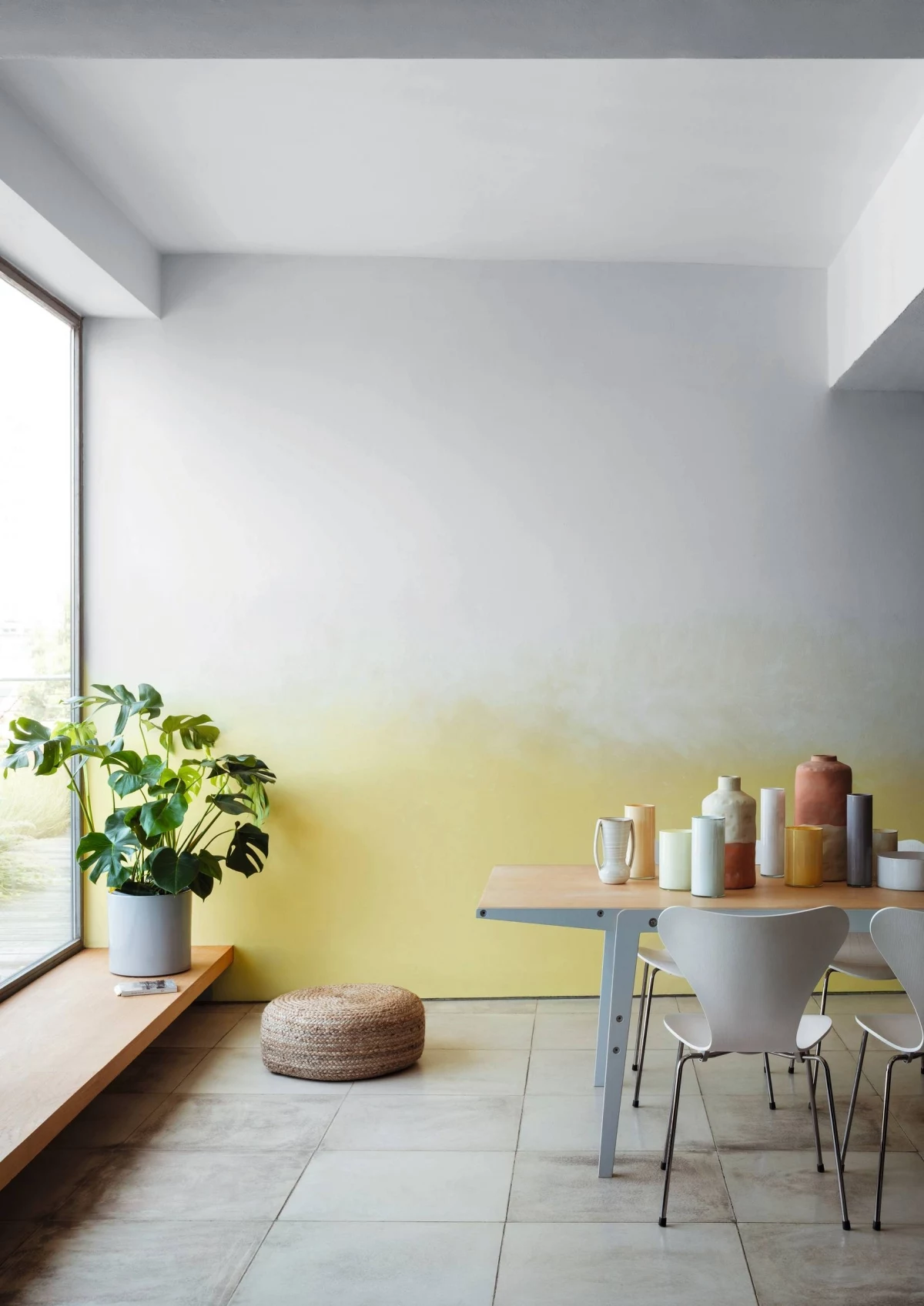
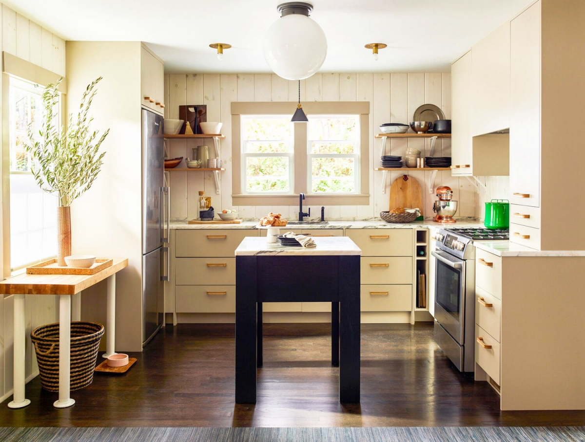
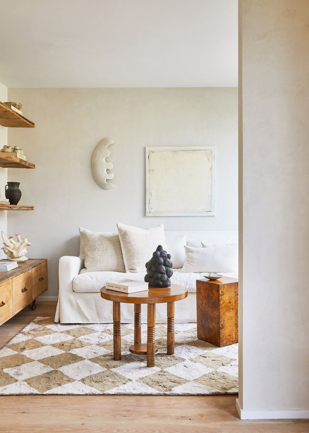
Cool whites have a little hint of blue, gray, or sometimes even green. These create a crisp, clean, almost gallery-like feeling. They’re fantastic for making a space feel bigger and brighter. The only catch? In a room that gets cool, northern light, they can sometimes feel a bit too sterile or clinical if you’re not careful.
Warm whites, on the other hand, have undertones of yellow, red, or cream. Think cozy, inviting, and traditional. A popular creamy off-white is a perfect example. These are beautiful in homes with natural wood floors or trim, and they can make a big, open room feel more welcoming. The risk here is that a warm white in a very sunny room can sometimes look a little too yellow or even dingy.
And then you have the neutral whites. These try to walk the line, balancing warm and cool for the purest white possible. They’re super versatile, but you still absolutely have to test them. I once painted a living room in what was supposed to be a perfect neutral white. The problem was, the client’s huge, lush green lawn reflected through the picture windows every afternoon, casting a sickly green glow on the walls. We had to repaint with a white that had the faintest touch of red in it to cancel out that green reflection. Lesson learned.
Light Reflectance Value, or LRV
Here’s a pro tip: on the back of any paint swatch, you’ll find a number called the Light Reflectance Value (LRV). This is one of your most powerful tools. It’s a simple scale from 0 (jet black) to 100 (pure, reflective white), and it tells you exactly how much light a color will bounce around a room.
For whites, you’re usually looking at an LRV between 75 and 95. A white with a super high LRV of, say, 92, is going to reflect a massive amount of light. This makes it a great choice for a dark hallway or a basement that needs all the help it can get. But a white with a slightly lower LRV of 82 will absorb a bit more light, which can be much more comfortable in a bedroom or a space that gets blasted with intense sunlight. Too much reflection can cause a harsh glare. So, LRV helps you use white to manage light, not just to add color.
Why Paint Sheen Changes Everything
The finish you pick is just as critical as the color itself. Sheen, or the gloss level, impacts how the color appears, how durable the surface is, and most importantly, how well it hides—or highlights—every little flaw on your wall.
- Flat (or Matte): This finish has zero shine, which makes it a champion at hiding imperfections like bumps and previous repairs on older walls. It gives a really soft, velvety look. The major drawback, though, is that it’s the least durable and a nightmare to clean. Try to scrub off a mark, and you’ll probably scrub the paint right off with it. I only recommend it for ceilings or very low-traffic spaces like a formal dining room.
- Eggshell: This is my go-to for probably 80% of residential walls. It has a very slight, low sheen—just like an eggshell, go figure. It’s way more durable and washable than flat but still does a great job of masking minor flaws. It’s the reliable workhorse for living rooms, bedrooms, and hallways.
- Satin: With a bit more gloss than eggshell, a satin finish is even easier to clean. This makes it a solid choice for high-traffic zones, kitchens, and kids’ rooms. Just be aware, that extra shine will start to show more of the wall’s imperfections, so your prep work needs to be on point.
- Semi-Gloss: This one is noticeably shiny and built for durability. It’s the standard for trim, doors, and cabinets. Its moisture resistance also makes it a good fit for bathrooms. I’d almost never put it on a main wall in a living area; the glare would be distracting and it would magnify every single tiny ding in the drywall.
A little trick we use all the time is to paint the walls in an eggshell finish and then use the exact same white color in a semi-gloss on the trim. It creates this subtle, sophisticated contrast and adds a layer of depth to the room without introducing a new color.
The Real Work: A Great Paint Job is 90% Prep
Look, anyone can roll paint on a wall. The difference between a weekend DIY job and a professional result is the prep work. I tell my clients that painting is the fast part; we spend most of our time just getting the room ready.
Step 1: Get to Know Your Walls
Before a single drop cloth hits the floor, I do a full inspection. I run my hand over the surface to feel for bumps and rough patches. Then I grab a bright work light and hold it close to the wall, shining the beam across it at a sharp angle. We call this ‘raking light,’ and it’s a magic trick for revealing every crack, nail pop, and shoddy patch job you’d otherwise miss until the final coat of paint is drying. I once used this trick and found a previous painter had just painted right over a kid’s crayon drawing of a stick figure. The new paint would have never hidden it properly.

Heads up! In homes built several decades ago, lead paint was a common material. If you suspect your home is from that era, it’s worth getting a simple lead test kit from the hardware store, which costs about $10. If it tests positive, the prep work requires serious safety protocols. To be frank, this is a job for a certified professional. The health risks are no joke.
Step 2: The Not-So-Glamorous Prep Phase
First, clean the walls. For most rooms, a wipe-down with a damp cloth is fine. But in a kitchen, you have to cut through any grease. A good degreaser is essential because paint simply will not stick to a greasy surface.
Next up is patching. I fill small nail holes with spackling. For bigger dents or cracks, I use joint compound, applying it in very thin layers. The key is to let each layer dry completely—which can take a few hours or even a full day, depending on humidity—before sanding lightly and adding the next. Feather the edges so you can close your eyes and run your hand over the patch without feeling where it begins or ends.
Step 3: The Unskippable Step—Primer!
Skipping primer is probably the most common DIY mistake I see, especially when painting with white. White paint has notoriously bad coverage, particularly over darker colors. Primer is your best friend here. It ensures the paint adheres properly, it seals the surface so your topcoat doesn’t soak in unevenly, and it gives you a clean, uniform canvas so your expensive white paint actually looks like the color on the chip.
And this is where a good paint investment pays off. You might be tempted by that $35 gallon of store-brand paint, but you’ll likely need three, maybe even four, coats to cover a previous color. A premium gallon might cost you $60 to $85, but with a good primer underneath, it will cover beautifully in two coats. You save time, effort, and often, money in the long run.
Step 4: Putting It All Together Like a Pro
Before we even talk technique, let’s talk tools. A cheap brush that leaves bristles in your finish or a cheap roller that sheds fuzz on your walls will ruin all your hard prep work. It’s worth spending a little more here.

My Go-To Toolkit:
- A quality 2.5-inch angled sash brush ($15-$20)
- A sturdy 9-inch roller frame and an extension pole ($25)
- A 3-pack of 3/8-inch nap roller covers for smooth walls ($15)
- A metal 5-in-1 painter’s tool (around $8 – this thing is my best friend for opening cans, cleaning rollers, and scraping)
- Good quality painter’s tape ($10)
- Canvas or plastic drop cloths ($15 and up)
Quick tip on testing whites: Don’t just paint a splotch on your wall! The old color will throw off your perception. Instead, get a couple of sample pots and paint a big square (at least 2′ x 2′) on a piece of white foam board. Now you can move it around the room, hold it against your trim, and see how it looks in the morning light versus the evening shadows. It’s the best way to make a confident choice.
And how much paint do you need? A gallon of paint typically covers about 400 square feet. A quick and dirty way to estimate is to add the length of all the walls together and multiply that by the ceiling height. So, a 12′ x 12′ room with 8′ ceilings is (12+12+12+12) x 8 = 384 square feet. And since you’re painting white, always plan for two full coats.
Okay, the actual painting process is always the same: you cut in, then you roll. ‘Cutting in’ is just a term for painting the edges your roller can’t reach. Using your angled brush, you’ll paint a 2 to 3-inch wide strip along the ceiling line, around trim and windows, and down the corners. The absolute most important trick is to do one entire wall at a time. Cut in the whole wall, then immediately grab your roller and paint the main surface while that brushed paint is still wet. This is called ‘keeping a wet edge,’ and it’s the secret to making the brushed and rolled sections melt together seamlessly. If you let the cut-in areas dry first, you’ll end up with ugly outlines, a classic rookie mistake we call ‘picture framing’.
By following these steps—from understanding undertones to keeping that wet edge—you’re not just painting a wall white. You’re setting a beautiful, professional-grade foundation for your entire home.
Inspiration:
Benjamin Moore’s Chantilly Lace (OC-65): Often called the ‘cleanest’ white, it has virtually no visible undertones. It’s a brilliant, gallery-like choice for modern spaces or to make art and furniture pop.
Farrow & Ball’s Wimborne White (No. 239): This is a much softer, off-white with a tiny hint of yellow. It feels timeless and gentle, perfect for creating a cozy, welcoming atmosphere in bedrooms or living rooms with traditional architecture.
The pro tip? Never decide in the store. Paint large swatches on your wall and observe them at different times of the day—morning sun, afternoon glow, and with artificial light at night. The way light interacts with the undertone is everything.
Matte, Eggshell, or Satin? Does the finish really matter for white walls?
It matters immensely, especially with white! The finish, or sheen, dictates not just the look but also the durability. A matte finish is beautifully soft and excellent at hiding minor wall imperfections, giving a chalky, high-end feel. However, it’s the least washable. Eggshell is the go-to for most pros; it offers a very low-sheen elegance that’s far more durable and wipeable than matte, making it perfect for living rooms and bedrooms. For high-traffic or high-humidity areas like hallways, kitchens, or bathrooms, a satin finish provides a subtle glow and maximum durability against scuffs and moisture.