Picking Paint is Hard. Here’s a Pro Painter’s No-Fail Method.
After more than two decades with a paintbrush in my hand, I can tell you one thing for sure. The toughest part of any paint job happens long before you pry open a can. It’s choosing the color.
In this article
- Start With What You Can’t Change
- How Light Tricks Your Eyes (And Your Paint)
- The Only Way to Test Paint (Seriously)
- What If You Still Hate It? A Quick ‘Oops’ Plan
- Sheen Matters More Than You Think
- Tying It All Together: Whole-Home Color
- A Final Word on Fumes and When to Call for Help
- Inspirational Gallery with Photos
I’ve watched homeowners torture themselves for weeks, taping up a dozen swatches that look almost identical, terrified of making a costly mistake. And that fear is totally valid. A gallon of good quality paint from a specialty store like Sherwin-Williams or Benjamin Moore can easily run you $50 to $80, and your time is worth even more. But trust me, picking a color doesn’t have to be a high-stakes guessing game.
Over the years, I’ve worked on everything from classic homes to super modern spaces, and I’ve dialed in a process that just works. It’s the same method I teach my apprentices, and it goes way beyond just finding a pretty shade on a tiny paper chip. It’s about really understanding your room, the light, and the paint itself. This isn’t about fleeting trends; it’s a framework to help you pick a color with total confidence, so the final result is exactly what you envisioned.
Start With What You Can’t Change
Before you even glance at a paint chip, take a hard look at the fixed elements in your room—the things that aren’t going anywhere. These are the building blocks of your color scheme, and ignoring them is the #1 mistake I see people make. They fall for a cool, trendy gray they saw online, paint the whole living room, and then wonder why it looks awful next to their warm, honey-oak floors.
Grab a notepad and walk into your room. What colors do you really see in these items?
- Flooring: Are your wood floors leaning yellow, orange, or red? Does your carpet have tiny flecks of blue or brown in it? Is the tile a crisp, cool white or a soft, warm cream?
- Countertops & Tile: Granite and quartz are notorious for having complex undertones. Look closer. Is that “gray” countertop truly neutral, or does it have sneaky hints of green, purple, or even blue?
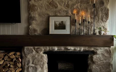
- Brick or Stone: A fireplace or an accent wall has a whole color palette built right in. A single brick can hold shades of red, orange, brown, and even black.
- Big Furniture: If you’ve got a massive sofa or a hulking media cabinet that’s staying put, its color is a key player in the room.
A little trick I use with clients is to hold a plain white piece of printer paper right next to these surfaces. Against the stark white, the hidden undertones in your wood or countertop will pop right out. It’s a simple move that has saved so many projects from clashing.
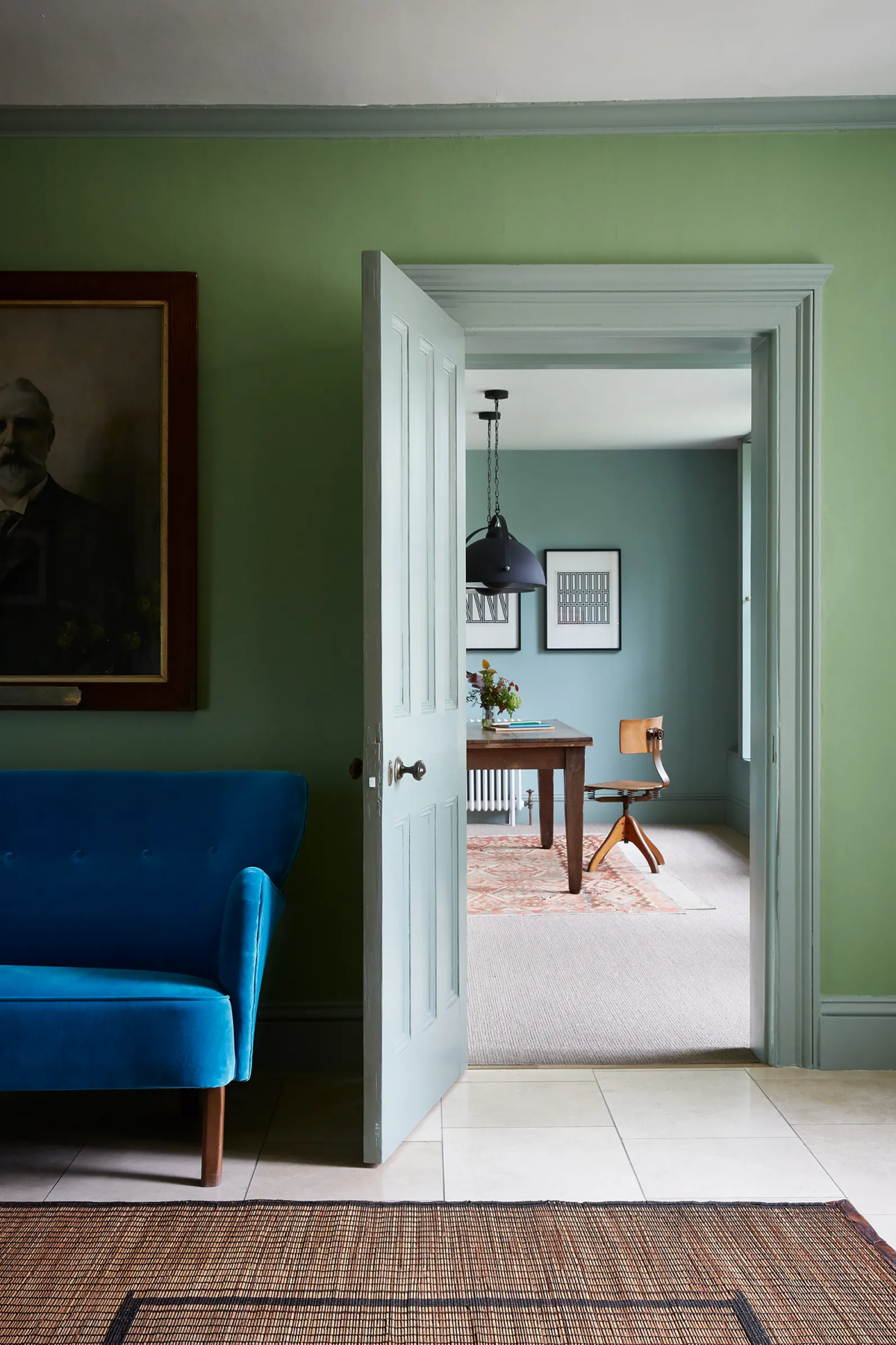
Oh, and what happens if your floor’s undertones are warm and your countertop’s are cool? That’s the classic design puzzle. The solution is to find a “bridge” color for your walls—something complex like a greige (gray + beige) or a taupe that has hints of both warm and cool tones to tie everything together.
How Light Tricks Your Eyes (And Your Paint)
Understanding how light and color play together isn’t just for art school; it’s a painter’s most practical tool. The same can of paint will look wildly different from one room to another. That’s why the color you loved in your friend’s house will almost never look the same in yours. Let’s break down what’s really going on.
Light Reflectance Value (LRV)
Flip over a paint chip, and you’ll usually find a number labeled LRV, or Light Reflectance Value. It’s a simple scale from 0 (jet black) to 100 (pure white) that tells you how much light a color will reflect. Honestly, it’s way more helpful than fuzzy terms like “light” or “dark.”
- LRV of 60+: These are the light, airy colors that bounce a ton of light around. They can make a space feel bigger and brighter. Most off-whites and pastels live here. Your typical ceiling white is probably up in the 80-90 range.
- LRV of 20 to 60: This is the sweet spot where most wall colors fall. They offer a nice balance, providing noticeable color without sucking all the light out of the room.
- LRV below 20: Welcome to the dark side. These are your deep, dramatic colors that absorb most of the light. They’re amazing for creating a cozy, moody vibe, but you absolutely need good lighting to pull them off without the room feeling like a cave.
When I’m helping someone choose a color, LRV is my first checkpoint. If they want to brighten a dim hallway with no windows, I know we need to be looking at colors with an LRV of at least 65. It gives us a technical starting point that’s much more reliable than just eye-balling it.
The Direction Your Windows Face
The type of natural light your room gets is a game-changer. I always ask which direction the main windows face, because it matters that much.
- North-Facing Rooms: The light here is cool and indirect, and it tends to bring out blue or green undertones. A neutral gray can suddenly look icy blue. To counter this, I often suggest colors with built-in warmth, like creamy whites or beiges. Think of some of the popular choices like a soft, versatile off-white.
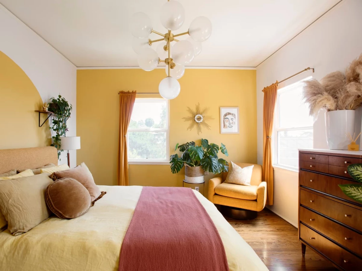
- South-Facing Rooms: You get bright, warm light all day. Lucky you! This intense light can sometimes wash out very pale colors, but it also means you can get away with cooler tones to balance the warmth, or go all-in with a vibrant, saturated color.
- East-Facing Rooms: You get that beautiful, warm light in the morning, which turns cooler and shadier in the afternoon. The trick is finding a color that looks good in both. I’ve found that complex colors, like a green-gray or a blue with a hint of warmth, tend to perform well all day.
- West-Facing Rooms: These rooms can feel a bit dark in the morning but are blasted with very warm, almost orange light in the evening. That golden hour glow can make beiges look sickly and turn taupes pink. Testing is absolutely critical here.
Metamerism: The Color-Shifting Gremlin
Ever pick a color that looked perfect in the hardware store, only to have it look totally wrong on your wall? You’ve met metamerism. It’s the phenomenon where two colors look like a match under one light source (like the store’s fluorescent lights) but clash under another (like the warm lamplight in your living room).
I learned this the hard way on an early job. The client picked a beautiful, sophisticated greige. We tested it during the day, they loved it, and we painted the whole room. That night, I got a frantic call. Under their lamps, the lovely greige had turned into a muddy, depressing purple. We had to repaint the entire room. Now, it’s a non-negotiable rule: you have to test paint under every light source you use.
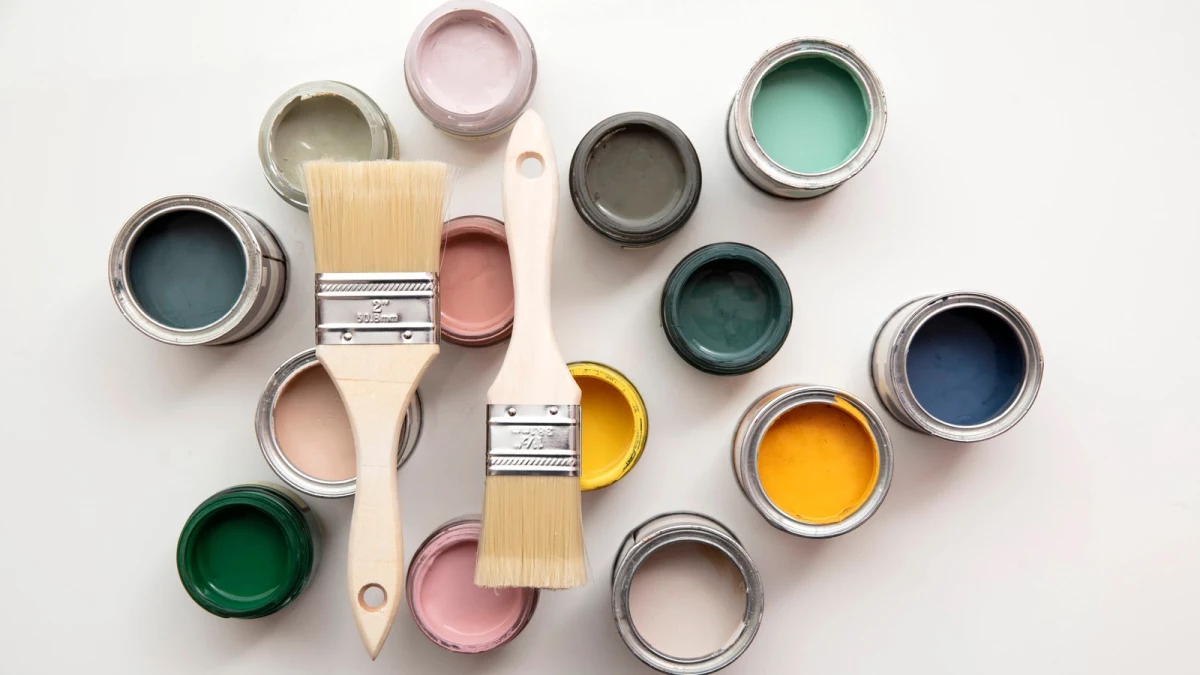
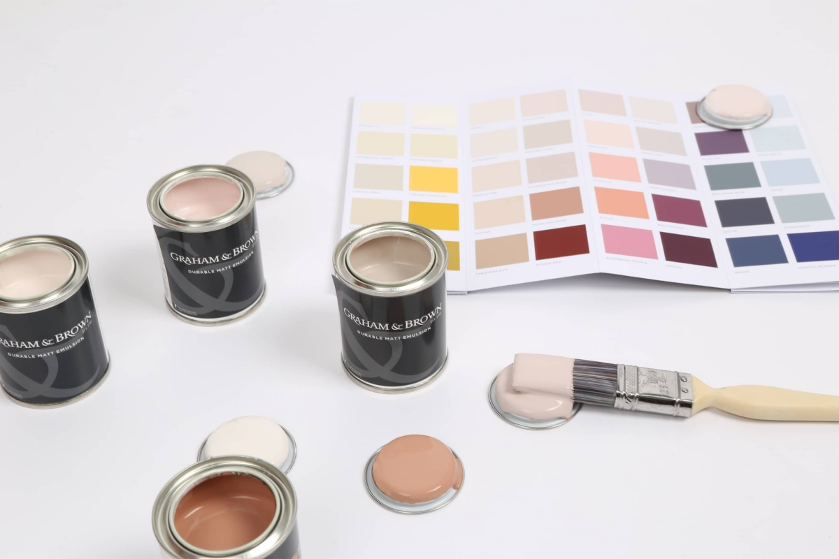
The Only Way to Test Paint (Seriously)
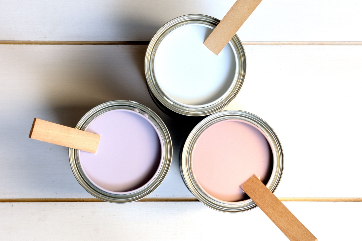
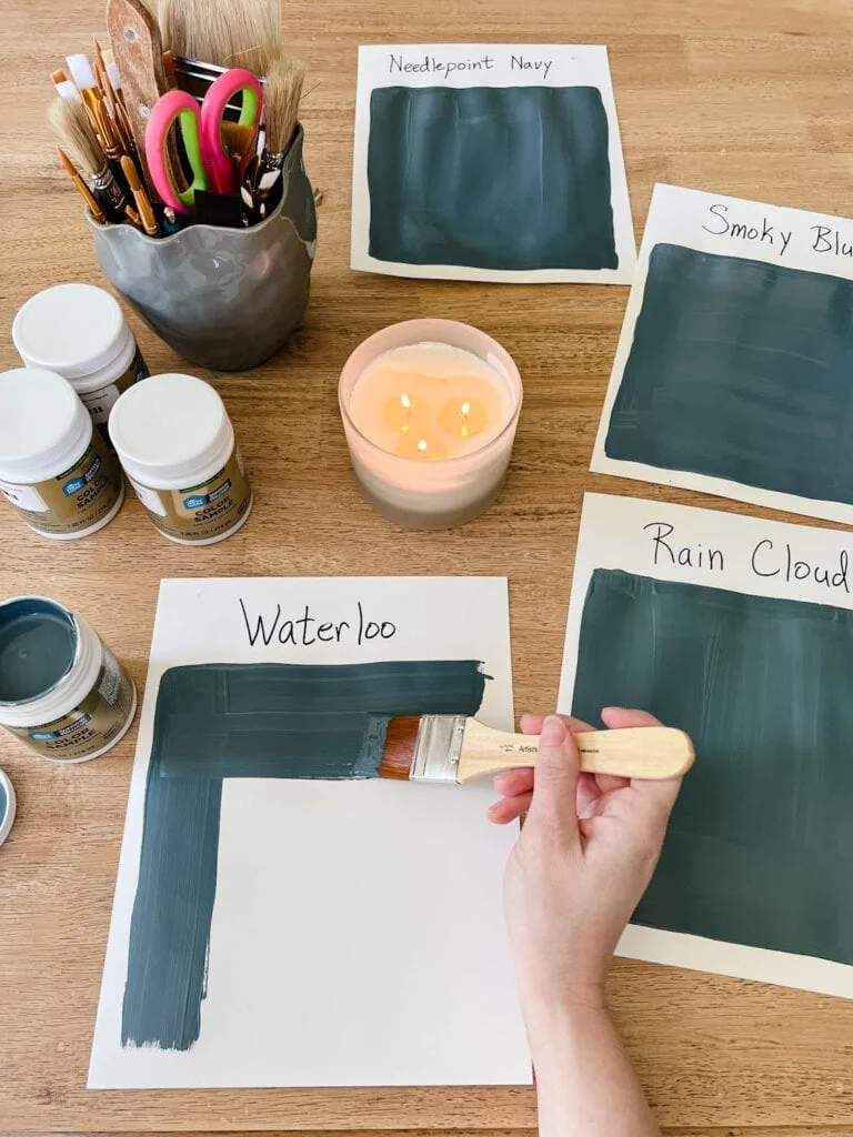
Those little paper chips from the paint store are for gathering ideas, not making decisions. Your final choice has to be made by testing the actual paint in your actual room. But there’s a right way to do it.
Step 1: Get Your Gear
First, commit to buying sample pots of your top two or three choices. Don’t get ten—that just leads to decision paralysis. A sample pot will cost you between $7 and $10, and it is the cheapest insurance you can buy against a $70 mistake on a full gallon. While you’re at the store (like Home Depot or any local hardware shop), grab two large pieces of white poster board per color—at least 12×12 inches, but bigger is better. A small 4-inch foam roller kit will cost about $5 and is essential for getting the right texture.
Step 2: Make Your Sample Boards
Whatever you do, don’t paint test swatches directly onto your wall. The current color will mess with your perception. A cream sample painted on a blue wall will look way more yellow than it actually is.
Here’s the pro method: Apply two full coats of your sample paint onto each poster board with your foam roller. You need two coats to see the true, final color. Let them dry completely, which can take a couple of hours. The color can change slightly as it cures, so be patient.
Step 3: Play Detective For a Full Day
Now you have portable, accurate color samples. For the next 24 hours, move them around the room and observe.
- Check different walls. Tape one board to the wall that gets the most light and the other to the darkest corner. See how it changes.
- Check your fixed elements. Hold the board right up against your sofa, your wood trim, and your fireplace. Do the undertones play nice?
- Check at all times of day. Look at the boards in the morning, at noon, and in the late afternoon as the light shifts.
- Check with the lights on! After dark, turn on all the lamps and overhead lights you normally use. This is the moment of truth. Does the color still work? So many people forget this and get a nasty surprise at 9 PM.
By using these boards, you’re seeing the color against a neutral background and can see how it behaves everywhere in your room, not just one spot.
What If You Still Hate It? A Quick ‘Oops’ Plan
So, you followed all the steps, painted the room, and… you still hate it. It happens. Before you panic and buy more paint, try this:
Change your light bulbs. It sounds too simple, but the color temperature of your bulbs has a massive impact. If your new gray paint looks too blue, try switching from a “cool white” or “daylight” bulb to a “warm white” bulb. It can sometimes be enough to shift the color in the right direction and save you from having to repaint.
Sheen Matters More Than You Think
Picking the color is only half the battle. The paint’s sheen—its finish—dramatically affects the look, feel, and durability of the room. A common rookie mistake is just picking one sheen for everything.
Here’s a quick rundown, from least to most shiny. Keep in mind, the same paint color will look slightly darker and richer as you go up in sheen.

Flat has zero reflection. It’s fantastic for hiding imperfections on older walls, making it a go-to for ceilings. But be warned: it’s the least durable and nearly impossible to clean. Scuffs are basically permanent. I only use it for ceilings or very low-traffic adult rooms.
Matte is a close cousin to flat but has a tiny bit more durability and a slight velvety look. It’s a beautiful, sophisticated finish for bedrooms and dining rooms where you won’t be scrubbing the walls.
Eggshell is the go-to for most residential projects. It has a soft, low glow (like its namesake) and offers the perfect balance of a pleasing look with good durability. It’s my standard recommendation for living rooms, hallways, and most bedrooms.
Satin has a bit more gloss than eggshell and is even easier to clean. It’s great for high-traffic areas or rooms that see moisture, like bathrooms, kitchens, and laundry rooms. Some find it a bit too shiny for main living spaces.
Semi-Gloss is noticeably shiny and super durable. Its slick surface is perfect for wiping down, making it the standard for trim, doors, and cabinets. Using it on a wall is a bold look that will highlight every single bump and flaw.
High-Gloss is the most reflective and durable of all, creating a hard, almost lacquered finish. It’s a statement maker for furniture or front doors, but it demands a perfectly smooth surface to look good.
Tying It All Together: Whole-Home Color
If you’re painting more than one room, you want the colors to feel connected. In an open-concept space, pick one main neutral for the most connected areas to create a calm backdrop. Then, you can use a slightly darker shade of that same color in a dining nook or a bolder accent on a kitchen island to create definition without clashing.
For separate rooms, you can create a beautiful flow by choosing colors from the same paint strip. For example, you could use a light beige in the hall, a medium tan in the living room, and a deep brown in the office. They’re all different, but their shared DNA makes the whole house feel harmonious and intentional.
A Final Word on Fumes and When to Call for Help
Let’s talk practicalities. For years, that strong “paint smell” came from VOCs (Volatile Organic Compounds), chemicals that were released into the air as paint dried. Today, you can and should opt for low-VOC or zero-VOC paints. They’re available at every major paint store, cost about the same, and are a much healthier choice, especially in bedrooms and kids’ rooms.
And finally, when should you just hire a pro? Be honest with yourself. If you have soaring 15-foot ceilings, significant wall damage that needs repair, or simply lack the time and patience for a weekend (or two) of meticulous work, it might be time to call for help. Hiring a professional painter for an average-sized room might cost between $400 and $800, but for that price, you get an expert prep job, flawless lines, and your weekend back. Sometimes, that’s the best value of all.
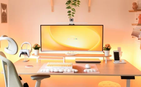
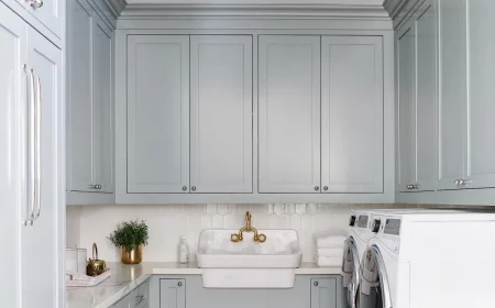
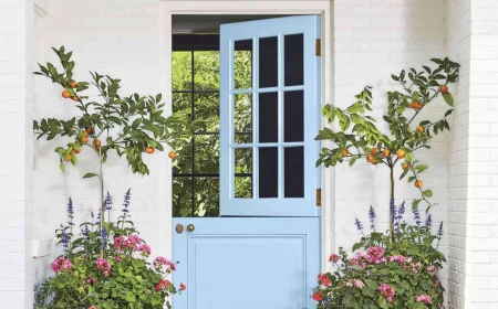
Inspirational Gallery with Photos
Revere Pewter (Benjamin Moore): Often called the perfect “greige,” this iconic color has warm, beige undertones that prevent it from feeling cold. It’s incredibly versatile, working well in both north- and south-facing rooms.
Agreeable Gray (Sherwin-Williams): A slightly cooler take on greige, with soft, subtle undertones that can lean a hint green or even violet depending on the light. It’s a true chameleon color, prized for its ability to coordinate with almost anything.
Both are fantastic neutrals, but test them in your space; the undertones are what make them unique.
The human eye can distinguish about 10 million different colors, but the lighting in a room can trick it into seeing the same paint color in vastly different ways.
This is why testing a sample is non-negotiable. What looks like a soft, earthy green under the warm lamplight in the evening might appear as a sharp, minty green in the bright morning sun. Move your paint samples around the room at different times of day before you commit.
What’s the real difference between paint sheens, and does it matter?
It matters immensely, as the sheen (or finish) dramatically affects how a color is perceived. A Matte finish has no shine and is excellent at hiding surface imperfections, giving a rich, velvety look. Eggshell has a very low luster, like its namesake, offering more durability and washability than matte. Satin has a soft glow and is a popular choice for high-traffic areas like kitchens and bathrooms because it’s even easier to clean.
The best way to test a color isn’t directly on your current wall, where the existing color can influence your perception. Instead:
- Paint a large sample (at least 2×2 feet) on a white poster board or foam core.
- Leave a white border around the edge to see the color’s true character.
- Use two full coats of your sample paint for accurate color depth.
- Move the board around the room—next to the window, in a dark corner, beside your sofa—to see how it behaves in different light and next to your fixed elements.
Don’t ignore the LRV: On the back of most paint chips, you’ll find a number called the Light Reflectance Value (LRV). It runs on a scale from 0 (absolute black) to 100 (pure white). This number tells you how much light a color will reflect. If you’re trying to brighten up a dark room or a north-facing space, choosing a paint with an LRV of 60 or higher can make a significant difference.
Tired of taping messy paint swatches to your wall? The modern solution is peel-and-stick samples. Companies like Samplize and SureSwatch offer real paint samples—made with two coats of actual paint from brands like Benjamin Moore and Sherwin-Williams—on a repositionable adhesive backing. You can move them around the room without damaging your walls, making it easy to see the color in different lighting conditions next to your trim and furniture.
- A room that feels effortlessly balanced and intentional.
- A color story that guides the eye without overwhelming it.
- A professional-looking result, even for a first-timer.
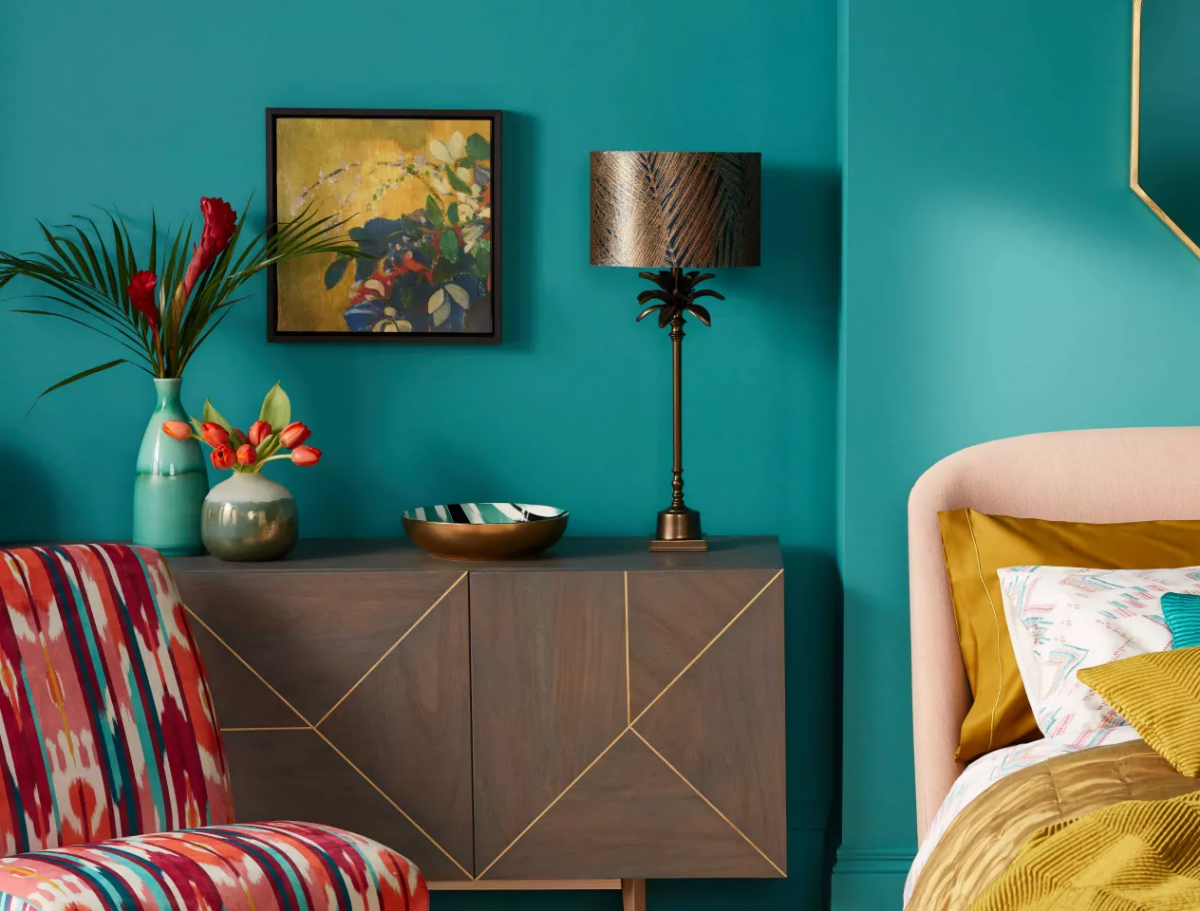
The secret? The classic 60-30-10 interior design rule. This guideline suggests distributing your colors by percentage: 60% for your dominant color (usually the walls), 30% for a secondary color (furniture, curtains), and 10% for an accent color (pillows, art, accessories). It’s a simple framework for creating a cohesive palette.
According to the U.S. Environmental Protection Agency (EPA), concentrations of many Volatile Organic Compounds (VOCs) are consistently higher indoors (up to ten times higher) than outdoors.
When you’re painting an entire room, that’s a lot of surface area. Opting for a low-VOC or Zero-VOC paint, like those found in Benjamin Moore’s Eco Spec® line or Sherwin-Williams’ Harmony series, significantly reduces the off-gassing of these chemicals, leading to better indoor air quality for your family long after the paint smell is gone.
Paint is more than just color; it’s the backdrop to your life. It’s the soft, calming blue that greets you in your bedroom after a long day, the cheerful, buttery yellow that makes your kitchen feel like the heart of the home, or the deep, dramatic navy that turns a simple powder room into a jewel box. The right color choice doesn’t just change a room—it changes how you feel within it.
Wondering how to use a trendy