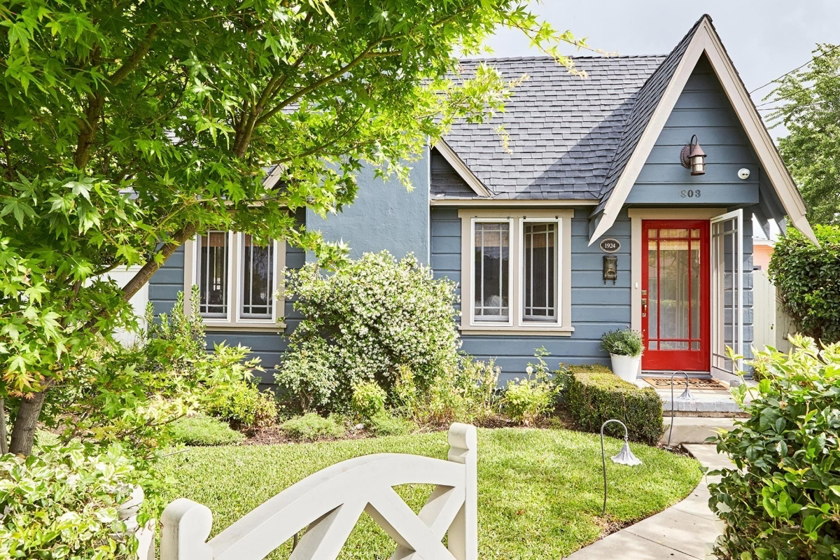
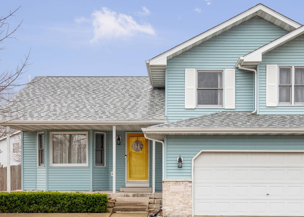
Afraid of Powder Blue? Here’s How to Use It Like a Pro
I’ve spent a lot of time helping people choose colors for their homes, and one thing is for sure: when someone wants a space that feels calm, serene, and airy, the conversation always lands on blue. And more often than not, the name ‘powder blue’ gets whispered like a secret wish. People love the idea of it, but honestly, they’re also a little scared. They worry it’ll scream “baby nursery,” feel chilly, or clash with all their existing stuff.
In this article
My job is to cut through that fear with some real-world, practical advice. Forget the trends for a second. Powder blue isn’t just one color; it’s a huge range of possibilities. The key is understanding how it plays with light, space, and other materials. Once you get the hang of it, you can use it with confidence to get the exact vibe you’re going for.
Why We’re So Drawn to Light Blue
To really get a feel for a color, it helps to know a little bit about what’s going on behind the scenes. This isn’t just trivia—it directly impacts how you’ll choose and use a paint or fabric in your own home.
The Science of a Calm Color
So, color is just how our brain interprets light waves. Blue has one of the shortest wavelengths, which is why it scatters so easily and makes the sky look blue. This connection is wired deep inside us. In a room, this can actually make a blue wall seem to recede, or move away from you, which is a neat trick for making a small room feel a bit bigger. It’s a color that doesn’t shout for attention like a fiery red or a bright orange; it just creates a sense of peaceful space. But—and this is a big but—this all depends on the light in your room, which we’ll come back to again and again.
From Rare Rocks to Perfect Tints
For most of history, a good, stable light blue was incredibly hard to come by and ridiculously expensive. The original high-status blue was made from grinding up semi-precious stones and was literally worth more than gold. This is probably why we still associate the color with a certain kind of luxury and importance.
Creating a soft, permanent powder blue was a real challenge. Early versions were often unpredictable and faded over time. Thankfully, we don’t have that problem anymore. Today, when you buy a can of powder blue paint, that color comes from a few drops of highly stable, synthetic liquid tint added to a neutral base. This means we get perfectly consistent and reliable color, something the old masters could only dream of.
The Most Important Number on the Can: LRV
When I’m looking at paints, one of the first things I check is the Light Reflectance Value, or LRV. Every color has an LRV score from 0 (absolute black) to 100 (pure white), and it tells you exactly how much light that color will reflect. For a color like powder blue, this is EVERYTHING.
For example, a color like Benjamin Moore’s ‘Breath of Fresh Air’ has a high LRV of about 79. It’s going to bounce a ton of light, making a room feel incredibly bright and open. On the other hand, something like their ‘Santorini Blue’ has an LRV closer to 65. It’s still a light blue, but it will absorb more light, looking deeper and cozier—or, in the wrong light, a bit gloomy.
I once had a client who fell in love with a gorgeous powder blue with an LRV of 55 for their north-facing living room. It looked amazing on the paint chip in the store. On their walls? It looked gray and sad. The room just didn’t have enough natural light to support a color that soaked it up. We repainted with a similar shade that had an LRV of 72, and boom—the room came to life. It’s a perfect example of how a technical number has a massive real-world impact.
Getting It Right: Pro Tips for a Flawless Finish
Getting a professional result involves more than just slapping paint on the wall. With a subtle color like powder blue, the little details really matter. Mistakes you’d never see with a basic beige can stick out like a sore thumb.
Prep Work Isn’t Optional
I can’t stress this enough: your final paint job will only look as good as the surface underneath it. Light colors, especially if they have any sheen, are ruthless. They will highlight every single bump, crack, and imperfection. Before you even think about cracking open that paint can, you need to patch any holes and sand them perfectly smooth. Seriously, run your hand over the wall with your eyes closed. If you can feel it, you will definitely see it later.
The Primer Secret That Saves You Money
A lot of people think primer is just for new drywall. That’s a common mistake. For light blues, primer is non-negotiable for two reasons. First, it gives you a clean, neutral canvas so the true color can shine through. Painting light blue over an old yellow wall without primer can give you a weird, greenish surprise.
Second, and this is a lesser-known trick: use a lightly tinted gray primer. It sounds weird, but a very pale gray primer helps our eyes perceive the blue topcoat more richly. This often means you can get perfect coverage in two coats instead of three, which saves you both time and money on that expensive paint. Just go to the paint counter and ask them for a ‘P2’ or ‘light gray’ primer tint. It’s a game-changer.
Choosing the Right Sheen
The gloss level of your paint will totally change the look and feel of your powder blue walls. Here’s the breakdown:
- Matte/Flat: For a velvety look that hides flaws. This sheen has zero reflection and looks incredibly sophisticated. It’s my favorite for low-traffic areas like bedrooms or formal living rooms. The catch? It’s the least durable and scuffs easily, so it’s a definite no for hallways or playrooms.
- Eggshell: The perfect go-to for most rooms. Just like its name, this has a very soft, low luster. It’s way more durable and wipeable than matte but still looks elegant. It’s the happy medium I recommend for almost any space.
- Satin: Best for durability, but unforgiving. Satin has a noticeable sheen and is super easy to clean, making it great for bathrooms and kitchens. But be warned: that sheen will put a spotlight on every single flaw in your drywall. If your prep work isn’t perfect, just don’t do it.
Bringing in Blue with Fabrics and Materials
Paint isn’t the only way to go. When you use powder blue in textiles, the material itself changes the color’s personality.
A powder blue velvet, for instance, will look incredibly rich and deep because of how the pile creates light and shadow. The same color on a linen fabric will look softer, more casual, and a little rustic. And on a simple cotton, the color will look pure and straightforward.
Heads up! A critical lesson when working with fabrics is to understand dye lots. If you’re ordering fabric for both curtains and a sofa, you have to order it all at the same time, from the same bolt. Fabric is colored in huge batches, and the shade can vary slightly from one batch to the next. If you order more fabric a few months later, it will likely be from a different dye lot and won’t be a perfect match. Trust me, it’s a hard lesson to learn after the fact.
Practical Ways to Use Powder Blue in Your Home
You don’t have to go all-in to enjoy this color. You can start small or make it the main event. Here are a few ideas, from dipping your toes in to diving right in.
For the Cautious: Start with Accents
If you’re feeling a bit hesitant, don’t start with the walls. Begin with things that are easy and cheap to change out.
- Quick Win: Go to a thrift store or flea market and find a cool wooden chair or a small side table. You can probably get one for $15-$20. Then grab a can of Krylon or Rust-Oleum spray paint in a powder blue for about $9. In one afternoon, you can have a charming, custom accent piece.
- Soft Touches: A few powder blue throw pillows on a neutral gray or beige sofa can completely change the feel of the room. Or drape a soft blue blanket over an armchair. Easy, zero commitment.
- Art & Decor: A large piece of art dominated by a light blue sky can set a serene mood. A little collection of blue and white ceramic vases on a bookshelf is another classic, beautiful touch.
For the Confident: The Accent Wall or Full Room
Ready to make more of an impact? It’s time to paint. A DIY accent wall is a fantastic weekend project. Plan for about 2-3 hours of prep and 3-4 hours of painting and cleanup, spread over two days to allow for drying time.
For a DIY accent wall, your shopping list is pretty straightforward. You’re looking at a manageable budget, probably around $120-$170.
- 1 Gallon of Quality Paint: $60-$80 (e.g., Benjamin Moore Regal Select or Sherwin-Williams Emerald)
- 1 Gallon of Primer: $30-$50
- A Good Roller Kit: $25 (includes roller, frame, tray, and brush)
- Painter’s Tape: $8
- Drop Cloth: $10
Painting a whole room is a bigger commitment, of course. If you decide to hire a pro, expect to pay anywhere from $400 to $1,000+ for a standard-sized room, depending on your location and the amount of prep work needed. You’re trading money for time and a guaranteed perfect finish.
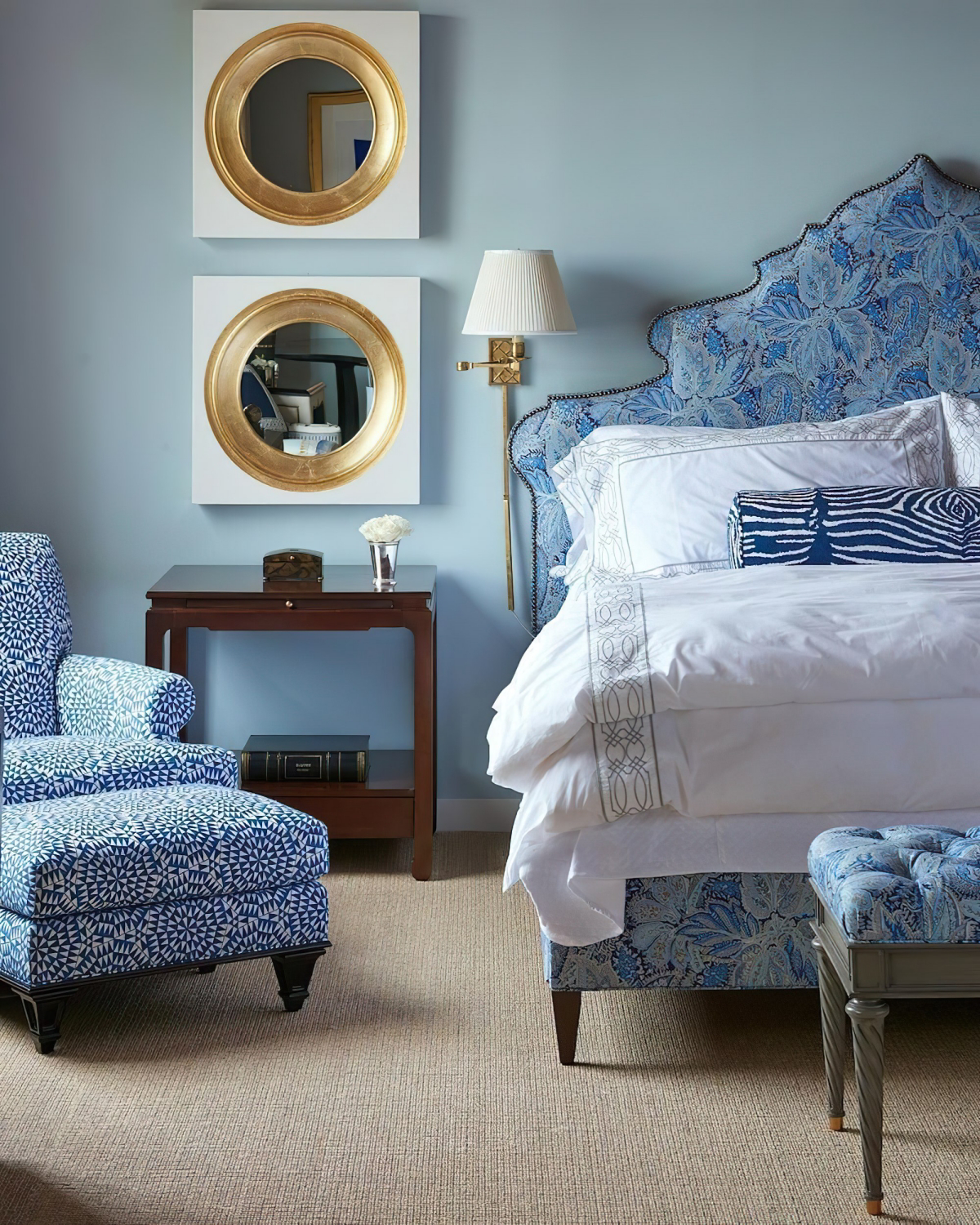
Color Pairings That Just Work
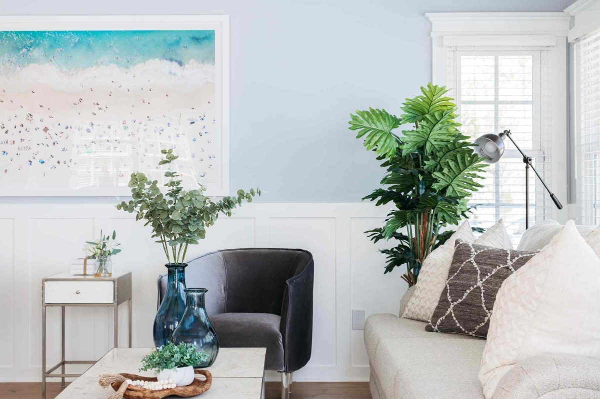
- Powder Blue + Crisp White: This is the timeless, coastal combination. It feels fresh, clean, and intentional. The white makes the blue pop.
- Powder Blue + Warm Gray: A more modern and sophisticated pairing. A soft ‘greige’ (a gray with beige undertones) keeps the blue from feeling too chilly. It’s incredibly balanced and serene.
- Powder Blue + Gold or Brass: This is my favorite way to add a little luxury. Think of a powder blue wall with a single, elegant brass floor lamp next to the sofa. The warmth of the metal is a beautiful contrast to the cool blue.
- Powder Blue + A Pop of Coral or Yellow: For a more energetic look, bring in a complementary warm color. A little goes a long way. A single yellow vase on a blue console table, or pillows with a coral pattern on a blue chair, can make the whole room feel more vibrant.
Seriously, Don’t Skip This Part: Final Advice
Here are the things that people often mess up. A little extra care here will save you a world of frustration.
The Lighting Test is MANDATORY
I have to say it again because it’s the #1 mistake people make. NEVER choose a paint color from the chip in the hardware store. Buy a sample pot ($5-$10), paint a big piece of foam board (at least 2×2 feet), and move it around the room. Look at it in the morning light, in the afternoon shade, and at night with your lamps on. The type of lightbulb you use will dramatically change the color. A warm, yellowish bulb (around 2700K) can make powder blue look dull or even greenish. A cooler, whiter bulb (4000K+) will make it look brighter and more true to its color. You might have to swap your bulbs to get the look just right.
Health & Safety
Modern paints are much safer now, but always work in a well-ventilated area. Open the windows and use a fan. I strongly recommend spending a few extra bucks on low-VOC or zero-VOC (Volatile Organic Compounds) paints, like Benjamin Moore’s Aura or Sherwin-Williams’ Harmony line. It’s worth it for the peace of mind, especially in bedrooms.
A very important warning: if your home was built before the late 1970s, you could have lead-based paint on your walls. Sanding or scraping this creates toxic dust that is extremely dangerous. You can get a test kit at a hardware store. If you find lead, do not disturb it. This is a job for a certified lead-abatement professional, period.
In the end, powder blue is an amazing tool. It has the power to make a space feel calm, clean, and expansive. By understanding how it works with light and how to apply it correctly, you can move past the fear and use it to create a room that doesn’t just look good, but feels amazing to be in.
Galerie d’inspiration
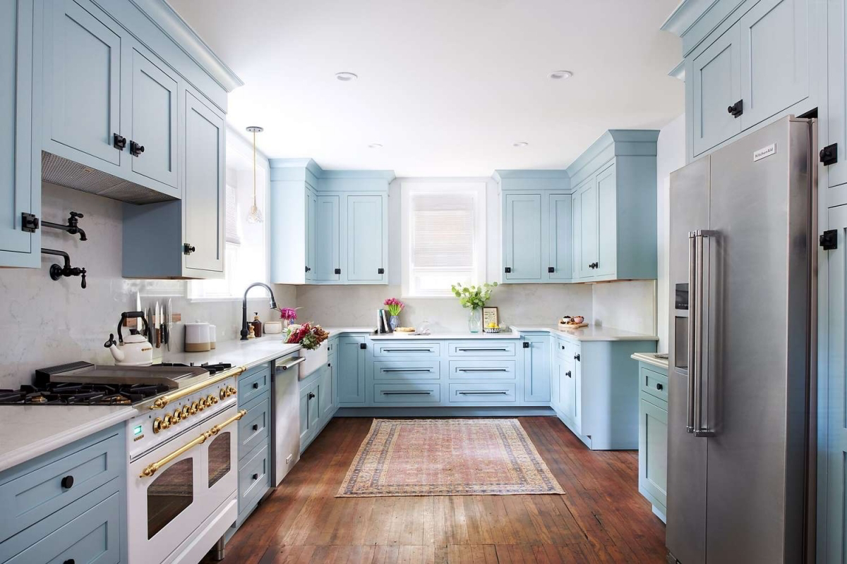
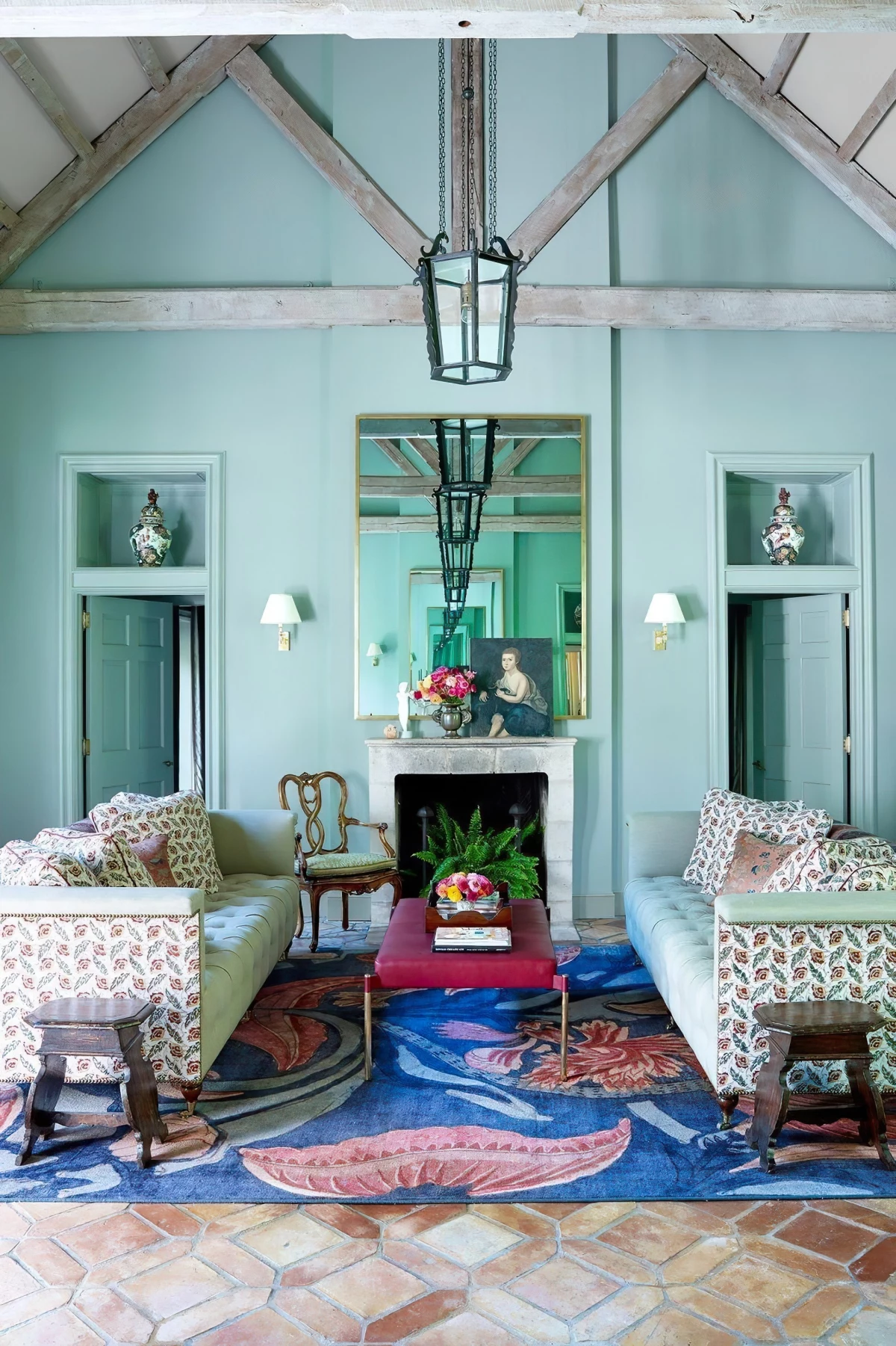
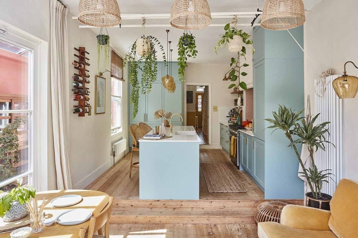
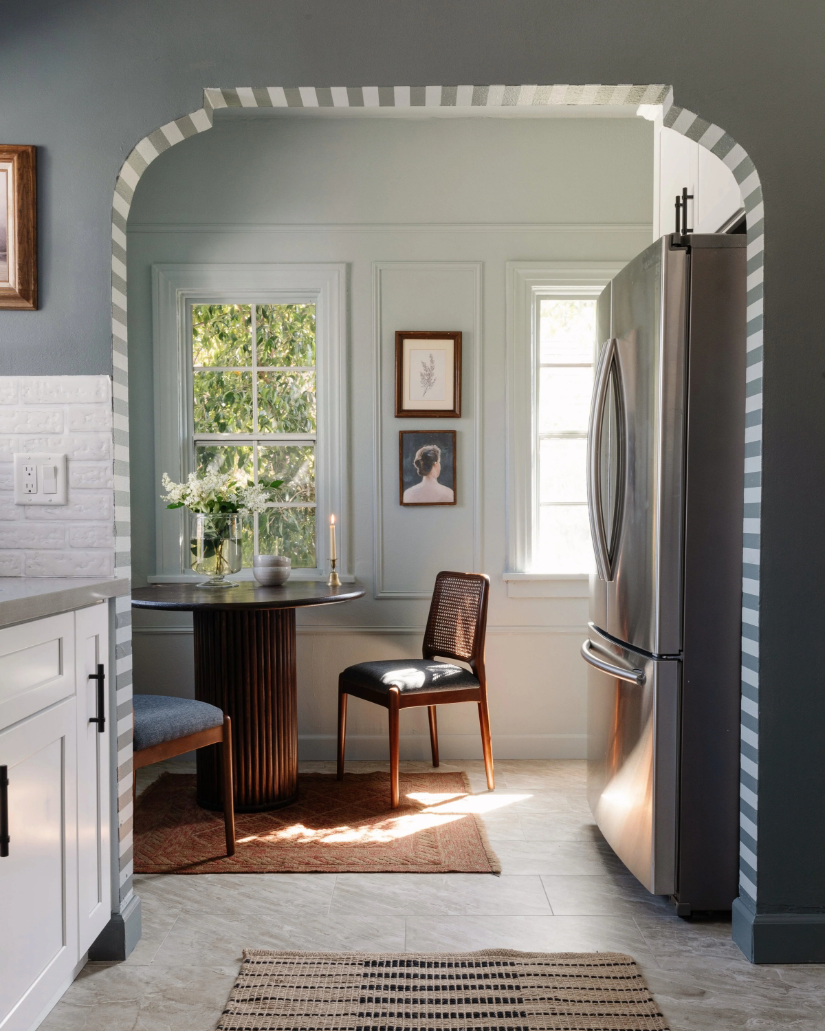
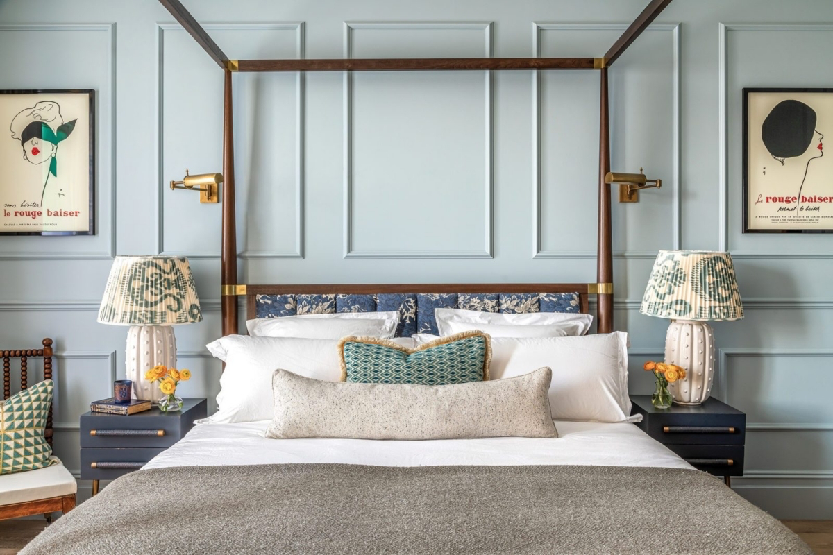
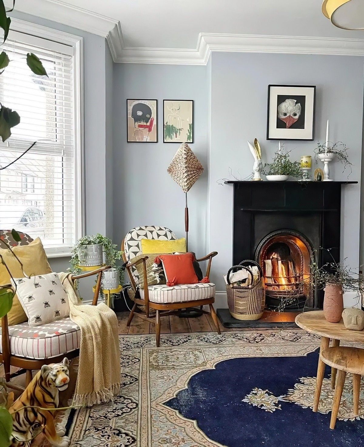
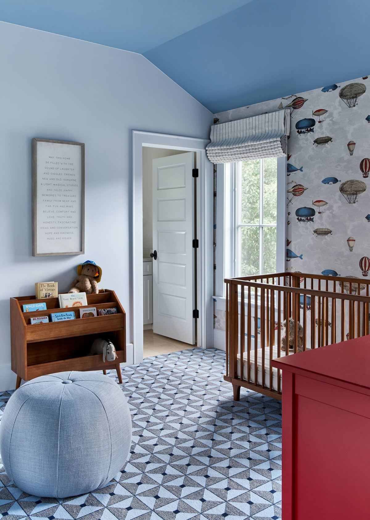
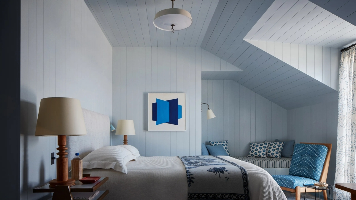
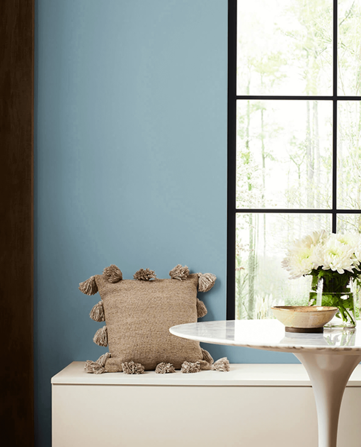
Look up! A powder blue ceiling, often called a ‘haint blue’ in the American South, is a classic design trick. It’s meant to mimic the open sky, making a room feel instantly taller and more expansive. This is a subtle yet brilliant way to incorporate the color without committing to four walls, adding an airy, unexpected elegance to any space.
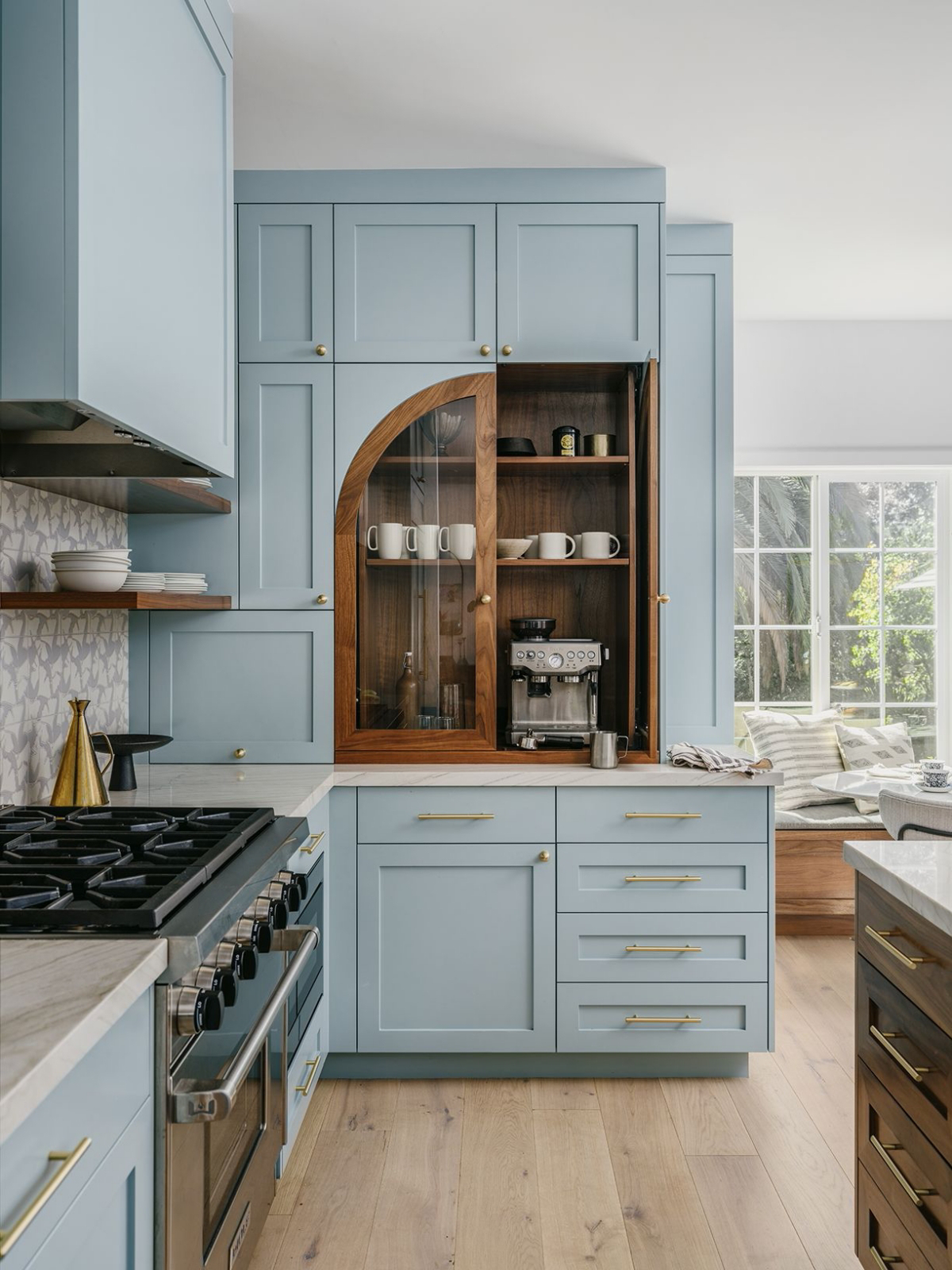
- Brushed Brass: Its warmth is the perfect antidote to blue’s coolness, adding instant vintage glamour.
- Light Oak or Ash Wood: Keeps the palette soft and airy, leaning into a Scandinavian or coastal aesthetic.
- Crisp White Linen: Creates a classic, clean contrast that feels both casual and sophisticated.
- Terracotta: A small pot or decorative tile in this earthy tone provides a rich, complementary accent.
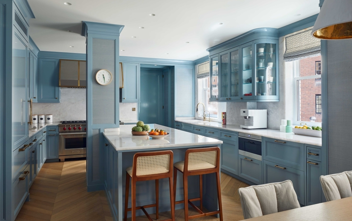
The critical detail is the undertone: Not all powder blues are the same. A shade with a hint of gray, like Sherwin-Williams’ ‘Upward’ (SW 6239), feels more sophisticated and acts as a versatile neutral. In contrast, a blue with a subtle green base, like Benjamin Moore’s ‘Palladian Blue’ (HC-144), evokes a more vibrant, spa-like coastal feel. Always test a large swatch on your wall.
A 2018 study by the University of Sussex confirmed that participants who viewed the color blue experienced a decrease in heart rate, associating it with feelings of calm and relaxation.
To prevent a powder blue room from feeling flat, texture is your best friend. Think beyond paint and consider:
- A velvet armchair in a slightly deeper shade of blue to add depth and a touch of luxury.
- Nubby, off-white bouclé cushions for a modern, tactile contrast.
- A high-pile wool rug in a cream or beige to ground the space and add softness underfoot.
Will powder blue work in a dark, north-facing room?
It can, but you must choose wisely. North-facing light is cool, so it can amplify the chilliness of a gray-based blue. The trick is to select a powder blue with a warm, almost creamy undertone. Farrow & Ball’s ‘Borrowed Light’ No.235 is a fantastic example; it has a soft, translucent quality that reflects light beautifully without feeling icy, even in lower-light conditions.
For a historic feel: Look at ‘Light Blue’ No.22 from Farrow & Ball. It’s a silvery, almost mercurial blue that shifts beautifully with the light, giving it a timeless, aged character.
For a modern, crisp look: Consider ‘Breath of Fresh Air’ 806 by Benjamin Moore. It’s a clearer, more optimistic blue that feels clean and uplifting, perfect for kitchens and bathrooms.
Your choice depends on the mood you want: serene and traditional, or fresh and contemporary.
According to Pantone, the first-ever “Color of the Year” in 2000 was Cerulean Blue, a close cousin to powder blue, chosen to represent the calming sky on the cusp of a new millennium.
This shows the enduring appeal of light blue as a color that signifies tranquility and optimism. Using it in your home taps into this shared cultural feeling, creating a space that feels both current and timeless.
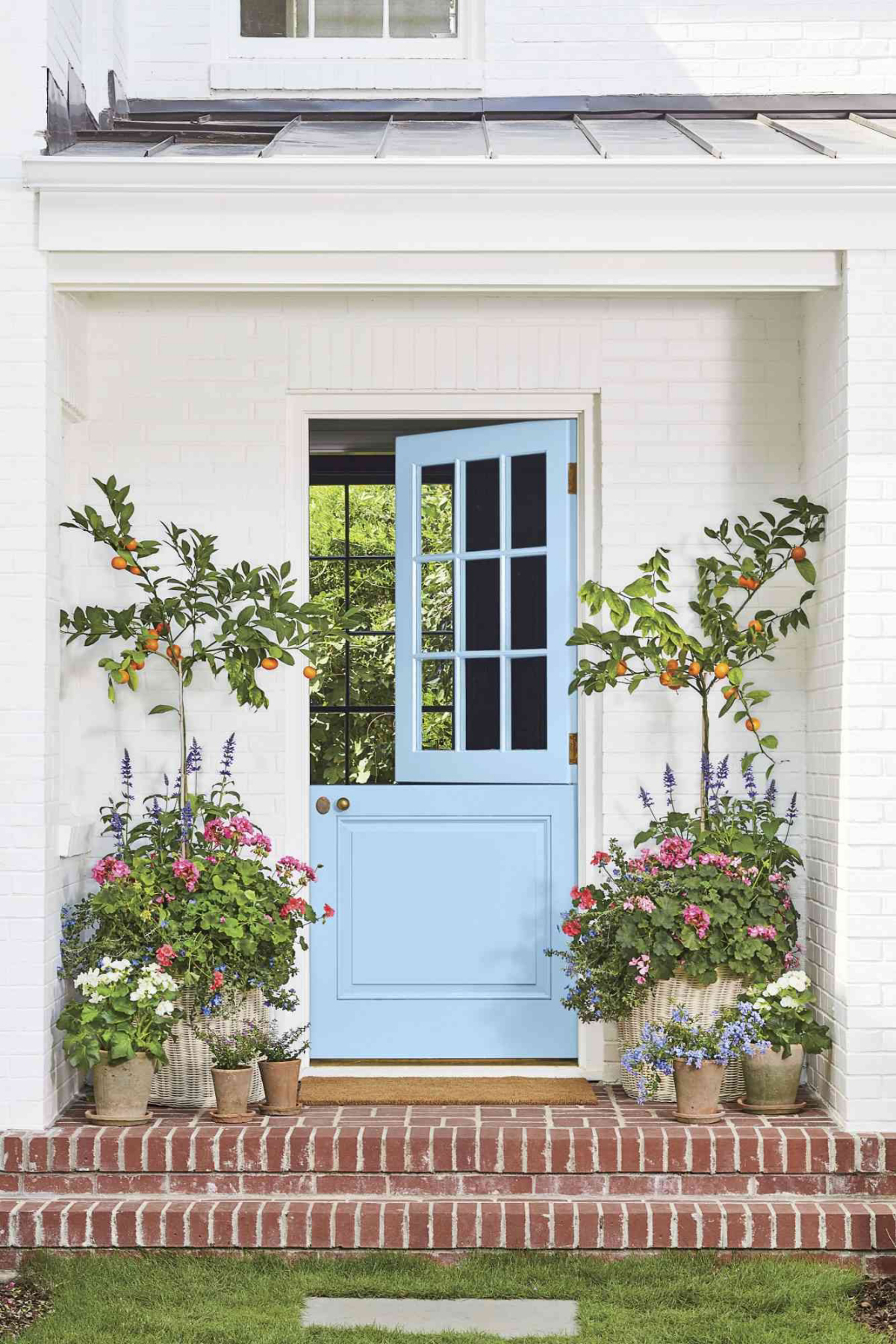
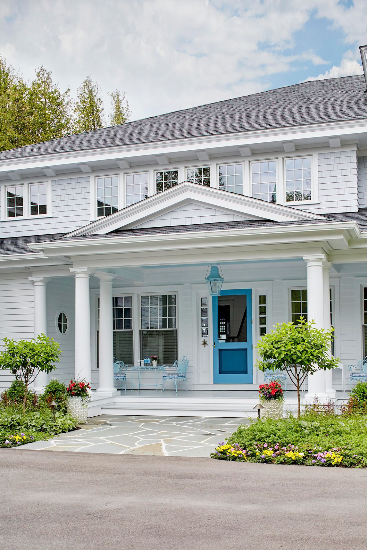
- It adds an instant pop of personality.
- It highlights beautiful architectural details.
- It feels custom-designed and thoughtful.
The secret? Painting your interior doors or window trim in a semi-gloss powder blue. It’s a lower-commitment, high-impact way to introduce the color, creating a memorable design moment without overwhelming the room.


